

What was advertised in a colonial newspaper 250 years ago this week?

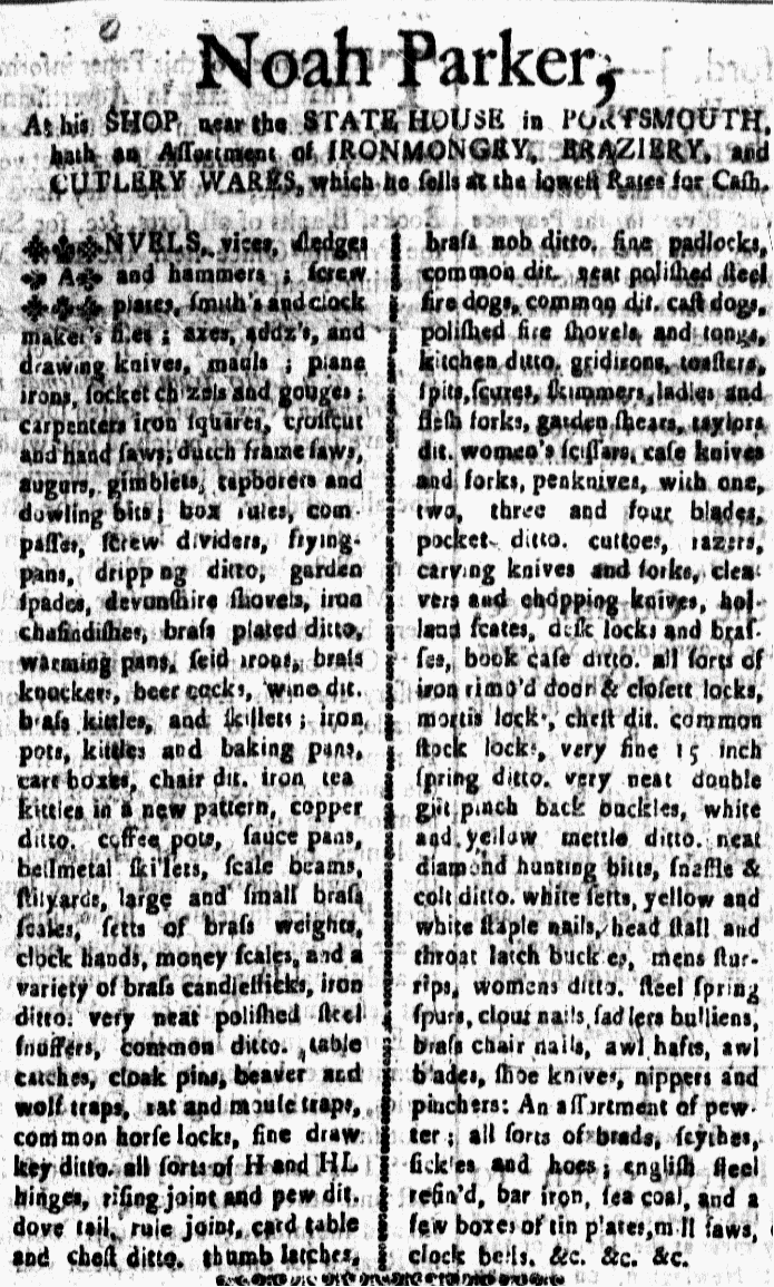
“Very neat double gilt pinch back buckles, white and yellow mettle ditto.”
Sometimes it can be a bit disorienting to read eighteenth-century advertisements. Some of the goods on offer seem unfamiliar to twenty-first-century readers (as is certainly the case in today’s advertisement), but the frequent use of the word “ditto” can also cause confusion.
- “steel snuffers, common ditto”
- “polished fire shovels and tongs, kitchen ditto”
- “desk locks and brasses, book case ditto”
- “common stock locks, very fine 15 inch spring ditto”
- “mens sturrips, womens ditto”
In the eighteenth century, “ditto” had the same meaning as it does today: the aforesaid, the above, the same. Accordingly, the examples above should be read as:
- “steel snuffers, common snuffers”
- “polished fire shovels and tongs, kitchen fire shovels and tongs”
- “desk locks and brasses, book case locks and brasses”
- “common stock locks, very fine 15 inch spring locks”
- “mens sturrips, womens sturrips”
Eighteenth-century readers would have made the transition easily, but (if students in any early American course I have ever taught are representative of modern Americans) today’s readers do not speak the language of the eighteenth century, nor do they recognize all of its conventions for writing. This sometimes leads to confusion about what advertisements, as well as manuscripts and other kinds of printed documents, meant to communicate.
“Ditto.” Is that just a quaint way that Americans expressed themselves in the eighteenth century? It actually had a very practical use. Imagine Noah Parker writing out this advertisement before dropping it off at the printing office. Paper may have been in short supply, but his time and efforts were both precious to him as well. When writing with a quill pen, inserting “ditto” to replace longer words and phrases reduced the amount of writing that needed to be done.
It’s impossible to know how Parker originally composed this particular advertisement, but I wouldn’t be at all surprised if he had used “do.” (itself an abbreviation for “ditto”) repeatedly, reducing the amount of writing he had to do with a quill pen significantly. (I’ve looked through enough account books to know that “do.” appeared repeatedly, sometimes as the most frequent word on a page.) The printer may have expanded “do.” to “ditto” at various places in the advertisement, though there are several examples of the much less common “dit.” standing in for “ditto.” It’s likely that both the printer and the advertiser made decisions about how to save time and space in the process of creating this advertisement.
BONUS: “&c. &c. &c.”
The advertisement ends with what appears to be a nonsensical collection of letters and symbols, at least to twenty-first-century readers. In the eighteenth century, however, writers and printers also had methods for abbreviating “et cetera, et cetera, et cetera” (and others, and so forth, and so on). Instead of “etc.” they used the more economical “&c.” (I’m not certain when the transition from “&c.” to “etc.” took place, but I suspect it may have had something to do with the relative ease of typing the latter compared to the former on a QWERTY keyboard.)