
What was advertised in a colonial American newspaper 250 years ago this week?
“Two young HORSES.”
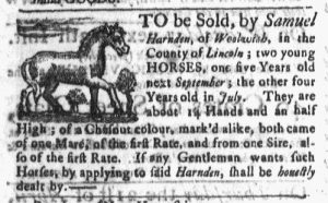
Samuel Harnden placed an advertisement seeking to sell “two young HORSES” in the April 11, 1768, edition of the Boston Post-Boy. An image of a horse accompanied his advertisement, distinguishing it from most others. More than thirty advertisements appeared in that issue, but only four featured images of any sort. In addition to Harnden’s advertisement, a real estate notice included a woodcut of a house and two others concerning maritime trade and transportation incorporated woodcuts of ships. Otherwise, the issue was devoid of visual images, with the exception of the masthead. A ship at sea and a post rider flanked the newspaper title at the top of the first page of each issue of the Boston Post-Boy.
Visual images constitute an important aspect of twenty-first-century media, in general, and advertising, in particular. Printing technologies of the eighteenth century, however, made visual images in newspapers relatively rare. In addition to their type, printers also had a limited number of stock images, woodcuts that could accompany some of the most common types of advertisements. Most of these generic images were represented in the April 11, 1768, edition of the Boston Post-Boy, but advertisements also frequently included woodcuts of slaves in addition to horses, houses, and ships. Since they belonged to printers and could be used interchangeably for advertisements with the same purpose, such images were not associated with any particular advertisers. However, some advertisers did invest in woodcuts that represented their businesses, often replicating their shop signs. Compared to the stock images, significantly fewer paid notices had woodcuts commissioned by the advertiser.
Woodcuts were not the only way to introduce visual variation into eighteenth-century newspapers. Printers typically possessed a variety of printing ornaments that could be deployed to add visual interest to the page, though the extent of ornamental printing varied from newspaper to newspaper. The compositors in Green and Russell’s printing shop, for instance, did not tend to insert much ornamental printing into the pages of the Boston Post-Boy, but their counterparts in Edes and Gill’s shop used ornaments to separate news items and advertisements. In the process, they presented a more sophisticated graphic design. Given the scarcity of visual images in eighteenth-century newspapers, readers may have been even more attuned to the variations in ornamental printing than modern readers who quickly become overwhelmed by the density of the text in both news items and advertisements.