May 7

What was advertised in a colonial American newspaper 250 years ago today?

Connecticut Journal (May 7, 1773).

ALL Persons indebted for this Paper, whose Accounts have been above 12 Months standing, are requested to make immediate Payment.”

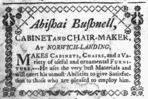
It was the only decorative type in the May 7, 1773, edition of the Connecticut Journal and New-Haven Post-Boy.  It had been the only decorative type in the previous issue of that newspaper.  It would be the only decorative type in the following issue.  Thomas Green and Samuel Green, the printers, used decorative type sparingly.  What prompted them to deploy it in three consecutive issues in the spring of 1773?  They wished to call attention to their own notice that called on “ALL Persons indebted for this Paper, whose Accounts have been above 12 Months standing … to make immediate Payment.”  Such notices appeared frequently in newspapers throughout the colonies.  Printers often gave them privileged places to help direct readers to them.  Less often, they used decorative type to distinguish their notices from other advertisements.

Connecticut Journal (April 23, 1773).

The Greens enclosed their notice within an ornate border, enhancing its visibility no matter where it appeared on the page, whether near the bottom of the last column on the third page when it first ran on April 30 or as the last item on the last page in subsequent issues on May 7 and May 14.  No other advertisements in those issues featured decorative type, nor did the remainder of the contents.  In the previous issue published on April 23, a single line of printing ornaments that separated news items comprised the extent of decorative type.  After the Greens discontinued their notice, printing ornaments depicting skulls and bones appeared above a death notice for “Mrs. MARY LOTHROP, the agreable Consort of Mr. John Lothrop, of this Town,” in the May 21 edition.  No other decorative type appeared among the news or advertisements.

Connecticut Journal (May 21, 1773).

The Greens certainly had printing ornaments among their type.  They apparently believed that decorative type had practical value, that it could draw attention to an advertisement they considered important.  While they recognized the potential for adorning advertisements and other content, they did not embrace all the possible uses of printing ornaments in their newspaper in the eighteenth century.  That innovation came later.  Like other colonial printers, the Greens produced pages rather conservative in appearance compared to the vibrant use of printing ornaments in advertisements in many nineteenth-century newspapers.

January 23

What was advertised in a colonial American newspaper 250 years ago this week?

Supplement to the New-York Gazette and Weekly Mercury (January 21, 1771).

“SADLERY WARE.”

Ornamental printing helped to make the final page of the supplement that accompanied the January 21, 1771, edition of the New-York Gazette and Weekly Mercury more visually interesting than any other portion of that issue.  Rather than use a single line to separate advertisements, the compositor instead selected a variety of decorative type.  Compare, for instance, the line between the advertisement for “SADLERY WARE” and George Ball’s advertisement about his new location to the ornaments that appeared above and below most of the other advertisements.

Eighteenth-century newspapers tended to feature few visual images other than a crest or signet in the masthead and a small number of woodcuts depicting ships, houses, horses, enslaved people, and runaway indentured servants.  Sometimes those woodcuts appeared in great numbers, but most often advertisers deployed them sparingly.  The edition of the New-York Gazette and Weekly Mercury under consideration here ran only three advertisements with woodcuts, one on the third page and two on the fourth page.  No images appeared on the second page; only the crest in the masthead adorned the first page.  The two-page supplement included six woodcuts, two on the first page and four on the second.  (Three of them can be seen in the detail of that page above.)  With four woodcuts, the last page of the supplement already incorporated greater visual diversity than any other page of the standard issue and the supplement.

Beyond that, the compositor spruced up the page with more than twenty lines of decorative type that separated advertisements.  The third and fourth pages of the standard issue and the first page of the supplement all consisted entirely of advertising, yet none of them received such treatment.  Instead, single lines sequestered advertisements.  What explains the burst of creativity on the final page?  Was it a ploy to attract attention from readers once they discovered no news or editorials, especially those prone to skip over advertisements?  Did more than one compositor set type for that issue and its supplement?  What other factors might have influenced the design decisions that produced a final page so different from the rest of the issue?  The format of these advertisements raises interesting questions without clear answers.

June 18

What was advertised in a colonial American newspaper 250 years ago this week?

Jun 18 - 6:15:1769 Pennsylvania Journal
Pennsylvania Journal (June 15, 1769).

“ROBERT AITKEN, Bookseller, From Glasgow.”

Robert Aitken, a bookseller, kept shop in Philadelphia only briefly in 1769. In an advertisement in the Pennsylvania Journal, he announced that he had “just now arrived” from Glasgow and “opened his store” on Front Street. His inventory consisted of “a valuable variety of books,” including literature, history, law, medicine, and divinity as well as novels, plays, songs, and ballads. Aitken offered something agreeable to the tastes of practically any reader.

To stimulate sales, the bookseller advised “Such who intend to furnish themselves with any of the above articles” to make their purchases as soon as possible or else miss their chance because he did not intend to remain in Pennsylvania long. Indeed, he did make “but a short stay” in Philadelphia, returning to Scotland before the year ended. Yet he must have been encouraged by the prospects available in Philadelphia. He returned two years later and remained in the city until his death in 1802.

In his History of Printing in America, Isaiah Thomas offers an overview of Aitken’s career. Born in Dalkeith, Scotland, Aitken apprenticed to a bookbinder in Edinburgh. After his initial sojourn as a bookseller in Philadelphia in 1769, he returned in 1771 and “followed the business of bookselling and binding, both before and after the revolution.”[1] In 1774, he became a printer. In January 1775 he founded the Pennsylvania Magazine, one of only seventeen magazines published in the colonies before the American Revolution.[2] It survived for a little over a year, ending its run in July 1776. He earned some renown for publishing an American bible in 1802, though Thomas contests the claim that it was the first printed in America.

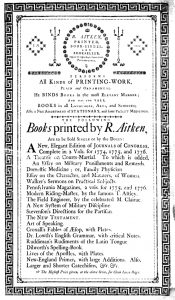
Aitken Broadside
Robert Aitken, Advertising Broadside (Philadelphia: 1779). Courtesy Library Company of Philadelphia.

Like other eighteenth-century printers, Aitken contributed to the culture of advertising in early America. His ledger, now in the collections of the Historical Society of Pennsylvania, lists several broadsides, billheads, and other printed materials distributed for the purposes of advertising that are otherwise unknown since, unfortunately, copies have not survived. He delivered the Pennsylvania Magazine enclosed in advertising wrappers; these are also rare, though some can be found among the collections of the Library Company of Philadelphia. He also printed broadsides listing books he printed in Philadelphia. One also advised prospective clients that Aitken bound books and “PERFORMS All KINDS of PRINTING-WORK, PLAIN and ORNAMENTAL.” The ornamental printing on that broadside was a model of the advertising that Aitken could produce for his customers.  Aitken’s first newspaper advertisements in 1769 barely hinted on the influence he would exert over early American advertising, both as an advertiser of his own goods and services and as a producer of advertising for others who enlisted him in printing broadsides, handbills, magazine wrappers, trade cards, and other media intended to stimulate consumer interest.

**********

[1] Isaiah Thomas, History of Printing in America with a Biography of Printers and an Account of Newspapers (1810; 1874; New York: Weathervane Books, 1970), 401.

[2] See “Chronological List of Magazines” in Frank Luther Mott, A History of Americasn Magazines, 1741-1850 (Cambridge, Massachusetts: Harvard University Press, 1939), 787-788.

December 16

What was advertised in a colonial American newspaper 250 years ago today?

Just come to Hand, and to be sold by Glen and Gregory.”

Connecticut Journal (December 16, 1768).

As fall turned to winter in 1768, the partnership of Glen and Gregory ran an advertisement for “A Neat Assortment of Goods suitable for the Season” in several consecutive issues of the Connecticut Journal and New-Haven Post-Boy. In the process of creating this advertisement, Glen and Gregory most likely wrote the copy and submitted it to the printing office. Then the compositor set the type, making all of the decisions about fonts, format, and other graphic design elements. Occasionally advertisers made specific requests concerning the visual appearance of paid notices, but in most instances they left that part of producing advertisements to the compositors.

In the case of Glen and Gregory’s advertisement, the compositor most likely made decisions about which words appeared in italics and which in larger font. The compositor also elected to center the first two lines of the advertisement, which served as a headline to draw attention. The compositor also made other decisions about the appearance of advertisements in the Connecticut Journal, moving beyond the copy submitted by Glen and Gregory and other advertisers. Lines of ornamental type separated many (but not all) of the advertisements in the December 16, 1768, edition and most other issues. Compositors at other newspapers also placed decorative borders above and below advertisements. In the same week that Glen and Gregory’s advertisement appeared in the Connecticut Journal, the compositors for the Boston-Gazette and Richard Draper’s Massachusetts Gazette also deployed this strategy for dressing up advertisements.

Doing so operated as an implicit advertisement for the services provided at the printing offices where these newspapers were published. In addition to publishing newspapers, printers solicited job printing orders for blanks, broadsides, handbills, and other items. The ornamental type that separated advertisements in newspapers alerted prospective clients to the possibilities of decorative printing for their own orders. Although they did not do so exhaustively, these borders served as specimens of type otherwise not widely incorporated into the news items, advertisements, and other content of colonial newspapers. They offered compositors an opportunity to play with the visual appearance of advertisements and challenged prospective clients to think about the possibilities for their own job printing orders.

April 17

What was advertised in a colonial American newspaper 250 years ago this week?

Apr 17 - 4:11:1768 Boston Post-Boy
Boston Post-Boy (April 11, 1768).

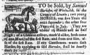
“Two young HORSES.”

Samuel Harnden placed an advertisement seeking to sell “two young HORSES” in the April 11, 1768, edition of the Boston Post-Boy.  An image of a horse accompanied his advertisement, distinguishing it from most others.  More than thirty advertisements appeared in that issue, but only four featured images of any sort.  In addition to Harnden’s advertisement, a real estate notice included a woodcut of a house and two others concerning maritime trade and transportation incorporated woodcuts of ships.  Otherwise, the issue was devoid of visual images, with the exception of the masthead. A ship at sea and a post rider flanked the newspaper title at the top of the first page of each issue of the Boston Post-Boy.

Visual images constitute an important aspect of twenty-first-century media, in general, and advertising, in particular.  Printing technologies of the eighteenth century, however, made visual images in newspapers relatively rare.  In addition to their type, printers also had a limited number of stock images, woodcuts that could accompany some of the most common types of advertisements. Most of these generic images were represented in the April 11, 1768, edition of the Boston Post-Boy, but advertisements also frequently included woodcuts of slaves in addition to horses, houses, and ships.  Since they belonged to printers and could be used interchangeably for advertisements with the same purpose, such images were not associated with any particular advertisers.  However, some advertisers did invest in woodcuts that represented their businesses, often replicating their shop signs.  Compared to the stock images, significantly fewer paid notices had woodcuts commissioned by the advertiser.

Woodcuts were not the only way to introduce visual variation into eighteenth-century newspapers.  Printers typically possessed a variety of printing ornaments that could be deployed to add visual interest to the page, though the extent of ornamental printing varied from newspaper to newspaper.  The compositors in Green and Russell’s printing shop, for instance, did not tend to insert much ornamental printing into the pages of the Boston Post-Boy, but their counterparts in Edes and Gill’s shop used ornaments to separate news items and advertisements.  In the process, they presented a more sophisticated graphic design.  Given the scarcity of visual images in eighteenth-century newspapers, readers may have been even more attuned to the variations in ornamental printing than modern readers who quickly become overwhelmed by the density of the text in both news items and advertisements.

July 12

What was advertised in a colonial American newspaper 250 years ago this week?

Jul 12 - 7:9:1767 Massachusetts Gazette
Massachusetts Gazette (July 9, 1767).

“Ready for Sale, BY Jolley Allen.”

Regular readers of the Massachusetts Gazette may have been surprised when they glimpsed this notice for Jolley Allen’s “Shop about Midway between the Governor’s and the Town-House, and almost Opposite the Heart and Crown in Cornhill, BOSTON.” Allen regularly advertised in the Massachusetts Gazette. He also regularly advertised in the city’s other three newspapers, so the advertisements itself would not have caused surprise. No, that would have resulted from the design of the advertisement. It did not feature a border comprised of printing ornaments, a distinctive aspect of Allen’s advertising that had practically become his trademark in all of his notices, regardless of which newspaper published them. Allen had developed a consistent visual appearance for his advertisements, making them instantly recognizable. This advertisement, however, looked like so many others on the page. It lacked the most significant element that previously set Allen’s notices apart from others.

Perhaps the printer made an error. Perhaps a new compositor now worked in the shop and set the type without realizing that Jolley’s advertisement was supposed to have a decorative border. After all, the shopkeeper seems to have consistently negotiated with the printers of all four of Boston’s newspapers to include that adornment. Perhaps he forgot to underscore this request when he submitted the copy for this advertisement.

Yet later in the week, the Boston Evening-Post, the Boston-Gazette, and the Boston Post-Boy all carried Allen’s newest advertisement. None of them enclosed his list of “English and India Goods” within any sort of border. While it was possible that one printing office overlooked this particular request, it seems unlikely that all four made the same mistake. Apparently Allen had not renewed his instructions concerning the graphic design of his advertisement. Why did he abandon a practice that made his advertisements so easily identifiable to readers and potential customers? Why did he eliminate the most innovative aspect of his advertising?   Even as eighteenth-century advertisers experimented with early forms of branding, they did not consistently adopt new methods, not realizing the value of cementing unique images of their business endeavors in the minds of consumers.

September 27

GUEST CURATOR: Nicholas Commesso

What was advertised in a colonial newspaper 250 years ago today?

sep-27-9271766-providence-gazette
Providence Gazette (September 27, 1766).

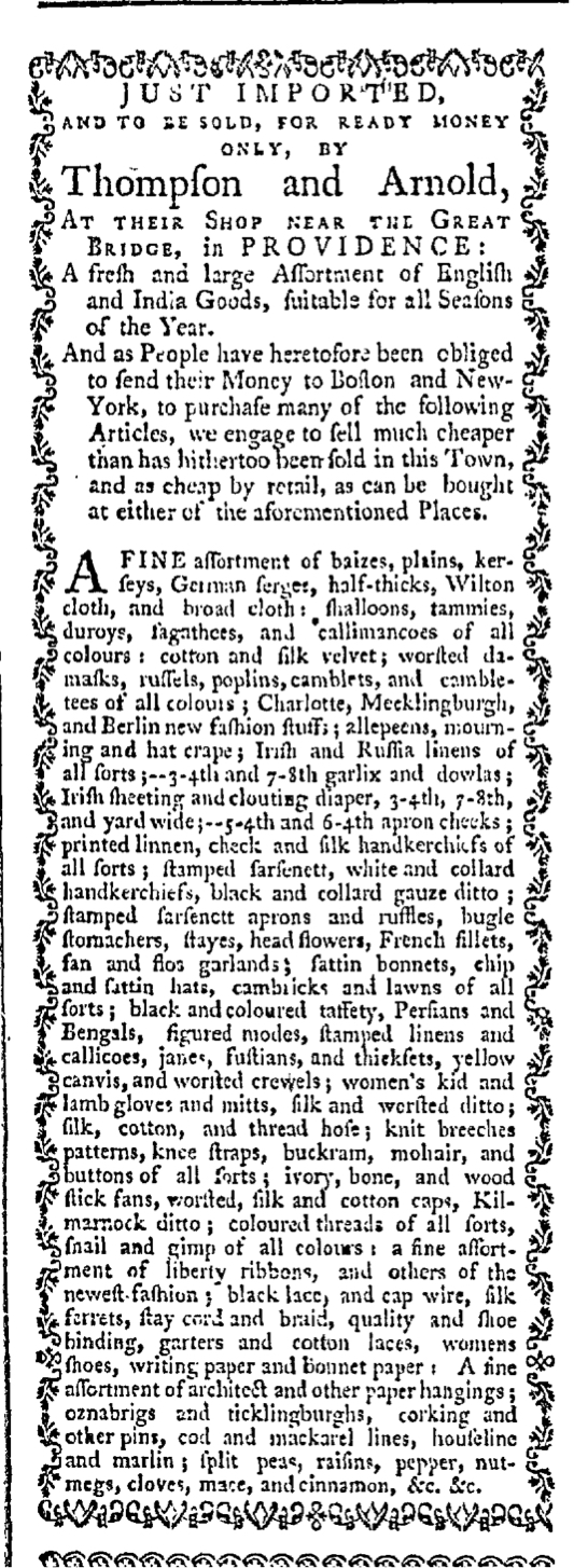
“A fresh and large Assortment of English and India Goods.”

This advertisement in the Providence Gazette features a lengthy list of newly imported goods at the shops of Thompson and Arnold. “TO BE SOLD, FOR READY MONEY ONLY,” these goods had been imported from both from England and India. Included in this “FINE assortment” were different textiles, clothing, and related items, such as “Irish and Russia linens of all sorts,” satin bonnets, shalloons, tammies, “colored threads of all sorts,” and countless other products. Why was importation so important? Business for the British was truly booming in colonial America. As T.H. Breen notes, newspapers “carried more and more advertisements for consumer goods,” and all Americans were a part of this “consumer revolution.”[1]

This shop clearly emphasized fashion, as they offered many different options in terms of colors and materials, which especially interested women. For women, shopping was an exhibition of liberty, and “with choice came a measure of economic power.” They had choices of products and choices of shops to visit. A variety of options allowed customers to gain leverage as they asked questions and made demands. Additionally, Breen argues, choice “reinforced the Americans’ already strong conviction of their own personal independence.”[2]

**********

ADDITIONAL COMMENTARY: Carl Robert Keyes

I originally intended to feature this advertisement a week ago today, but when Nick submitted the same advertisement (printed a week later) for approval I decided to hold off for a week. I figured that the chances were quite probable that he and I would approach the advertisement from very different perspectives, that discussion of this advertisement would be enhanced from both of us examining it.

That turned out to be the case. I initially selected this advertisement because I wanted to discuss its format. In some regards it looks quite similar to an advertisement previously published by Thompson and Arnold (which appeared for the first time in the August 9, 1766, issue of the Providence Gazette and then many more times in subsequent issues.) The original iteration of this advertisement deployed graphic design in several unique ways. It surely caught the attention of readers and potential customers.

This version of the advertisement reverted to some of the more standard aspects of eighteenth-century newspaper advertisements. In particular, it inhabited a single column within the issue, whereas the earlier version spanned two columns. The previous version also used three columns to delineate Thompson and Arnold’s merchandise, but in today’s advertisement their inventory collapsed into a dense list instead. This did not have the same visual resonance, nor did it make it as easy for potential customers to locate specific products of interest.

Still, the updated version of Thompson and Arnold’s advertisement featured design elements intended to continue drawing the eyes of readers. Like the previous version, it retained a decorative border made of printing ornaments. Very few newspaper advertisements in the 1760s had such borders (though we have previously seen that Jolley Allen made sure that his advertisements in Boston’s newspapers were easily identified by their borders). In addition, Thompson and Arnold’s advertisement was much longer than most that appeared in the Providence Gazette. Its size alone merited notice. Finally, today’s advertisement appeared in the first column of the first page of the Providence Gazette, right below the masthead. In design, layout, and location, there was no way for readers to overlook Thompson and Arnold’s updated advertisement.

**********

[1] T.H. Breen, “An Empire of Goods: The Anglicization of Colonial America, 1690-1776,” Journal of British Studies 25, no. 4 (October 1986): 486-487.

[2] Breen, “Empire of Goods,” 489.

July 7

What was advertised in a colonial newspaper 250 years ago today?

Jul 7 - 7:7:1766 Boston Post-Boy
Boston Post-Boy (July 7, 1766).

JUST Imported from London, by Jolley Allen.”

Shopkeeper Jolley Allen almost certainly played a role in designing this advertisement. As I have noted previously, the available evidence suggests that advertisers tended to write their own copy and printers tended to make decisions about layout and fonts when they set the type. Printers often adopted formats that were consistent from advertisement to advertisement, giving all commercial notices that appeared in a given newspaper similar visual qualities and making them easy to recognize at a glance.

Allen’s advertisement had a distinctive border that set it apart from other advertisements in the Boston Post-Boy. It seemed unlikely that the printer went through the additional effort of setting ornamental type of his own volition. What was more probable, I hypothesized, was that Allen made special arrangements with the printer (and perhaps paid more) to arrange for this special feature.

Jul 7 - 7:7:1766 Boston Evening-Post
Boston Evening-Post (July 7, 1766).

Allen’s advertisement in other newspapers published in Boston on the same day suggested that was indeed the case. His advertisement in the Boston Evening-Post also had a decorative border, though it was composed of different ornaments. Otherwise, the advertisement had the same copy and nearly identical layout. Another version of the advertisement appeared in the Boston-Gazette. While the copy was the same, the border consisted of yet another style of printing ornaments and the format had two columns within the advertisement. Finally, Allen’s advertisement had previously appeared in Boston’s other newspaper (the only one not distributed on Mondays), the Massachusetts Gazette. Except for yet another method of creating the decorative border, it was nearly identical to the advertisements in the Boston Post-Boy and the Boston Evening-Post. The copy was the same and the format nearly identical.

Jolley Allen placed his advertisement in four newspapers. In each instance, it had a decorative border that would have drawn attention to it, especially since such borders were not a standard part of other advertisements in any of those publications. Allen almost certainly designed that portion of his advertisement, even if he left it to the individual printers to make decisions about setting the rest of the type. Realizing that advertisements often tended to look the same, Allen devised a graphic design innovation intended to set his own apart from the crowd.

Jul 7 - 7:7:1766 Boston-Gazette
Boston-Gazette (July 7, 1766).
Jul 7 - 7:3:1766 Massachusetts Gazette
Massachusetts Gazette (July 3, 1766).