
What was advertised in a colonial American newspaper 250 years ago this week?
“Fashionable silver, and metal shoe buckles.”
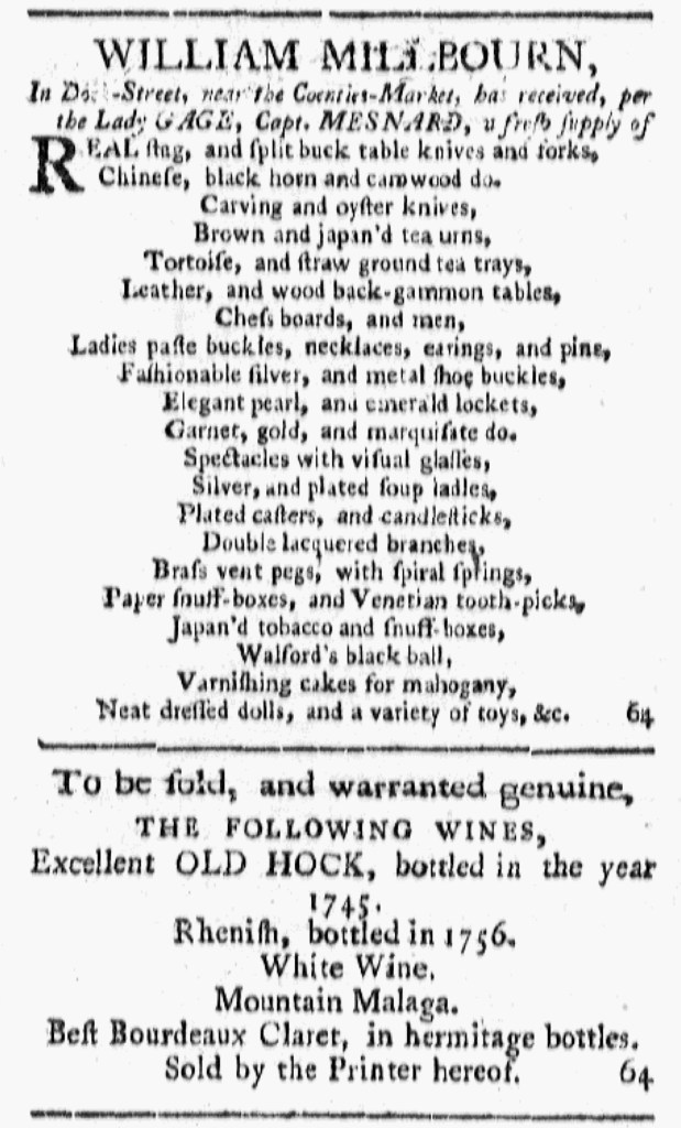
Like other merchants and shopkeepers who advertised imported goods for sale in the July 7, 1774, edition of Rivington’s New-York Gazetteer, William Millbourn listed many of his wares to give consumers a sense of the array of choices available to them. Yet Millbourn’s advertisement had a different format than most others in that issue. In the process of giving an inventory of everything from “Carving and oyster knives” to “Chess boards, and men” to “Paper snuff-boxes, and Venetian tooth-picks” to “neat dressed dolls, and a variety of toys,” he named only two or three related items on each line and centered each line. That gave Millbourn’s advertisement a distinctive appearance with white space on the left and right, ebbing and flowing depending on the length of each line.
Other advertisers deployed other design elements to draw attention to their notices. James Webb adorned his advertisement for “FRENCH BURR MILL-STONES” with a woodcut depicting a millstone. Others used headlines in much larger font than the rest of their copy, such as “MUSIC,” “BULL-BAITING,” “NEW RICE,” and “CHINA, GLASS, AND Earthen Ware.” Below their headline for “IRISH LINENS,” Woodward and Kip gave descriptions in two columns, including “Purple, blue and red copperplate furniture calicoes” and “Black, blue, brown, green, yellow, straw-colour, crimson, garnet, pink and purple moreens.” Most entries ran two or more lines, with the second and subsequent lines indented and all lines justified on the right. The indentations introduced some white space into what would have been a dense paragraph, the method that John Haydock used for listing his wares. Still, the format of Millbourn’s advertisement included much more white space than most others. He likely submitted instructions concerning how he wished his advertisement to appear along with the copy.
The compositor, either James Rivington himself or someone working in his printing office, apparently liked the look of Millbourn’s advertisement and decided to apply it to a notice about “THE FOLLOWING WINES … Sold by the Printer hereof.” Both had their initial appearance in the July 7 edition, the advertisement for wine running immediately below Millbourn’s notice. That suggests that the compositor set the type for one right after the other. Rather than competing with Millbourn’s advertisement, the second advertisement may have helped focus attention on both notices by extending the unusual use of white space, especially since paragraphs with little white space ran on the right and left as well as above and below. The distinctiveness of the format had the potential to incite curiosity, increasing the chances that readers engaged with Millbourn’s advertisement.