What was advertised in a revolutionary American newspaper 250 years ago today?
“M‘Knight’s Harmony of the
Duhamel’s Husbandry (Gospel.”
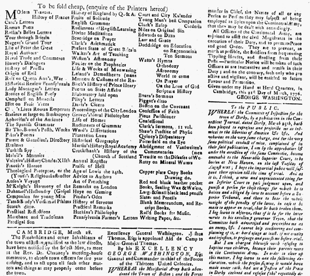
Like other printers throughout the colonies, Thomas Green and Samuel Green, the printers of the Connecticut Journal, stocked and sold an array of imported books, pamphlets, and other merchandise. Beyond newspaper subscriptions and advertisements and job printing, they cultivated other revenue streams. As newspaper printers, the Greens had ready access for promoting their wares, doing so, for instance, with an oversized advertisement in the April 3, 1776, edition of the Connecticut Journal.
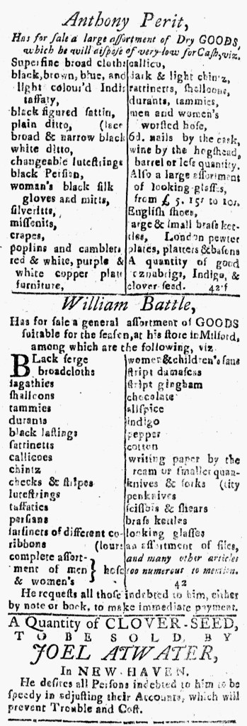
Listing dozens of titles, that advertisement dominated the third page. The format distinguished it from any other, extending across two columns in the upper left corner, yet the columns within the advertisement did not align with the rest of the columns in the newspaper. Rather than the standard width, the Greens used three narrow columns. They listed one title per line, leaving white space that made it easier for readers to navigate their notice than if they had resorted to a paragraph of dense text. A couple of advertisements on the facing page received similar treatment. Anthony Perit’s advertisement for a “large assortment of Dry GOODS” and William Battle’s advertisement for a “general assortment of GOODS suitable for the season” each had their inventory arranged in two columns with a line running down the center, but those notices did not exceed the standard width for the newspaper. On the other hand, either the Greens or a compositor who set the type realized that one title per line in the catalog of books and pamphlets available at their printing office in New Haven would leave too much white space. As a matter of both efficiency and design, their advertisement thus featured a format that distinguished it from others.
That efficiency included limiting the number of lines and the overall space required for the advertisement. Near the bottom of the first column, an incomplete entry for “M‘Knight’s Harmony of the” concluded at the end of the next entry for “Duhamel’s Husbandry” with “(Gospel.” The complete entry listed M‘Knight’s Harmony of the Gospel.” The “(” signaled to readers that “Gospel” belonged with either the previous or the following entry. Similarly, about one third of the way down the second column, an incomplete entry for “Manners & Customs of the Ro-” concluded with “(mans” on the line above and an incomplete entry for “Treatise on the Diseases of Wo-” near the bottom of the final column concluded with “(men” at the end of the previous line. While not always elegant, the format enhanced the visibility of the advertisement the printers ran to promote book sales.