Last week I participated in the Early American Material Texts, a conference co-sponsored by the Library Company of Philadelphia, the McNeil Center for Early American Studies, and the Kislak Center for Special Collections, Rare Books, and Manuscripts at the University of Pennsylvania. During my time in Philadelphia I had a series of encounters with material texts, both at the conference and in my exploration of the city.
The current exhibition at the Library Company of Philadelphia, which I was told was a happy coincidence rather than specifically planned to overlap with the conference, depended on the materiality of texts. Common Touch: The Art of the Senses in the History of the Blind opened on April 4 and will be on view through October 21. According to the Library Company’s website, Common Touch is a multimedia exhibition that looks at historical embossed and raised-letter documents for the visually impaired as a starting point for a multi-sensory exploration of the nature of perception. Inspired by her research in the Library Company’s Michael Zinman Collection of Printing for the Blind, artist-in-residence Teresa Jaynes” curated an exhibition “that combines her own original works with historical collections that document the education of the blind in the 19th century.”
Because so many of the texts included in this exhibition were intended – indeed, designed – to be read via the sense of touch rather than the sense of sight, the materiality of the texts took on additional significance. What have become familiar systems today, particularly Braille texts, emerged and gained prominence only after experimenting with a variety of other methods for creating texts that blind and sight-impaired individuals could read with their fingertips. Some, such as books that featured large embossed words, could be read fairly easily by sighted individuals, merely replicating traditional texts by adding raised surfaces. (See the image of The Students’ Magazine on the homepage for the exhibition.) Others seemed completely foreign and inaccessible to sighted individuals who would have had little reason to learn systems of reading that relied on tactile sensations. Just as one can hear Morse code and recognize a form of communication without understanding what is being transmitted, many of the texts on display revealed modes of communication reserved for a relatively small number of people who developed specialized skills to decipher it, effectively reversing the relationship between sighted and sight-impaired individuals when it comes to reading most texts.
The exhibition included texts designed for a variety of purposes; not all of them were intended to relay narratives. For instance, it included several methods for writing equations and doing mathematics, including wooden arithmetic blocks that had a surprising limited number of raised surfaces for communicating a lot of information. As a sighted individual, the equations looked like some sort of code, but it was their materiality that made them understandable to sight-impaired readers. In addition, mathematics texts included raised surfaces to demonstrate patterns (the snowflakes were especially beautiful) and teaching geometry. I was challenged to think about the materiality of texts in new ways throughout the conference, but this exhibition raised issues not even considered on the conference program. I was glad that I had a chance to view it before the conference began.
I discovered that some of the arguments made at the conference continued to resonate as I explored museums during my extended stay in Philadelphia. On Saturday I toured the Mütter Museum, operated by the College of Physicians of Philadelphia. I especially enjoyed their current exhibition, Vesalius on the Verge: The Book and the Body. According to the Mütter Museum’s website, “December 31st marked the 500th birthday of the ‘Father of Modern Anatomy’ Andreas Vesalius. In 1543 Vesalius published De humani corporis fabrica (On the Fabric of the Human Body), a series of seven books based on the dissection and research he conducted while at the University of Padua. This treatise on the human body was a groundbreaking work, with both detailed text and illustrations. To this day the Fabrica is still considered a masterpiece of both detailed text and illustrations.” This exhibition will remain on view through the end of August.
During my panel, Nancy Siegel, an art historian from Towson University, examined ephemeral prints by Paul Revere, including illustrations he engraved to accompany eighteenth-century cookbooks. Siegel argued that there were three texts that should be taken into consideration when considering the instructions for cooking a rabbit: the recipe, the illustration, and the rabbit itself. I continued to think about this point as I toured the Vesalius exhibition, which featured medical artifacts as well as the famous anatomical text. In his own time, Vesalius treated bodies as texts and encouraged his students to do the same. Today the exhibition can best be appreciated and understood only by engaging the interplay between “The Book and the Body,” treating each as texts that inform the other.
I was especially intrigued by the portion of the exhibition devoted to Vesalius’s Epitome, a companion piece to the Fabrica that was intended to be a less expensive study guide for students who could not afford the seven volume set. The Epitome included several anatomical plates, but that last two were not meant to be simply viewed and nothing else. Instead, readers were “encouraged to cut up these plates and match individual pieces to the corresponding parts of the first nine anatomical plates.” In this manner, Vesalius intended the Epitome would encourage “interactive learning, furthering the connections between reader, text and illustration” in the Fabrica. Such material manipulations of the printed text also came in handy as alternative texts in the absence of bodies to dissect.
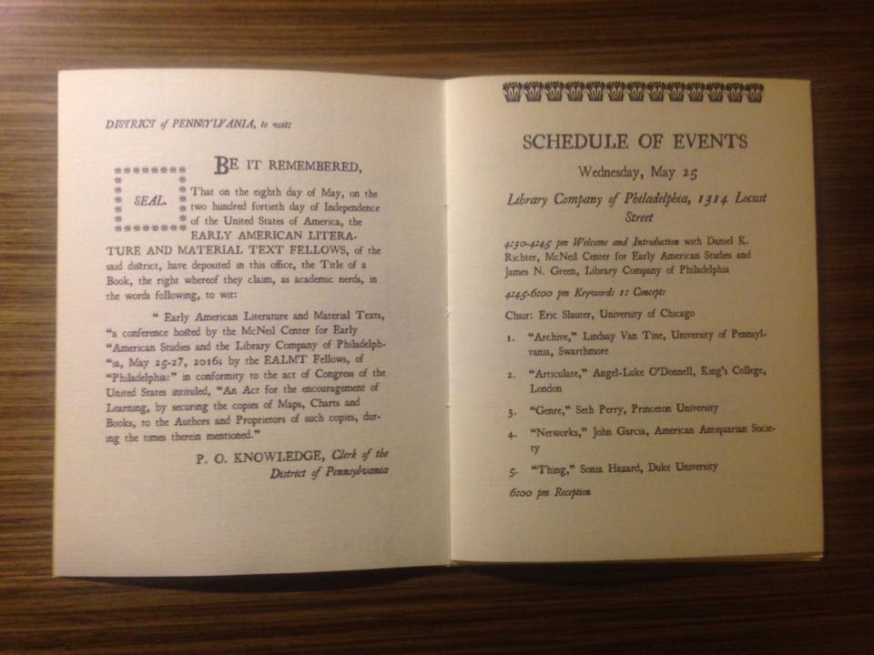
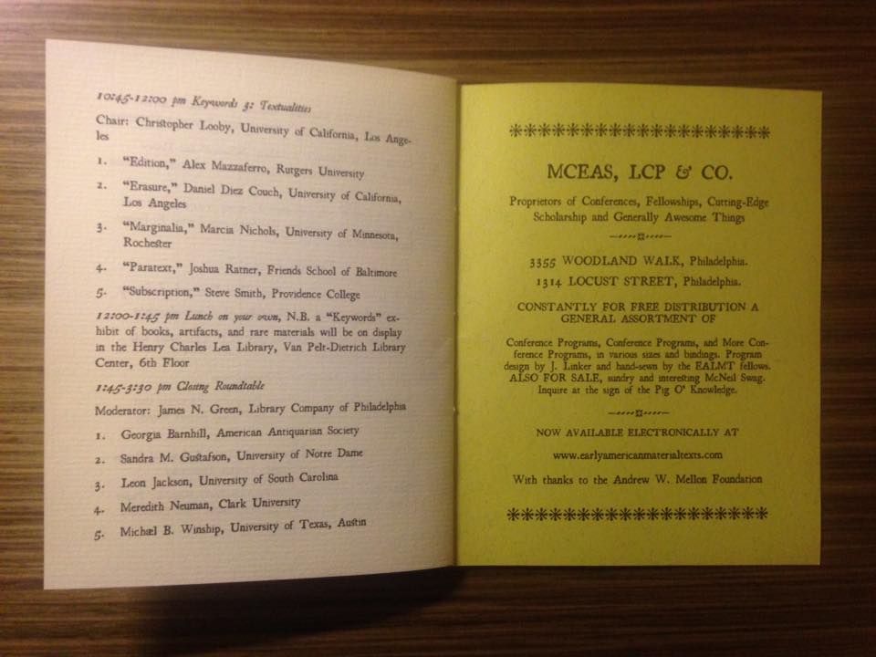
Finally, the conference program was an unexpected delight as a result of the material considerations that went into its design and execution. Measuring 4¼ by 5½ inches, it had the appearance of an eighteenth-century chapbook, complete with a simple binding hand-sewn by the Early American Literature and Material Texts fellows. The covers were printed on drab colored paper, not unlike the covers or wrappers that would have enclosed many eighteenth-century publications. The fonts, format, and illustrations replicated eighteenth-century printing and publishing practices. Advertisements and announcements were included on the interiors of the covers, just as they might have been for books or pamphlets printed in the eighteenth century. It was the most creative conference program I have encountered, but also extremely fitting for a conference about Early American Material Texts.