What was advertised in a colonial American newspaper 250 years ago today?

“JOHN MORTON, Has just received … a very neat Assortment of goods.”
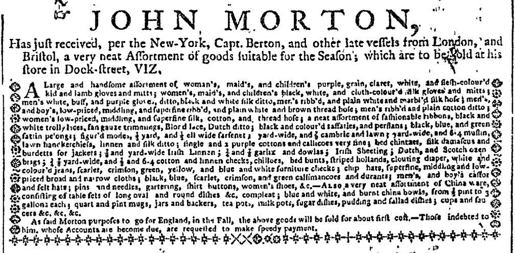
The layout of John Morton’s advertisement on the front page of the June 1, 1767, edition of the New-York Gazette would have attracted attention because it so significantly deviated from most other eighteenth-century advertisements. In his list-style advertisement, the text extended across two columns. In most cases, if a newspaper advertisement occupied space in two columns at all it was because of length, overflowing from one column into the next. That was not, however, necessary when it came to Morton’s advertisement. William Weyman, the printer of the New-York Gazette, or a compositor working in his printing shop made design decisions that not only yielded a unique advertisement for Morton but also produced a distinctive first page for the newspaper compared to the other three printed in New York and nearly two dozen more throughout the colonies.

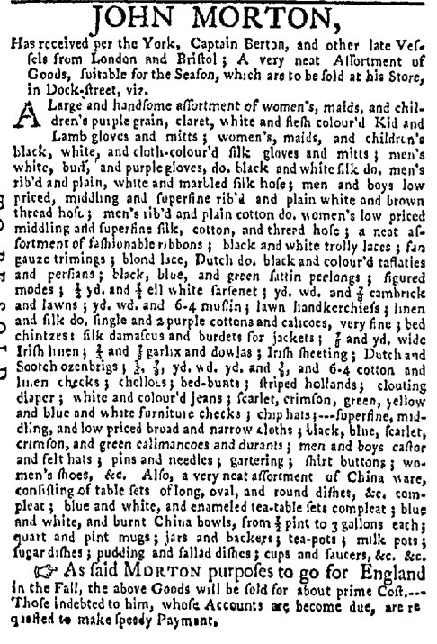
Why assert that the printer and compositor were responsible for the typographical elements of Morton’s advertisement rather than merely responding to requests made by a paying customer who generated the copy? The New-York Gazette was not the only newspaper that carried Morton’s notice during the first week of June. It also appeared in the New-York Mercury on the same day and again in the New-York Journal three days later. Although the content of the advertisement was consistent across the three publications, the layout differed significantly. In the Mercury, Morton’s notice took the standard form of most list-style advertisements, a dense paragraph. In the Journal, the compositor introduced more white space that made it easier to distinguish among the assortment of merchandise by creating two columns and listing a small number of items on each line. These differences were the most substantial, but the three advertisements also had variations in font size and the inclusion of printing ornaments. The Gazette, for example, included a decorative border on three sides, but was the only one that did not use a manicule to draw attention to Morton’s final plea for former customers “to make speedy payment.”
Although advertisers wrote their commercial notices themselves, printers and compositors exercised primary responsibility for layout and other typographical elements of most eighteenth-century advertisements. There were occasional exceptions. Jolley Allen and William Palfrey, for instance, both negotiated for specific design aspects of their advertisements, but generally innovative visual effects originated in the imaginations of members of the printing trade who then experimented with their execution.


