What was advertised in a colonial American newspaper 250 years ago this week?
New-York Gazette and Weekly Mercury (August 13, 1770).
“Coopers Bung borers, adzes, howells, compasses, crozes, bitts and rivets.”
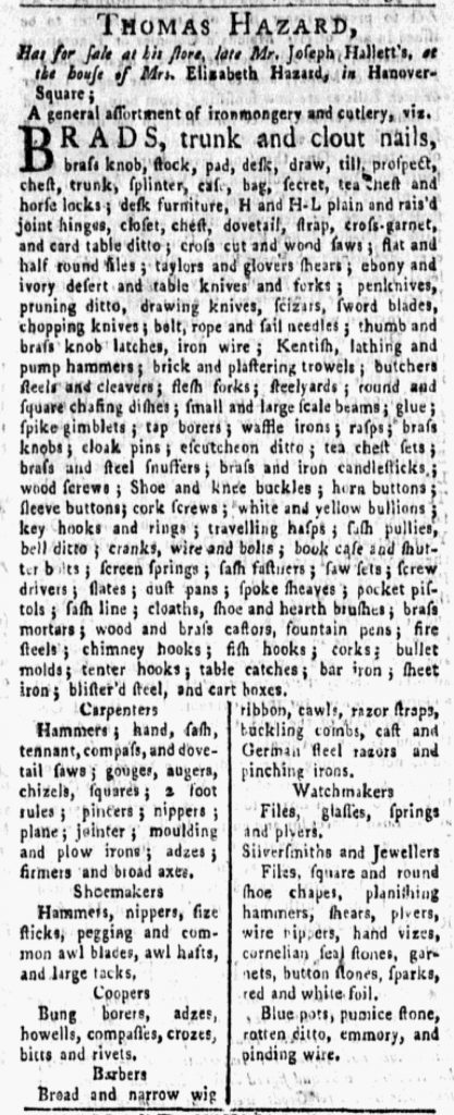
In the 1770s, when merchants and shopkeepers enumerated the “general assortment” of goods they offered for sale, their advertisements usually followed one of two formats. Most listed their merchandise in a dense paragraph of text that extended anywhere from a few lines to half a column or more. As an alternative, others created more white space and made their advertisements easier to read by including only one item per line or organizing their wares into columns. Adopting such methods meant that advertisers could name fewer items in the same amount of space as their competitors who chose paragraphs of text with no white space.
Both sorts of advertisements regularly appeared in the New-York Gazette and Weekly Mercury, but occasionally advertisers (perhaps in consultation with printers and compositors) added variations and innovations. Such was the case with Thomas Hazard’s advertisement for ironmongery and cutlery in the August 13, 1770, edition. Hazard began with a dense paragraph that included “H and H-L plain and rais’d joint hinges,” “brass and iron candlesticks,” and “sword blades.” In addition, he divided a portion of his advertisement into two columns. Within those columns, he resorted to short paragraphs of text rather than listing only one or two items per line, but those paragraphs were brief and likely easier for eighteenth-century consumers to navigate than the dense paragraph of text that constituted the bulk of the advertisement. Furthermore, Hazard inserted headers for each of those shorter paragraphs: “Carpenters,” “Shoemakers,” “Coopers,” “Barbers,” “Watchmakers,” and “Silversmiths and Jewellers.” Each paragraph listed tools used in a particular trade. In this manner, Hazard targeted specific consumers and aided artisans in finding the items of greatest interest to them.
Prior to the American Revolution, merchants and shopkeepers published undifferentiated lists of goods in their advertisements, but occasionally some attempted to impose more order and make their notices easier for prospective customers to navigate. Thomas Hazard did so by grouping together tools used by various sorts of artisans, setting them apart in columns, and using headers to draw attention to them. Carpenters or watchmakers who might have overlooked items when skimming dense paragraphs of text instead had a beacon that called their attention to the tolls of their trades.
What was advertised in a colonial American newspaper 250 years ago today?
New-York Journal (May 10, 1770).
“Pencill’d China,” “Burnt Image China,” “Blue and white China.”
Like many other colonial shopkeepers, George Ball published an extensive list of his merchandise in an advertisement he placed in the May 10, 1770, edition of the New-York Journal. Most advertisers who resorted to similar lists grouped all of their wares together into dense paragraphs of text. A smaller number, like Ball, used graphic design to aid prospective customers in differentiating among their goods as they perused their advertisements. Ball formatted his advertisement in columns with only one, two, or three items per line, just as Abeel and Byvanck, John Keating, and Jarvis Roebuck did elsewhere in the same issue. Ball, however, instituted a further refinement that distinguished his notice from the others. He cataloged his merchandise and inserted headers for the benefit of consumers.
Ball offered several categories of merchandise: “Pencill’d China,” “Burnt Image China,” “Blue and white China,” “Brown China,” “White China,” “White Stone Ware,” “Delph Ware,” “Plain Glass Ware,” “Flower’d Glass,” “Iron Ware from England,” and “Queen Pattern Lamps.” These headers appeared in italics and centered within their respective columns to set them apart from the rest of the list. The goods that followed them elaborated on what Ball had in stock, allowing prospective customers to more easily locate items of interest or simply assess the range of goods Ball offered for sale. His method could have benefited from further refinement. The items that followed “Queen Pattern Lamps” were actually a miscellany that did not belong in any of the other categories. Ball might have opted for “Other Goods” as a header instead. Still, his attempt to catalog his merchandise at all constituted an innovation over the methods of other advertisers.
In most instances, eighteenth-century advertisers submitted copy and compositors determined the layout. However, advertisements broken into columns suggest some level of consultation between advertisers and compositors, at the very least a request or simple instructions from one to the other. Ball’s advertisement likely required an even greater degree of collaboration between advertiser and compositor.
What was advertised in a colonial American newspaper 250 years ago today?
New-York Journal (August 10, 1769).
“The following assortment of GOODS.”
With the exception of the “POETS CORNER” in the upper left and the colophon running across the bottom, advertisements of various lengths comprised the final page of the August 10, 1769, edition of the New-York Journal. Most consisted of dense blocks of text with headlines in a larger font, but two likely attracted attention because their format differed from the others. Jonathan Hampton’s advertisement included a familiar woodcut that depicted a Windsor chair. By that time, Hampton had included the image in his advertising so often that the woodcut had been damaged through such frequent use. The Windsor chair was missing an arm. Still, Hampton continued to garner a return on the investment he made in commissioning the woodcut, apparently believing that a visual image, even a slightly damaged one, enhanced the visibility of his advertisement.
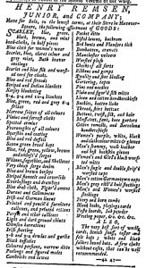
Henry Remsen, Junior, and Company’s advertisement, on the other hand, consisted entirely of text, but its layout distinguished it from other advertisements, including those by competitors who also listed scores of goods available at their shops. Remsen and Company enumerated a variety of textiles and accessories, from “Blue and red strouds” and “Striped flannels and coverlids” to “Ribbons and gimps” and “Ivory and horn combs.” They divided their advertisement into two columns with a line down the center separating them. Only one or two items appeared on each line. Remsen and Company’s advertisement included far more white space than others that presented litanies of goods, making it easier to read and locate or notice merchandise of interest. The advertisement that ran immediately below it, for instance, also provided an extensive list of inventory at a shop in New York, but it followed the most common layout for advertisements of that sort. The goods appeared one after another in a dense paragraph. This format saved space (and thus reduced the cost of advertising) and may have been easier for the compositor to set the type, but it did not make the same impression on the page as the dual columns in Remsen and Company’s advertisement. Although compositors usually made decisions about typography and layout, Remsen and Company likely submitted specific instructions, possibly even a manuscript example, for the format they desired. While not every advertiser considered the power of graphic design in the eighteenth century, some, like Jonathan Hampton and Remsen and Company, did take how and advertisement looked in addition to what it said into account.
What was advertised in a colonial American newspaper 250 years ago today?
Georgia Gazette (May 10, 1769).
“STRAYED off the Common at Savannah, A SORREL HORSE.”
In the late 1760s the Georgia Gazette did not have a standard format for the placement of advertisements in relation to other content. The publication followed a general rule that filling the final page with paid notices, but any additional advertisements could appear just about anywhere else in a standard four-page issue.
Consider the May 10, 1769, edition of the Georgia Gazette. Each page had a different configuration of news and advertising. No paid notices ran on the front page, just the masthead, news, and editorials. As usual, advertisements filled the last page, except for the colophon running across the bottom. It also served as an advertisement of sorts, advising readers of the services available at the printing office: “Hand-Bills, Advertisements, &c. printed at the shortest Notice.” Advertising also filled most of the third page. The Georgia Gazette had two columns per page. An editorial extended for half of the first column on the third page; advertisements accounted for the remainder of the column as well as the entire second column. The second page featured a more even division, with news in the column on the left and advertisements in the column on the right, along with the shipping news positioned at the bottom of that column.
One additional advertisement stood out from the rest of the content on the second page. It ran in the margin across the bottom, spanning both columns. In it, James Read described a horse that had strayed “off the Common at Savannah” and pledged that anyone who found the horse and returned it to him “shall be handsomely rewarded.” The format and placement indicates that Read likely submitted his advertisement to the printing office too late to have it integrated among the other content. Anxious for the return of his horse, Read may have negotiated for it to appear in the issue in any way possible; alternately, the printer may have devised this means of inserting it as a service. Either way, Read’s advertisement further demonstrates the Georgia Gazette’s flexible approach to positioning advertisements within its pages. At a glance, eighteenth-century newspapers may appear to be dense amalgamations of text, but the variations in the placement of news, advertising, and other content suggests that printers and compositors exercised creativity as they significantly altered the layout from issue to issue.
Who was the subject of an advertisement in a colonial American newspaper 250 years ago today?
Georgia Gazette (March 29, 1769).
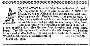
“RUN AWAY … A NEGRO FELLOW, named ABRAM.”
This advertisement contains the description of a runaway slave named Abram, including what he was wearing and distinguishing marks, and a reward for returning him. In running away, Abram participated in an his own act of resistance during a time of growing tensions between the British and the colonists. Unsurprisingly, many slaves were always looking for ways to become free. Noticing this sentiment, the governor of Virginia issued Lord Dunmore’s Proclamation on November 7, 1775. This proclamation offered freedom to slaves that belonged to people that were supporting or taking part in the war against the British, so long as they took up arms with the British against their masters. Many slaves took up this offer; according to Maya Jasanoff in Liberty’s Exiles: American Loyalists in the Revolutionary World, approximately 20,000 slaves joined up with the British. As for the Americans, many people who owned slaves had reservations against arming those that they had held in bondage. Jasanoff says only around 5,000 slaves fought for the colonists.[1] According to Ray Raphael, “Some who fought for the patriots were sent back into slavery at war’s end. … Patriot leaders in the South offered enslaved people as bounties to entice white recruits.”[2] It is not hard to see that slaves may have thought that their best shot at freedom would have been with the British instead of the colonists, who were not above using them as currency to entice more people to join their cause.
**********
ADDITIONAL COMMENTARY: Carl Robert Keyes
At a glance, the pages of the Georgia Gazette may appear rather static to modern eyes. Like most other colonial printers, James Johnston filled his newspaper with dense text and very few visual images. Yet careful attention to the issues published in early 1769 reveals variations in organization and typography that suggest Johnston and others who worked in his printing office experimented with how they presented the news and other content in the Georgia Gazette.
The March 29, 1769, edition, for instance, included another advertisement with the advertiser’s name in large gothic font, replicating an innovative visual element adopted by other advertisers in recent weeks. This time, John Johnston called on prospective customers to purchase bread.
Johnston also distributed advertisements throughout the entire issue, an organizational strategy repeated from other recent issues. Paid notices, along with the usual colophon, filled both columns of the last page. Every other page featured at least one advertisement. Two appeared at the bottom of the second column on the first page. Another, Johnston’s advertisement, ran at the top of the second column on the second page. Perhaps those on the first page served, in part, as filler to complete the column. Even so, Johnston made a choice not to continue with news coverage. The first item on the next page, news from Corsica, would have fit in the remaining space on the first page if Johnston had wished to continue with news rather than switch to advertising. Similarly, it would be difficult to argue that Johnston’s advertisement on the second page appeared there solely to neatly complete a column. Its position at the top of the column forced Johnston to continue the last item on the page, a moral tale, on the following page.
The advertisement about Abram making his escape ran in the first column on the third page, immediately following the conclusion of the moral tale. News from Savannah, including the usual lists from the customs house, appeared below it. Advertisements completed the column and the rest of the page. On the third page, Johnston switched between paid notices and other content multiple times rather than grouping all of the advertisements together. Readers holding open the newspaper to peruse the second and third pages encountered a hodgepodge of content, with advertisements in three of the four columns.
Some colonial printers chose to reserve advertising for the final pages of their newspapers, inserting paid notices only after all other content appeared. That was often Johnston’s strategy when he had only enough advertising to fill the last page. On occasions that he had more than would fit on the final page, however, he experimented with interspersing advertisements among news and other content throughout the rest of the issue. This strategy likely increased the chances readers noticed some of those advertisements since they were not consigned to space reserved solely for paid notices. Anyone seeking just the news had to make more effort to distinguish among the various types of content in the Georgia Gazette when Johnston spread out the advertisements.
**********
[1] Maya Jasanoff, Liberty’s Exiles: American Loyalists in the Revolutionary World (New York: Penguin, 2011), 361.
[2] Ray Raphael, Founding Myths: Stories that Hide Our Patriotic Past, rev. ed. (New York: New Press, 2014), 216.
What was advertised in a colonial American newspaper 250 years ago today?
Georgia Gazette (February 15, 1769).
“Proposed to be published.”
As usual, advertising comprised the final page of the February 15, 1769, edition of the Georgia Gazette. Yet the layout of the rest of that issue differed significantly from the standard order of news followed by advertising. Instead, advertisements appeared on every page, distributed throughout the issue alongside news items.
For instance, the front page was divided evenly between news and advertising. News filled the column on the left and three advertisements filled the column on the right. The first of those advertisements, a subscription notice for “THE ROYAL MERCHANT: A WEDDING SERMON” by Johannes Scriblerius, however, appears to have been a satire rather than a legitimate advertisement. Signed by “The EDITOR,” who otherwise remained unnamed, it advised “Those who chuse to have copies of the Royal Merchant are desired to send in their names to the printer of this paper as soon as possible.” It did not otherwise provide any information concerning a plan of publication commonly incorporated into most subscription notices. Whether inserted by the printer or another colonist, this playful piece masquerading as an advertisement served as a bridge between news and paid notices.
Advertising continued immediately on the second page, filling the entire column on the left and overflowing into the column on the right. News from Savannah, including the shipping news from the custom house, often the final item inserted before advertisements, filled most of the remainder of the column, though two short advertisements did appear at the bottom. More advertisements ran at the top of the column on the left on the third page, but filled only a portion of it. News items reprinted from newspapers from Boston and London accounted for the rest of the content on the page. Advertising filled the final page, not unlike most issues of the Georgia Gazette.
Not including the satirical “advertisement” on the front page, advertising accounted for more than half of the content of the February 15 edition, significantly more than usual for the Georgia Gazette. Perhaps the abundance of paid notices prompted James Johnston, the printer, to think creatively about the layout for the issue, though he would have certainly noticed that other colonial newspapers that he received from counterparts in other cities experimented with the placement of paid notices in relation to other content. Those that did so tended to have more advertising than would fit on the final page. Though they made exceptions on occasion, it appears that colonial printers adopted a general rule when it came to the layout of their newspapers. Reserve the final page for advertising and only distribute paid notices to other parts of an issue if they would not all fit on that last page.
What was advertised in a colonial American newspaper 250 years ago today?
New-York Gazette and Weekly Mercury (June 27, 1768).
“RUN-away from the subscriber at Hosack, near Albany, an indented Irish servant Man.”
The second and third pages (or the two center pages of a broadsheet folded in half to create the standard four-page issue) of the June 27, 1768, edition of the New-York Gazette and Weekly Mercury included more than just the usual three columns. The compositor created a very thin fourth column by rotating the type ninety degrees; this allowed for the insertion of three additional advertisements in the outside margins that otherwise would not have fit on the page. Two of those advertisements appeared on the second page. John Duncan and Thomas Peeles placed a notice calling on those indebted “to the estate of John Knox, of the town of Schenectady, and county of Albany” to settle accounts. Collin McDonald “of the manor of Livingston, and county of Albany” inserted a notice warning others against trusting his wife, Catherine. She had “eloped from his bed,” causing him to “forewarn all persons not to trust or harbour her on my account, as I will pay no debts contracted by her.” A single advertisement occupied the additional column on the third page. In it, John Macomb, “at Hosack, near Albany,” described James McKinzie, a runaway indentured servant. Given that all three of these advertisements came from Albany and none of them previously appeared in the New-York Gazette and Weekly Mercury, they likely all arrived at the same time via the same post carrier or messenger, after the type for the rest of the issue had been set but not before it went to press. The printer and compositor may have had a brief window of opportunity to work these advertisements into the June 27 issue rather than wait a week to publish them.
The placement of these advertisements was certainly out of the ordinary for the New-York Gazette and Weekly Mercury, but it was not altogether uncommon in newspapers published in the American colonies during the eighteenth century. Printers and compositors sometimes made space for short advertisements in the side margins or across the bottom of the page, but usually only when special circumstances required. This aspect of American newspaper production and format differs significantly from standard practices in Dutch newspapers in the 1760s, as I learned from during a panel on “Newspapers and Information Management in the Atlantic World” at the 24th annual conference sponsored by the Omohundro Institute of Early American History and Culture held earlier this month. In her paper on “Dutch Newspaper Coverage of the Berbice Slave Revolit, 1763,” Esther Baakman (Leiden University) presented images of the newspapers she consulted. In terms of graphic design, they featured two columns for news and a third column for advertising. The column for advertising was slightly narrower than the other two and rotated ninety degrees. What amounted to an occasional strategy for inserting additional advertisements in American newspapers was a design feature intended to aid readers in distinguishing among content in Dutch newspapers in the middle of the eighteenth century.
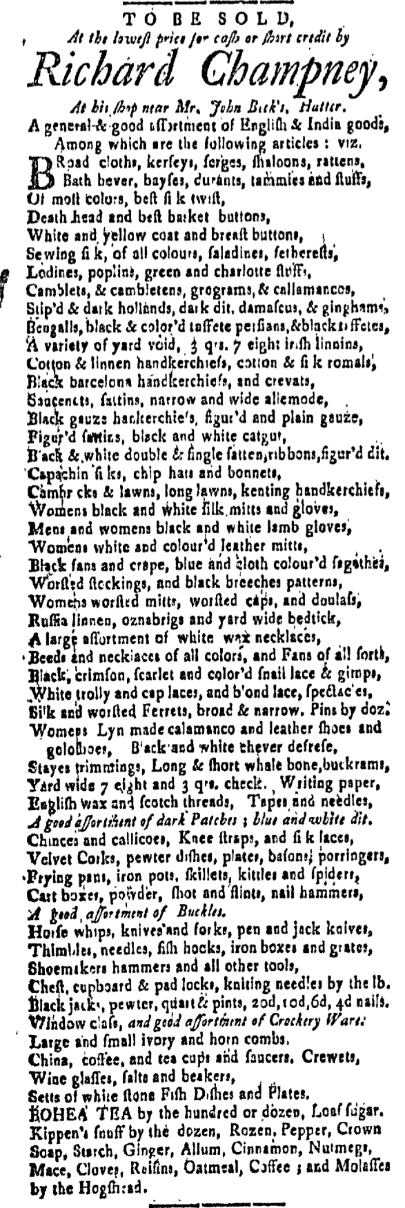
What was advertised in a colonial American newspaper 250 years ago today?
New-Hampshire Gazette (June 3, 1768).
“Mens and womens black and white lamb gloves.”
Thanks to unique typographical features, Richard Champney’s advertisement for “A general & good assortment of English & India goods” stood out among those published in the June 3, 1768, edition of the New-Hampshire Gazette. Like several of his competitors, Champney promoted his merchandise by listing dozens of items, prompting prospective customers to imagine the extensive variety he offered them, everything from “White and yellow coat and breast buttons” to “A large assortment of white wax necklaces” to “China, coffee, and tea cups and saucers.” Rather than publish his list in the form of a dense paragraph justified on both the left and right, Champney opted instead to name a limited number of items on each line and justify only the left margin. Especially given the length of his advertisement – more than half a column and twice as long as any other advertisement for consumer goods and services in the same issue – this format aided readers in distinguishing among his sweeping inventory, whether reading or skimming.
This layout may very well have been the work of the compositor rather than the result of a request by the advertiser, but other graphic design elements suggest that Champney at least consulted with those who produced the newspaper. For instance, the sparing use of italics called attention to a few items, including “A good assortment of dark Patches; blue and white dit[to]” and “A good assortment of Buckles.” One line appeared only partially in italics: “Window glass, and good assortment of Crockery Ware.” The compositor would have had no reason to randomly alter the format for those items; it seems more likely that Champney instructed that they receive some sort of special attention, not unlike “BOHEA TEA,” the only item that appeared in capitals. The white space that resulted from grouping like items together and proceeding to the next line without justifying the right margin increased the readability of the advertisement, making it more likely that prospective customers would notice the items that merited particular attention.
At a glance, Champney’s advertisement looked quite different than the other contents of the New-Hampshire Gazette, whether advertisements or news items. The format most resembled poetry, sometimes inserted in colonial newspapers as a transition between news selected by the editors and paid notices submitted by advertisers. Experimenting with the format may have drawn more eyes to the advertisement, prompting readers to scan it closely enough to determine that it was something other than the ode they anticipated. By the time they figured out it was not a poem, Champney had introduced them to some of the merchandise available at his shop.
What was advertised in a colonial American newspaper 250 years ago today?
Georgia Gazette (September 23, 1767).
“A LARGE ASSORTMENT OF GOODS.”
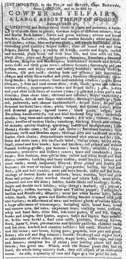
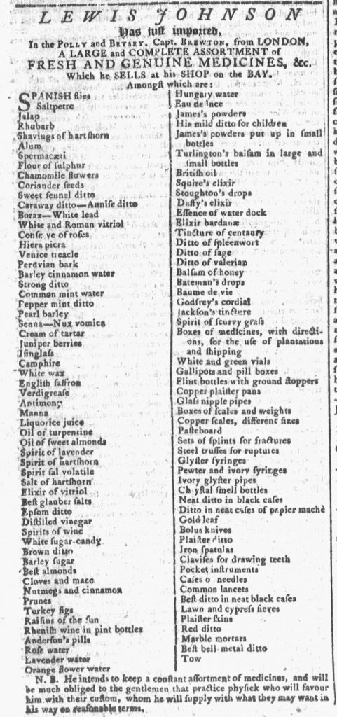
Lewis Johnson inserted an advertisement for his inventory of “A LARGE and COMPLETE ASSORTMENT of FRESH AND GENUINE MEDICINES” in the September 23, 1767, edition of the Georgia Gazette. The partnership of Cowper and Telfairs also placed an advertisement, informing potential customers of the “LARGE ASSORTMENT OF GOODS” they had imported from London. The notices, each listing an elaborate array of items, appeared side by side.
Although Lewis Johnson and Cowper and Telfairs each resorted to the common list-style advertisement to market their wares, the visual aspects of their notices distinguished them from each other. Cowper and Telfairs opted for a dense paragraph that extended two-thirds of the column, enumerating everything from “white, striped and ermine flannels” to “shirt buttons” to “broad and narrow axes” to “complete sets of china.” With some exceptions, they grouped their merchandise together by category (textiles, accouterments and accessories, hardware, and housewares). This made it somewhat easier for potential customers to locate specific items of interest (while also introducing them to others they may not have otherwise considered), even though the merchants did not include any sort of headers to indicate where one type of merchandise ended and another began. This dense list maximized the number of items Cowper and Telfairs presented to the public. While its format may have been somewhat overwhelming or difficult to read, it offered extensive choices to consumers.
Georgia Gazette (September 23, 1767).
Johnson’s advertisement, on the other hand, occupied the same amount of space on the page, but did not list nearly as many items. Instead, it divided a single column into two narrower columns, listing only one item per line. This left much more white space on the page, making it easier for readers to navigate through the merchandise. Like Cowper and Telfairs, Johnson introduced his list with the phrase “Amongst which are,” indicating that the advertisement did not include an exhaustive inventory. Both carried additional items at their shops. Given that he carried additional medicines, Johnson made a calculated decision to truncate his list in order to make it easier to read. Compared to the dense format of everything else on the page, the layout of his list likely drew the eyes of colonial readers, increasing the likelihood that they would take note of his advertisement.
Both list-style advertisements had advantages and shortcomings inherent in their appearance on the page. Although eighteenth-century advertisements lack the dynamic graphic design elements of modern marketing efforts, advertisers and printers did experiment with different layouts in their efforts to attract attention and incite demand among potential customers.
What was advertised in a colonial American newspaper 250 years ago today?
New-Hampshire Gazette (August 21, 1767).
“Choice London BOHEA TEA, to be sold by Henry Appleton, at £4 10s. Old Tenor by the Dozen.”
Henry Appleton advertised “Choice London BOHEA TEA” in the August 21, 1767, edition of the New-Hampshire Gazette. His was one of nearly two dozen paid notices that appeared in that issue, its format distinguishing it from the others. Appleton’s advertisement ran in a single line across the bottom of the third page, extending nearly the width of three columns. At a glance, it could have been mistaken for the colophon printed on the other side of the page.
Why did Appleton’s advertisement have such a unique layout? A few other advertisements were nearly as brief, yet they had been set as squares of text within the usual three-column format of the New-Hampshire Gazette. The brevity of Appleton’s notice alone did not justify its unusual layout.
Who made the decision to treat Appleton’s advertisement differently? Perhaps Appleton, wishing to draw special attention to it, made arrangements with Daniel and Robert Fowle, the printers, to deploy an innovative format. Perhaps the Fowles or someone working in their printing office opted to experiment with the appearance of advertising on the page.
Perhaps neither the advertiser nor the printers put that much consideration into Appleton’s notice. If it had been submitted late or somehow overlooked, running it in a single line across the bottom of the page may have been the result of practicality rather than an intentional effort to challenge the conventions of eighteenth-century advertising.
As far as potential customers were concerned, however, the origins likely would have been less important than the effects. Readers scanning the contents of the issue would have encountered Appleton’s advertisement three times instead of passing over it only once. Its unique format demanded at least one close reading to determine what kind of information it contained, whereas advertisements that conformed to the standard layout did not elicit the same curiosity merely from their appearance.
Even in a short advertisement, Henry Appleton incorporated appeals to price and quality, but the format of his advertisement – whether intentionally designed or not – made it much more likely that consumers would spot those appeals and consider purchasing his merchandise.