May 13

What was advertised in a colonial American newspaper 250 years ago this week?

Supplement to the Boston-Gazette (May 11, 1772).

“Oils…  Paints…  Varnishes… GUMS.”

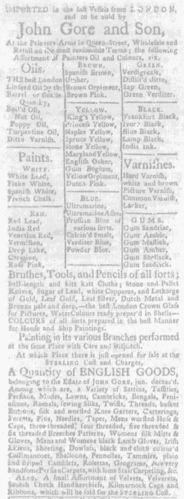
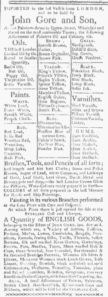
When it appeared in the Supplement to the Boston-Gazette on May 11, 1772, John Gore and Son’s advertisement for paint and supplies may have looked familiar to readers who regularly perused that newspaper.  After all, it ran two weeks earlier in the April 27 edition.  By the time the notice appeared in the Boston-Gazette a second time, it had also appeared in the Massachusetts Gazette and Boston Weekly News-Letter twice, first on April 23 and then on May 7.  The format made it memorable, an extensive list of oils, paints, varnishes, and gums arranged as a table.  That table had sections for various shades of whites, reds, browns, yellows, blues, greens, and blacks, suggesting the many choices available to customers.  No other advertisement in any of the newspapers published in Boston at the time incorporated that distinctive design.

It was not uncommon for advertisers to place notices in multiple newspapers in order to reach more consumers and increase their share of the market.  When they did so, they usually submitted copy to the printing offices and then compositors made decisions about the design of each advertisement when they set the type.  That meant that advertisements with identical copy had variations in line breaks, font sizes, italics, and capitalization from newspaper to newspaper, depending on the decisions made by compositors.  In some instances, advertisers made requests or included instructions.  For example, some merchants and shopkeepers preferred for their merchandise to appear in two columns with only one item on each line rather than in a dense block of text.  In such cases, compositors still introduced variations in graphic design, even when working with identical copy.

That did not happen with Gore and Son’s advertisement.  Instead, the same advertisement ran in both the Massachusetts Gazette and Boston Weekly News-Letter and the Boston-Gazette.  Workers in the two offices transferred type already set back and forth multiple times.  When the time the advertisement appeared in the Supplement to the Boston-Gazette, three transfers had taken place, first from Richard Draper’s printing office to the Benjamin Edes and John Gill’s printing office, then a return to Draper’s office, and once again to Edes and Gill’s office.  Early American printers frequently reprinted content from one newspaper to another.  That was standard practice for disseminating news, but it did not involve the coordination and cooperation required for sharing type.  Gore and Son’s advertisement suggests even greater collaboration among printers in Boston, a relationship that merits further investigation to understand how they ran their businesses.

May 7

What was advertised in a colonial American newspaper 250 years ago today?

Massachusetts Gazette and Boston Weekly News-Letter (May 7, 1772.)

“Oils…  Paints… Varnishes… GUMS.”

John Gore and Son’s advertisement for an “Assortment of Painters Oil and Colours” available “At the Painters-Arms in Queen-Street” ran once again in the May 7, 1772, edition of the Massachusetts Gazette and Boston Weekly News-Letter.  It featured a table of “Oils… Paints… Varnishes… [and] GUMS” of various colors, making it distinct from other advertisements and easy to recognize.  Among the various paints, the table offered choices that ranged from “Princess Yellow, Naples Yellow, [and] Spruce Yellow” to “India Red, Venetian Red, [and] Vermilion.”  The format both delineated the many choices available to consumers and challenged them to imagine the possibilities.

Readers of the Massachusetts Gazette and Boston Weekly Mercury had seen this advertisement before.  It ran two weeks earlier in the April 23 edition.  Unlike other advertisements that ran for consecutive weeks, however, Gore and Son’s advertisement did not appear in the subsequent issue on April 30.  Instead, it ran in the Boston-Gazette on April 27.  That was not merely a case of an advertiser submitting the same copy to two newspapers.  Careful examination reveals that the notices in the Massachusetts Gazette and Boston Weekly News-Letter and the Boston-Gazette featured identical format, indicating that someone transferred the type from one printing office to another.  That made publishing Gore and Son’s advertisement a collaborative effort among competitors.  It was not the only paid notice that originated in the Massachusetts Gazette and Boston Weekly Mercury and then ran in identical format in another newspaper in the spring of 1772.  The type for Gore and Son’s advertisement eventually found its way back to Richard Draper’s printing office, where the compositor added a final line about “A few Casks of NEW RICE” but otherwise did not make any adjustments to the format.

This raised all kinds of questions about the business of printing in early America.  What kinds of bookkeeping practices did this entail?  How did Draper and other printers keep track of which type belonged to them or to competitors?  How did they go about charging advertisers for notices that ran in multiple newspapers?  Did advertisers receive a discount from those printing offices that did not have to set the type?  Or did the work involved in transferring type from one office to another balance the labor required to set type?  Printers in Boston sometimes collaborated in publishing almanacs and pamphlets.  To what extent did they collaborate in publishing the advertisements that generated significant revenue for their newspapers?

April 29

What was advertised in a colonial American newspaper 250 years ago this week?

Boston-Gazette (April 27, 1772).

“Oils … Paints … Varnishes … GUMS.”

John Gore and Son’s advertisement in the April 27, 1772, edition of the Boston-Gazette raises all sorts of interesting questions.  An identical advertisement appeared in the April 23 edition of the Massachusetts Gazette and Boston Weekly News-Letter.  This does not seem to have been just a case of an advertiser inserting the same notice in multiple newspapers.  That was quite common in the 1770s, especially in Boston.  Yet this was not simply an instance of an advertiser writing out the copy more than once and then submitting it to more than one printing office.  Yes, the copy was identical … but so was the format and every aspect of typography, from the design of the table listing different kinds of paints to the line breaks to font sizes to capitalization of certain words.  Rather than a compositor copying an advertisement as it appeared in another newspaper, this looks like Richard Draper’s printing office outright transferred type already set for the Massachusetts Gazette and Boston Weekly News-Letter to Benjamin Edes and John Gill’s printing office for publication in the Boston-Gazette.

That was not the only instance of such a transfer in the April 27 edition of the Boston-Gazette.  John Barrett and Sons ran an extensive advertisement that previously appeared in Draper’s newspaper on April 23.  So did Joseph Peirce.  To further complicate matters, both of these advertisements also ran in the April 27 edition of the Boston Evening-Post. Once again, this does not seem to have been merely an instance of a compositor consulting an advertisement in another newspaper when setting type.  Instead, the type from one printing office found its way to another printing office.

The placement of these advertisements on the page in each newspaper contributes to some confusion about the sequence of events.  Take into consideration that a standard issue consisted of four pages created by printing two pages on each side of a broadsheet and then folding it in half.  Printers often printed the front and back pages first, filling them with the masthead, colophon, and advertisements.  They saved the second and third pages for the latest news.  Peirce’s advertisement ran on the fourth page of the April 27 edition of the Boston-Gazette, suggesting that the compositor received the type from the April 23 edition of the Massachusetts Gazette and Boston Weekly Mercury fairly quickly.  That also allowed sufficient time to pass along the type to the Boston-Evening Post for inclusion in a two-page supplement that consisted entirely of advertising.  That timing makes sense.

The timing for inserting Barrett and Sons’ advertisement in each newspaper, however, does not seem as clear.  It ran on the first page of the April 27 edition of the Boston-Gazette, printed at the same time that Peirce’s advertisement was printed on the fourth page.  It did not, however, run in the supplement to the Boston Evening-Post or even on the second or third pages among the last items inserted in the standard issue.  Instead, it appeared on the fourth page, presumably making it one of the first items printed for that issue.  The compositor did eliminate the final eight lines listing several imported goods in order to make the advertisement fit among the other content on the page, but did not make other alterations.  That someone transferred the type from one printing office to another so quickly for it to appear in the Boston-Gazette and the Boston Evening-Post on the same day suggests a very efficient operation.

This raises questions about the organization and collaboration between printing offices.  Who assumed the responsibility for transferring the type for these advertisements from one printing office to another?  Did they make sure that the type was returned to its original printing office?  Did any of the printing offices adjust the prices they charged for running these advertisements based on whether they invested time and labor in setting type?  How extensive were these practices of transferring type from one printing office to another?  These are all questions that merit further investigation.

Left: Massachusetts Gazette and Boston Weekly News-Letter (April 23, 1772). Right: Boston-Gazette (April 27, 1772).

**********

Left: Massachusetts Gazette and Boston Weekly News-Letter (April 23, 1772). Center: Boston-Gazette (April 27, 1772). Right: Boston Evening-Post (April 27, 1772).

April 26

What was advertised in a colonial American newspaper 250 years ago this week?

Massachusetts Gazette and Boston Weekly News-Letter (April 23, 1772).

“Oils .. Paints … Varnishes … GUMS.”

John Gore and Son included a table listing the various colors available at their shop “At the Painters-Arms” in Queen Street in Boston when they placed an advertisement in the April 23, 1772, edition of the Massachusetts Gazette and Boston Weekly News-Letter.  They clustered other goods together in dense paragraphs, including “Brushes, Tools, and Pencils of all sorts” and “Stone and Pallet Knives,” but used the table to demonstrate the range of choices and guide prospective customers in selecting the ones that most interested them.

Gore and Son divided the table among “Oils,” “Paints,” “Varnishes,” and “GUMS.”  Each category listed half a dozen items, except for “Paints.”  Instead, Gore and Son further subdivided the table to include sections for “WHITE,” “RED,” “BROWN,” “YELLOW,” “BLUE,” “GREEN,” and “BLACK.”  Each of those sections listed several options.  Rather than settle for blue, customers could choose from among “Ultramarine, Ultramarine Ashes, Prussian Blue of various sorts, Calcin’d Smalt, Verditer, [and] Powder Blue.”  Similarly, the varieties of yellow included “King’s Yellow, Princess Yellow, Naples Yellow, Spruce Yellow, Stone Yellow, Maryland Yellow, English Oaker, Gum Bogium, Yellow Orpiment, [and] Dutch Pink.”  To produce the table of paints and colors, the compositor created three columns and incorporated horizontal and vertical lines to separate each category from the others.

This method of displaying the extensive choices to consumers anticipated the racks of cards on display in hardware and home improvement stores today.  Gore and Son did not merely tell prospective customers that they stocked “COLOURS of all sorts” but instead encouraged them to imagine the different shades and contemplate which they preferred.  They likely hoped that some readers would visit their shop to compare the colors after seeing the many options listed in the table in the newspaper advertisement.  Gore and Son relied on text without images when marketing their paints, yet they still attempted to leverage graphic design and visual effects to make sales.  They opted for typography that simultaneously highlighted choices available to customers and distinguished their advertisement from others.