
What was advertised in a colonial American newspaper 250 years ago this week?
“Oils .. Paints … Varnishes … GUMS.”
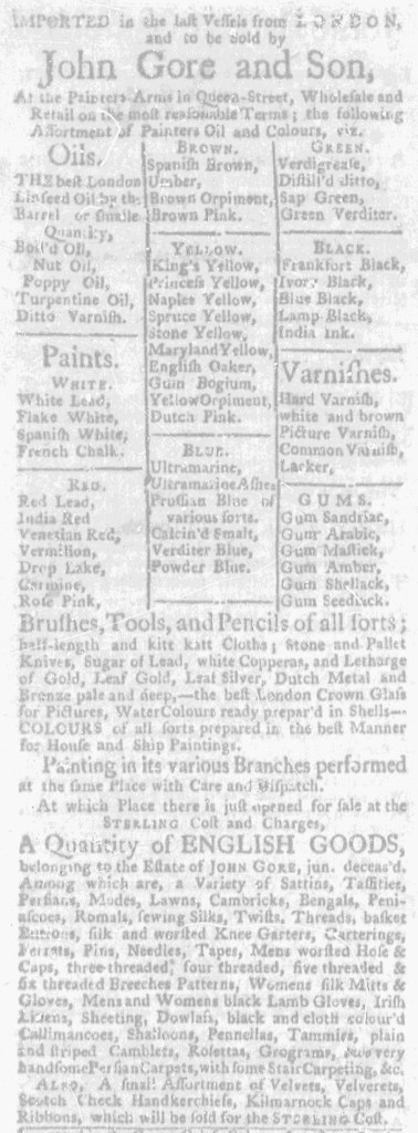
John Gore and Son included a table listing the various colors available at their shop “At the Painters-Arms” in Queen Street in Boston when they placed an advertisement in the April 23, 1772, edition of the Massachusetts Gazette and Boston Weekly News-Letter. They clustered other goods together in dense paragraphs, including “Brushes, Tools, and Pencils of all sorts” and “Stone and Pallet Knives,” but used the table to demonstrate the range of choices and guide prospective customers in selecting the ones that most interested them.
Gore and Son divided the table among “Oils,” “Paints,” “Varnishes,” and “GUMS.” Each category listed half a dozen items, except for “Paints.” Instead, Gore and Son further subdivided the table to include sections for “WHITE,” “RED,” “BROWN,” “YELLOW,” “BLUE,” “GREEN,” and “BLACK.” Each of those sections listed several options. Rather than settle for blue, customers could choose from among “Ultramarine, Ultramarine Ashes, Prussian Blue of various sorts, Calcin’d Smalt, Verditer, [and] Powder Blue.” Similarly, the varieties of yellow included “King’s Yellow, Princess Yellow, Naples Yellow, Spruce Yellow, Stone Yellow, Maryland Yellow, English Oaker, Gum Bogium, Yellow Orpiment, [and] Dutch Pink.” To produce the table of paints and colors, the compositor created three columns and incorporated horizontal and vertical lines to separate each category from the others.
This method of displaying the extensive choices to consumers anticipated the racks of cards on display in hardware and home improvement stores today. Gore and Son did not merely tell prospective customers that they stocked “COLOURS of all sorts” but instead encouraged them to imagine the different shades and contemplate which they preferred. They likely hoped that some readers would visit their shop to compare the colors after seeing the many options listed in the table in the newspaper advertisement. Gore and Son relied on text without images when marketing their paints, yet they still attempted to leverage graphic design and visual effects to make sales. They opted for typography that simultaneously highlighted choices available to customers and distinguished their advertisement from others.
