
What was advertised in a colonial American newspaper 250 years ago today?
“The following assortment of GOODS.”
With the exception of the “POETS CORNER” in the upper left and the colophon running across the bottom, advertisements of various lengths comprised the final page of the August 10, 1769, edition of the New-York Journal. Most consisted of dense blocks of text with headlines in a larger font, but two likely attracted attention because their format differed from the others. Jonathan Hampton’s advertisement included a familiar woodcut that depicted a Windsor chair. By that time, Hampton had included the image in his advertising so often that the woodcut had been damaged through such frequent use. The Windsor chair was missing an arm. Still, Hampton continued to garner a return on the investment he made in commissioning the woodcut, apparently believing that a visual image, even a slightly damaged one, enhanced the visibility of his advertisement.
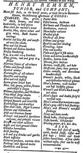
Henry Remsen, Junior, and Company’s advertisement, on the other hand, consisted entirely of text, but its layout distinguished it from other advertisements, including those by competitors who also listed scores of goods available at their shops. Remsen and Company enumerated a variety of textiles and accessories, from “Blue and red strouds” and “Striped flannels and coverlids” to “Ribbons and gimps” and “Ivory and horn combs.” They divided their advertisement into two columns with a line down the center separating them. Only one or two items appeared on each line. Remsen and Company’s advertisement included far more white space than others that presented litanies of goods, making it easier to read and locate or notice merchandise of interest. The advertisement that ran immediately below it, for instance, also provided an extensive list of inventory at a shop in New York, but it followed the most common layout for advertisements of that sort. The goods appeared one after another in a dense paragraph. This format saved space (and thus reduced the cost of advertising) and may have been easier for the compositor to set the type, but it did not make the same impression on the page as the dual columns in Remsen and Company’s advertisement. Although compositors usually made decisions about typography and layout, Remsen and Company likely submitted specific instructions, possibly even a manuscript example, for the format they desired. While not every advertiser considered the power of graphic design in the eighteenth century, some, like Jonathan Hampton and Remsen and Company, did take how and advertisement looked in addition to what it said into account.