February 14

What was advertised in a colonial American newspaper 250 years ago this week?

New-York Journal (February 11, 1773).

“And many more articles, too tedious to insert.”

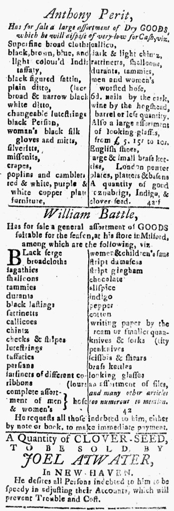
William Wikoff sold a variety of imported goods at his store in Hanover Square in New York in the early 1770s.  In an advertisement in the February 11, 1773, edition of the New-York Journal, for instance, he informed consumers that he stocked “a very handsome Assortment of Dry Goods, suitable for the Season,” and then offered a short catalog of some of those items to demonstrate the array of choices.  Wikoff listed a variety of textiles, including a “beautiful assortment of callicoes and cottons,” as well as “Mens and womens white and beaver gloves of the best kind” and “Childrens yellow and red leather shoes.”  Beyond fabrics and garments, Wikoff also had “Taylors thimbles,” “spelling books,” “knives and forks,” and “Bed furniture.”

To help readers navigate his advertisement, Wikoff opted for two columns with two or three items on each line.  That made it easier to read than advertisements that amalgamated everything together into a dense paragraph of text.  The merchant apparently considered that format effective, having used it on another occasion.  He also incorporated another element from his previous advertisements, asserting that that the list of merchandise did not cover everything available at his shop.  Wikoff confided that he carried “many more articles, too tedious to insert,” echoing his assertion in another advertisement that he sold “many other articles, too tedious to mention.”  Prospective customers, he suggested, would have a much more enjoyable experience browsing at his store than reading through a lengthy catalog in the newspaper.

That strategy allowed him to entice prospective customers who were curious about what else they might encounter at his store.  At the same time, Wikoff limited his advertising expenses.  He could have published an even longer list, but that would have cost more.  He likely aimed for what he considered the right balance between showcasing a good portion of the selection at his store and how much he was willing to spend on the advertisement.  In doing so, he offered enough details to capture readers’ attention and demonstrated that they were likely to find an even greater variety when they shopped at his store.

November 3

What was advertised in a colonial American newspaper 250 years ago today?

South-Carolina Gazette and Country Journal (November 3, 1772).

“A compleat ASSORTMENT of fashionable GOODS.”

Below the masthead, the entire front page of the November 3, 1772, edition of the South-Carolina Gazette and Country Journal consisted entirely of advertisements.  The one placed by William Stukes dominated the page, due in large part to its size and unusual format.  That newspaper ran three columns per page.  Stukes’s advertisement extended across two columns.  This was not a case of a lengthy advertisement that overflowed from one column into another.  Instead, it had been designed to take up space in more than one column.  The notice ran at the top of the first two columns, making it the first item in that issue.  That enhanced its visibility, though readers could hardly have missed an advertisement that occupied about half the space on the page.

The notice opened with a standard headline and introduction, similar to those in other advertisements for consumer goods.  The advertiser’s name in capital letters, “WILLIAM STUKES,” served as the headline.  The introduction stated that he “ACQUAINTS hid Customers and Friends, that he has removed into Broad-Street … and is now opening a complete ASSORTMENT of fashionable GOODS, imported in the last Ships from LONDON.”  In addition, Stukes declared that he would sell his wares “on the most reasonable Terms, at the usual CREDIT, and extraordinary cheap for CASH.”  He used formulaic language even as the format differentiated his advertisement from others on the same page and throughout the rest of the issue.

While the headline and introduction ran across two columns, Stukes’s extensive list of merchandise ran in three narrow columns.  Other advertisers grouped goods together in dense paragraphs.  Stukes made it easier for prospective customers to skim his advertisement and spot items of interest by giving each item its own line.  That resulted in significantly more white space within his advertisement than in the news and other paid notices.  For instance, “Silk gauze handkerchiefs” appeared on their own line without other items crowding them.  That even allowed space for readers to make notations, if they wished.

Stukes deployed popular marketing strategies and incorporated formulaic language into his advertisement, depending on its size and unique format to draw attention to the low prices and range of choices he offered to consumers.  Even though this newspaper notice consisted entirely of text, Stukes effectively used graphic design to distinguish it from advertisements placed by his competitors.

November 17

What was advertised in a colonial American newspaper 250 years ago this week?

New-York Journal (November 14, 1771).

A large and neat assortment of Dry Goods.”

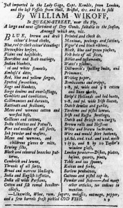
William Wikoff advertised a “large a neat assortment of Dry Goods, suitable to the season” in the November 14, 1771, edition of the New-York Journal.  He attempted to entice prospective customers to his shop by demonstrating the range of choices he made available to them, listing everything from “Devonshire kerseys” to “Mens and womens, and childrens gloves & mits” to “Wire and mould shirt buttons” to “Table and tea spoons.”  His inventory appeared in two columns with one or two items per line, arranged in two columns, to make it easier to peruse.  It looked quite different than most of the advertisements for imported consumer goods that ran in the Providence Gazette the same week.  Several advertisers in that town declared that they stocked too much merchandise “to be particularly mentioned in an Advertisement,” deploying a different strategy for invoking choice as a reason to visit their stores.

Even though he concluded his list by claiming that he has “many other articles, too tedious to mention,” Wikoff decided on a more common means of making an appeal about consumer choice in his advertisement, one that many of his competitors used in their advertisements in the same issue of the New-York Journal.  On the same page as his notice, John Morton, John J. Roosevelt, and George Webster all ran advertisements that listed dozens of items arrayed in two columns.  Henry Remsen and Company and Abeel and Byvanck also listed their wares, though they did not resort to columns but instead published dense paragraphs that required even more active reading on the part of prospective customers.  Elsewhere, John Amiel, Hallett and Hazard, Robert Needham, Thomas Pearsall, Daniel Phoenix, Robert Sinclair, Samuel Tuder, and Kelly, Lott, and Company all inserted lists of goods arranged as columns, while William Neilson and Henry Wilmot opted for paragraphs that took up less space (and cost less since advertisers paid by the amount of space rather than the number of word).  Gerardus Duyckinck placed two advertisements for his “UNIVERSAL STORE,” also known as the “Medley of Goods,” that listed his inventory and deployed unique formats.

In yesterday’s entry, I argued that many merchants and shopkeepers in Providence simultaneously deployed an uncommon strategy for suggesting consumer choice in the fall of 1771.  They proclaimed that they carried “a Variety of well assorted GOODS” but asserted that the choices were so vast that they could not print them in newspaper advertisements.  Today, I offer examples of more common formats that traders in other cities used to catalog their merchandise to demonstrate the choices consumers would encounter in their shops.  In each case, advertisers did more than announce they had goods on hand and expect that was sufficient to attract customers.

October 25

What was advertised in a colonial American newspaper 250 years ago today?

New-London Gazette (October 25, 1771).

“Scarlet, / Crimson, / Brown, / Blue, / Mix’d } Broadcloths.”

In the early 1770s, the New-London Gazette carried less advertising than its counterparts published in the major urban ports.  Newspapers in Boston, Charleston, New York, and Philadelphia often overflowed with advertising; the printers sometimes resorted to disseminating supplements in order to disseminate all the advertisements.  Those newspapers tended to feature greater variation and innovation in the format of their advertisements.  The New-London Gazette rarely ran more than two pages of advertising, yet occasionally it featured notices that rivaled the advertisements in newspapers from port cities.

Such was the case for John-McClarren Breed’s advertisement in the October 25, 1771, edition of the New-London Gazette.  It listed scores of items available at his store in Norwich, but rather than dense paragraphs of text, the most common format in any newspaper (and especially those printed in smaller towns), it divided the space into two columns with only one item on each line.  Items of similar sorts appeared together.  For example, Breed carried several different kinds of locks.  Each of them – “Chest, Cupboard, Desk, Till, Pad” – had its own line, with a bracket that extended five lines to the right and the word “Locks” printed only once.  The advertisement utilized the same style for various sorts of broadcloths, handkerchiefs, and hinges.  Visually, this communicated choices for consumers while also adding an unusual element to attract attention.  In the final portion of the advertisement, Breed listed more than two dozen books that he stocked, once again dividing them into two columns with one title or genre per line.

Breed carried an assortment of goods similar to the inventory prospective customers expected in any shop in the largest ports.  His advertising also looked as though it could have appeared in a newspaper published in Boston or New York.  The design guided readers through the contents, helping them locate items of interest much more easily than paragraphs of crowded text that required closer attention.  When it came to graphic design, Breed’s advertisement was an outlier in the New-London Gazette in the early 1770s, but it also testified to what was possible for advertisers to achieve in the public prints, even in smaller towns.

June 8

What was advertised in a colonial American newspaper 250 years ago today?

Providence Gazette (June 8, 1771).

“Choice Cyder Vinegar.”

As summer approached in 1771, the number of advertisements in the Providence Gazette increased, due in part to the arrival of ships from England delivering imported goods to merchants and shopkeepers after winter ended.  Advertising accounted for nearly half of the content in the June 8, 1771, edition, many of the paid notices seeking to entice consumers to purchase textiles, garments, housewares, and hardware.

Many of those advertisements followed a similar format.  Headlines consisted of the names of the advertisers while the body of the notices provided lists of goods, alerting prospective customers to the many choices available, in dense paragraphs of text.  In terms of graphic design, those advertisements resembled other paid notices, including advertisements about runaway indentured servants, legal notices, estate notices, and even advertisements about strayed or stolen horses.  Some advertisements did not much different than news accounts.  Determining the purpose of an advertisement and navigating its contents required careful reading.

Some purveyors of consumer goods adopted a different strategy when enumerating their merchandise.  Instead of a single paragraph, Edward Thurber used two columns with only one item on most lines.  This introduced a greater amount of white space into the advertisement while simultaneously making it easier to skim the notice and determine whether it included specific items of interest.  This format increased the amount of space an advertisement filled, which meant that advertisers paid more for it.  Thurber may have considered it well worth the investment if the graphic design distinguished his notice from the many others placed by his competitors.

Only one other advertisement in the June 8 edition featured merchandise listed in columns.  Amos Throop, an apothecary, used columns for listing the various patent medicines available at his shop.  He then reverted to the standard paragraph format for listing other items, producing a hybrid format for describing his inventory.  Both Thurber and Throop competed with other advertisers who sold the same goods, as well as many others who did not resort to the public prints to hawk their wares.  Thurber and Throop made appeals to consumer choice, customer service, and low prices, but they did not depend on advertising copy alone in reaching out to prospective customers.  Graphic design likely also helped them to capture and keep the attention of consumers perusing the Providence Gazette.

March 13

What was advertised in a colonial American newspaper 250 years ago this week?

South-Carolina Gazette and Country Journal (March 12, 1771).

“Writing Paper, Wafers, &c.
Loaf Sugar, and Bohea Tea,
Cinnamon, Nutmegs, &c.”

When an advertisement announcing the “SALE of the late Mr. CORKER’S Store Goods” appeared in the March 12, 1771, edition of the South-Carolina Gazette and Country Journal, its format likely caught the attention of readers.  It listed more than one hundred items, from textiles to patent medicines to housewares to hardware.  In addition, the advertisement promised that “many small Articles too tedious to mention” would also be available for sale “at the Vendue-House” in the coming days.

The compositor designed a catalog of goods that was relatively easy for readers to navigate compared to many notices merchants and shopkeepers placed in early American newspapers.  The advertisement spanned two columns on the third page, occupying enough space to create three columns within the notice.  In turn, only one or two items appeared on each line.  A significant amount of white space, especially compared to the dense text in news accounts and other advertisements, facilitated scanning the advertisement for items of interest.  In contrast, Parker and Hutchings’s advertisement for “An ASSORTMENT of FRESH GOODS” immediately below the notice for Corker’s goods listed dozens of items in three paragraphs.  It had no white space to aid in distinguishing among the merchandise.  Parker and Hutchings selected the more common means of listing their wares in the public prints.  Incorporating orderly columns into the advertisement for Corker’s goods also increased the amount of space necessary to run it.  The size of the notice, in addition to the design elements, made it more visible on the page.

In addition to promoting the sale sponsored by Corker’s estate, this advertisement also testified to the skills of those who labored in Charles Crouch’s printing office.  In the colophon, Crouch invited prospective clients to visit him on Elliott Street, “where all Manner of Printing Work is performed with Care and Expedition.”  The format of the notice about Corker’s store goods simultaneously served as an advertisement for the different styles of printing that Crouch could deliver to customers who ordered broadsides, handbills, circular letters, blanks, and other job printing.

February 23

What was advertised in a colonial American newspaper 250 years ago today?

Providence Gazette (February 23, 1771).

“Brass candlesticks.”

Joseph Russell and William Russell regularly placed advertisements in the Providence Gazette in the late 1760s and early 1770s.  Like many other purveyors of goods, they listed some of the many items in stock at their store, including “Mens silk hose,” “Womens newest fashioned furr’d hats,” “Brass candlesticks,” and “Looking glasses.”  In so doing, they demonstrated to consumers the wide array of choices available to them.  The descriptions of some items further underscored that prospective customers could choose according to their own tastes and desires, such as “SCarlet, claret, tyrean, mixed, drab, cinnamon, green & blue broadcloths” and “Sewing silks of all colours.”  The Russells’ notice in the Providence Gazette constituted a catalog of their merchandise in the format of a newspaper advertisement.

In addition to making an appeal to consumer choice, the Russells also deployed graphic design to draw attention to their advertisement and aid readers in navigating it.  Their notice featured two columns of goods with a line down the center.  Only one or two items appeared on each line, creating white space that made the entire advertisement easier to read.  In contrast, most other items in the Providence Gazette (and other colonial newspapers) ran in dense blocks of text.  News items almost invariably took that form.  Most advertisements did as well, including the majority that enumerated the many items offered for sale.  As a result, the design of the Russells’ advertisement likely caused readers to notice it before they actively set about reading it, encouraging them to look more closely.  When they did read it, they could scan the contents more efficiently than working through a lengthy and dense paragraph.  Primitive by modern standards, the two-column design distinguished the Russells’ advertisement from most other items in the newspaper.

That design cost more money since newspaper printers charged by the amount of space advertisements occupied rather than the number of words.  The Russells apparently considered the additional expense worth the investment if it increased the number of readers who engaged with their advertisement.

June 1

What was advertised in a colonial American newspaper 250 years ago today?

Jun 1 - 6:1:1770 New-Hampshire Gazette
New-Hampshire Gazette (June 1, 1770).

“Ratteen, / Wiltons, / Sagathees, / Ducapes, / Lutestrings.”

James King and Jacob Treadwell each advertised a variety of consumer goods in the June 1m 1770, edition of the New-Hampshire Gazette.  King’s advertisement took the more standard form.  After a brief introduction that included his name and location, the remainder of the advertisement consisted of a dense paragraph of text.  King listed dozens of items available at his shop, from textiles to “a Variety of Necklaces” to hardware.

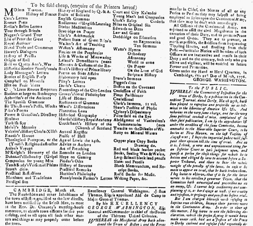
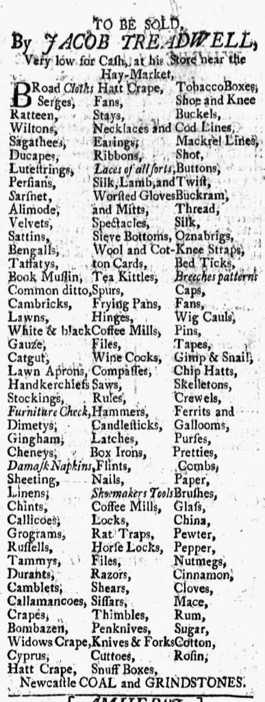
Treadwell also published a catalog of the goods he sold, but his advertisement had a less common format.  Rather than a single paragraph, Treadwell’s notice divided the goods into three columns, listing only one item on most lines.  Given the space constraints, some items overflowed onto additional lines, such as “Shoe and Knee / Buckels,” “Wool and Cot- / ton Cards,” and “Silk, Lamb, and / Worsted Gloves / and Mitts.”  Creating columns also produced white space within the advertisement; the combination made Treadwell’s advertisement easier to peruse than King’s.  It likely helped prospective customers more fully appreciate Treadwell’s extensive assortment of merchandise.  That columns required more space also communicated the range of consumer choice, though Treadwell paid to make that part of the appeal he presented to readers of the New-Hampshire Gazette.  In the eighteenth century, advertisers paid by the amount of space their notices occupied on the page, not the number of words.

To provide further visual distinction, some goods in Treadwell’s advertisement appeared in italics: “BRoad Cloths,” “Furniture Check,” “Damask Napkins,” “Laces of all sorts,” “Shoemakers Tools,” and “Breeches patterns.”  Why these particular items is not readily apparent today … and may not have been in 1770 either.  Did Treadwell believe they were in high demand?  Did he have surplus inventory?  Did Treadwell even instruct that those items appear in italics or did the compositor independently make the decision to provide even greater variation in the advertisement?  Whatever the reason, the graphic design elements of Treadwell’s advertisement likely garnered greater attention for it than King’s notice in standard format that ran on the same page.

May 10

What was advertised in a colonial American newspaper 250 years ago today?

May 10 - 5:10:1770 New-York Journal
New-York Journal (May 10, 1770).

Pencill’d China,” “Burnt Image China,” “Blue and white China.”

Like many other colonial shopkeepers, George Ball published an extensive list of his merchandise in an advertisement he placed in the May 10, 1770, edition of the New-York Journal.  Most advertisers who resorted to similar lists grouped all of their wares together into dense paragraphs of text.  A smaller number, like Ball, used graphic design to aid prospective customers in differentiating among their goods as they perused their advertisements.  Ball formatted his advertisement in columns with only one, two, or three items per line, just as Abeel and Byvanck, John Keating, and Jarvis Roebuck did elsewhere in the same issue.  Ball, however, instituted a further refinement that distinguished his notice from the others.  He cataloged his merchandise and inserted headers for the benefit of consumers.

Ball offered several categories of merchandise:  “Pencill’d China,” “Burnt Image China,” “Blue and white China,” “Brown China,” “White China,” “White Stone Ware,” “Delph Ware,” “Plain Glass Ware,” “Flower’d Glass,” “Iron Ware from England,” and “Queen Pattern Lamps.”  These headers appeared in italics and centered within their respective columns to set them apart from the rest of the list.  The goods that followed them elaborated on what Ball had in stock, allowing prospective customers to more easily locate items of interest or simply assess the range of goods Ball offered for sale.  His method could have benefited from further refinement.  The items that followed “Queen Pattern Lamps” were actually a miscellany that did not belong in any of the other categories.  Ball might have opted for “Other Goods” as a header instead.  Still, his attempt to catalog his merchandise at all constituted an innovation over the methods of other advertisers.

In most instances, eighteenth-century advertisers submitted copy and compositors determined the layout.  However, advertisements broken into columns suggest some level of consultation between advertisers and compositors, at the very least a request or simple instructions from one to the other.  Ball’s advertisement likely required an even greater degree of collaboration between advertiser and compositor.

December 15

What was advertised in a colonial American newspaper 250 years ago today?

“Stript Camblets     |     Knee Garters     |     Brass Ink Pots.”

Dec 15 - 12:15:1769 New-Hampshire Gazette
New-Hampshire Gazette (December 15, 1769).

According to the advertisement he placed in the December 15, 1769, edition of the New-Hampshire Gazette, Jacob Treadwell sold an assortment of goods at his shop in Portsmouth. He carried everything from textiles to tea kettles to “Locks & Latches.” His advertisement listed more than 120 items and promised even more, concluding with “&c. &c. &c.” (the eighteenth-century abbreviation for et cetera). Enumerating his inventory served to demonstrate to prospective customers the extent of the choices Treadwell offered them. He did not have just a couple kinds of fabric in stock. Instead, he listed dozens of options available at his shop. He did not make general assertions about carrying housewares or hardware. Instead, he named an array of goods he sold, prompting consumers to imagine acquiring specific items.

Treadwell’s advertisement served as a catalog of his wares. The advertisement’s format, three neatly organized columns, helped prospective customers navigate that catalog. Publishing an extensive list of merchandise was a common marketing strategy in early America. Most advertisers who adopted that approach lumped their goods together in dense paragraphs of text that made it difficult for readers to distinguish among the multitude of items the advertisement included. Some advertisers, however, experimented with other formats, incorporating graphic design into their marketing efforts. Treadwell advertised the same items as other eighteenth-century retailers, but he made his inventory more accessible with the use of columns and white space.

Doing so liked incurred additional expense since most newspaper printers sold advertising by the amount of space it occupied rather than the number of words. Treadwell’s advertisement extended half a column as a result of its design. Had he opted for the paragraph format instead, the advertisement would have taken up a fraction of the space. Treadwell apparently believed that the potential return on his investment merited the additional expense. In making his advertisement easier for readers to peruse, he augmented the chances that they would become customers.