
What was advertised in a colonial American newspaper 250 years ago today?
“colours, Six quarter|London quality’s|common, Spike do”
Although many eighteenth-century newspaper advertisements for consumer goods took the form of long lists delivered in dense paragraphs, some advertisers and compositors experimented with other formats that made advertisements easier to read. Listing only one or two items per line better highlighted each item; the white space aided in directing readers to those goods that most interested them. This strategy, however, reduced the number of items that could be included in the same amount of space. Advertisers had to choose between listing fewer goods or paying for advertisements that occupied greater amounts of space in newspapers.
Getting creative with typography allowed for another choice: dividing an advertisement into columns and listing one item per line per column. When undertaken by a skilled compositor, this strategy still introduced sufficient white space to significantly improve readability while doubling or tripling, depending on the number of columns, the number of goods that appeared in a neatly organized list. List-style advertisements that featured columns usually had only two, but occasionally compositors demonstrated that it was possible to effectively incorporate three columns.
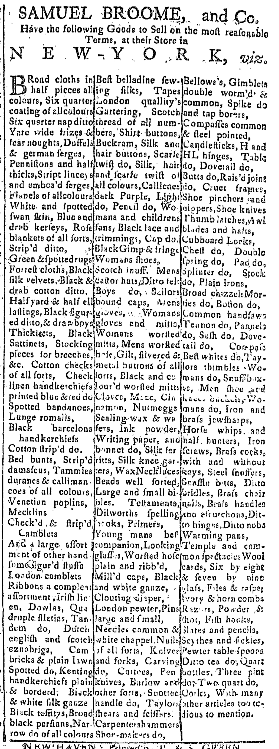
The success of this strategy depended on the skills of the compositor. An advertisement placed by Samuel Broome and Company in the August 5, 1768, edition of the Connecticut Journal demonstrates that experimenting with the graphic design elements of newspaper advertisements did not necessarily produce positive results. In an advertisement that filled an entire column, Broome and Company made an appeal to consumer choice by listing scores of items they sold at their store in New York. The compositor divided the advertisement into three columns, but apparently nobody affiliated with the production of the advertisement – neither Broome and Company when writing the copy nor the compositor when setting the type – insisted that it should list only one item per line per column. Instead, the advertisement featured the dense paragraph format common to so many newspaper advertisements, but divided into three narrow columns. Not only did this not make the contents any easier for prospective customers to read, the lack of space devoted to separating columns made the advertisement even more confusing and difficult to decipher.
While it is possible that the strange format may have attracted some attention, the challenges inherent in reading Broome and Company’s advertisement likely did not prompt potential customers to examine it closely, especially not casual readers who did not already have an interest in some of the goods that Broome and Company carried (if they could only find them in that disorienting list). Good typography helped to develop interest and perhaps incite demand for consumer goods listed in eighteenth-century newspaper advertisements, but clumsy typography that made it more difficult for readers to peruse some advertisements likely made those advertisements even less effective than if they had simply resorted to the traditional dense paragraph format.
[…] first appearing in the August 5 edition, Broome and Company’s advertisement ran again on August 19, September 2, 16, and 30, October 14, […]