August 19

What was advertised in a colonial American newspaper 250 years ago today?

Massachusetts Gazette and Boston Weekly News-Letter (August 19, 1773).

“SILKS and superfine Broad-Cloths.”

Although John Barrett and Sons did not happen to adorn their advertisement in the Massachusetts Gazette and Boston Weekly News-Letter with a woodcut related to some aspect of their business, that did not mean that their notice lacked visual appeal.  A border comprised of decorative type enclosed their advertisement for a variety of imported textiles and “All Kinds of English, Scotch, India, Hard-Ware and Cutlary GOODS.”  Other typographical elements also helped draw attention to their advertisement.  It featured a headline, “SILKS and superfine Broad-Cloths,” that highlighted some of the goods that readers would encounter in the advertisement.  It alternated lines in larger and smaller fonts.  In addition to the headline, three other lines – “A Prime Assortment of Padusoys,” “By JOHN BARRETT & SONS,” “All Kinds of English, Scotch” – appeared in larger type.  An appeal to price, “to be sold at an exceeding low Rate,” utilized italics for emphasis.  Overall, Barrett and Sons’ advertisement had a lively appearance.

Massachusetts Gazette and Boston Weekly News-Letter (August 19, 1773).

The border certainly distinguished it from other notices, but many had their own distinctive visual elements to draw attention.  An advertisement for the sloop Industry seeking freight and passengers for a voyage to New York was the only advertisement in the August 19, 1773, edition with a woodcut.  The printer provided a stock image of a vessel at sea.  Other advertisements had their own headlines in larger fonts, including “WHIPS,” “Fyal WINE,” and “Drugs & Medicines.”  An advertisement for groceries and other goods sold “Next Door Southward of the Sign of the Buck and Gloves” divided the items into three columns, listing one item per line rather than clustering them together in a paragraph of dense text.  Daniel Bell did not resort to columns in his advertisement; he (and the compositor) devised a different means of giving each item more space on the page, naming one or two items per line and centering them.  That resulted in an amorphous and irregular shape about as different from the rectangle defined by the border of Barrett and Sons’ advertisement as possible.  All of the advertisements in that issue of the Massachusetts Gazette and Boston Weekly News-Letter relied primarily on text rather than images, yet they did not lack visual images.  The advertisers and compositors deployed typography that distinguished advertisements from the columns of news and from each other, creating a visual cacophony to engage readers and prospective customers.

August 16

What was advertised in a colonial American newspaper 250 years ago today?

New-York Gazette and Weekly Mercury (August 16, 1773).

“IRISH / LINENS, / Sheetings, cotton and / Linen checks; calicoes.”

The format of an advertisement for upcoming sales at Templeton and Stewart’s Auction Room in the August 16, 1773, edition of the New-York Gazette and Weekly Mercury almost certainly caught the eye of readers.  Rather than appear in a blocky paragraph of text or side-by-side columns with one or two items per line, as was the case in other advertisements for consumer goods in that issue, the list of items for sale formed a diamond.  The entries at the top and bottom of the diamond, “IRISH LINENS” and “PLAYING CARDS,” had one word per line, all in capital letters spaced appropriately to create a pleasing and attractive form.  The compositor realized that lowercase letters at the top and bottom of the diamond would have had a jarring and unpleasant visual effect.  Likewise, too many uppercase letters would have crowded the rest of the diamond, so other items appeared in lowercase letters as the list progressively widened and then progressively narrowed.

Using type to form geometric shapes, especially diamonds, was rare but not unknown in newspaper advertisements of the period.    On September 30, 1771, all of the copy in Gilbert Deblois’s advertisement in the Supplement to the Boston-Gazette appeared within a diamond, though the compositor did not manage to create lines nearly as straight as those in Templeton and Stewart’s advertisement.  Such was also the case for Deblois’s advertisement in the Massachusetts Gazette and Boston Weekly News-Letter later that week.  The compositor for the Essex Gazette achieved better results in an advertisement placed by John Cabot and Andrew Cabot in the December 3, 1771, edition of the Essex Gazette.  All of the copy ran at a forty-five-degree angle, filling an entire square.  Two weeks later, the compositor and the Cabots experimented with the same copy, devising a shape that resembled a bulb as much as a diamond.  Still, the unique format set it apart from other advertisements.  With a shorter list of goods, Duncan Ingraham, Jr., concluded his advertisement in the April 20, 1772, edition of the Massachusetts Gazette and Boston Post-Boy with a diamond that featured straight edges.

Each of these advertisements demonstrates one manner for experimenting with graphic design elements of newspaper notices.  The advertisers likely made special requests or sent instructions.  They may have even submitted copy arranged the way they wished for it to appear in print, though compositors exercised final discretion in making innovative designs work.  While some of these advertisements evidenced greater skill than others, each presented a novelty to readers and prospective customers.  Such innovative graphic design demanded attention on pages largely devoid of visual images, the format encouraging readers to peruse the content.

October 22

What was advertised in a colonial American newspaper 250 years ago today?

Massachusetts Gazette and Boston Weekly News-Letter (October 22, 1772).

“CHEAP GOODS.”

In the fall of 1772, David Sears joined other advertisers in Boston who used borders composed of decorative type to enclose either the headline or their entire newspaper notice.  Sears proclaimed that he sold “CHEAP GOODS,” that headline surrounded by printing ornaments that called attention to his advertisement and prompted subscribers of the Massachusetts Gazette and Boston Weekly News-Letter to read more about the “fresh Assortment of Gall and Winter Goods” he recently imported from London.  His advertisement in the October 26 edition of the Boston-Gazette included the same headline within a decorative border.  In with instances, the headline and its border directed prospective customers to his bold claim that he set “such Prices that is not possible to be conceived of without Trial.”  In other words, it would take some effort to even imagine such low prices.

Sears certainly was not the first advertiser in Boston to incorporate a border into a newspaper advertisement.  As early as 1766, Jolley Allen made borders around his entire notices a signature element of his marketing.  Occasionally other advertisers deployed borders as well, but greater numbers did so simultaneously in the summer and fall of 1772.  Jolley Allen and Andrew Dexter both published advertisements with borders in May, though the Massachusetts Spy seemingly rejected any requests or instructions to include a border around Allen’s advertisement.  Martin Bicker ran an advertisement surrounded by a border in August.  Jonathan Williams, Jr., also did so in September.  Other merchants and shopkeepers opted for borders around just the headlines.  The week before Sears ran his advertisement on October 22, William Jackson introduced his notice with a border around the headline, “Variety Store.”  A few days later, Herman Brimmer and Andrew Brimmer had a border enclosing “Variety of Goods” at the top of their advertisement in Supplement to the Boston-Gazette.  The printers of that newspaper had recently used a decorative border for their own notice calling on subscribers with overdue accounts “to make immediate Payment.”

These examples may seem scattered, but considering how infrequently borders adorned advertisements in Boston’s newspapers (or newspapers printed elsewhere in the colonies) they suggest a trend among advertisers in 1772.  Sears may have observed that others included borders in their notices and determined that he desired the same for his advertisement, combining a pithy headline and graphic design to demand the attention of readers.

May 19

What was advertised in a colonial American newspaper 250 years ago today?

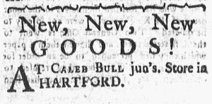
Connecticut Courant (May 19, 1772).

“New, New, New GOODS!”

Less is more.  Caleb Bull, Jr., adopted that theory for his advertisement in the May 19, 1772, edition of the Connecticut Courant.  Extending only four lines, the advertisement proclaimed, “New, New, New GOODS! AT CALEB BULL jun’s. Store in HARTFORD.”  He did not include any of the standard appeals to price or quality.  He did not attempt to convince genteel customers that he carried fashionable textiles, garments, and housewares.  He did not provide a list of dozens or scores of items to demonstrate the choices available to consumers.  He did not promise exemplary customer service.  In short, he did not deploy most of the marketing strategies that commonly appeared in newspaper advertisements in the eighteenth century.

That does not necessarily mean, however, that Bull’s advertisements did not catch the attention of prospective customers.  After all, he composed innovative copy with the repetition of “New, New, New” on the first line.  Most advertisers did not incorporate such repetition as a means of engaging readers, though sometimes their lists of merchandise concluded with “&c. &c. &c.”  In repeating the abbreviation for et cetera, they underscored that they had far too many goods to fit into an advertisement.  Bull relied on a similar principle, but he did not reserve the repetition for the end of his notice.  Instead, “New, New, New” served as his primary marketing strategy, signaling to prospective customers that his inventory had not lingered on the shelves.  Bull challenged readers to visit his store to see these “New, New, New GOODS” for themselves.

The typography made his advertisement notable, most of the content in larger fonts than appeared in other advertisements on the same page.  Other notices featured dense paragraphs in smaller fonts.  Readers likely absorbed Bull’s advertisement at a glance, even if they casually skimmed the advertisements, but other notices required greater effort to read.  As a result, “New New, New GOODS” may have been enough to make Bull’s advertisement memorable and effective,

May 8

What was advertised in a colonial American newspaper 250 years ago today?

New-Hampshire Gazette (May 8, 1772).

“A good Assortment of GOODS, / suitable for the Season, lately imported, / from Great-Britain and Ireland.”

When John McMasters and Company “removed from Col. Wallingford’s, to Mr. David Moore’s Store, North-End” in Portsmouth in the spring of 1772, they placed an advertisement in the New-Hampshire Gazette to inform current and prospective customers of their new location.  They incorporated a variety of marketing appeals into their notice.  They promoted their “good Assortment of GOODS,” suggesting plenty of choices for consumers, and then listed several of the items they imported from Great Britain and Ireland, including “Broad Cloths of different Prizes; A great Variety ofRIBBONS, Irish Linnens of all Prizes, Shalloons, Tammies, and Callamancoes.”  McMasters and Company set low prices and offered “short Credit.”  They also emphasized customer service, pledging that “their Customers in Town and Country … may depend on being as well used as they could be at any Warehouse in BOSTON.”  In making that assertion, McMasters and Company acknowledged that they operated in a regional marketplace rather than competing solely with local merchants and shopkeepers.  They realized that consumers looked to the bustling port of Boston for extensive selections of merchandise at bargain prices, but assured them that they did not need to travel or send away for the goods they wanted.

McMasters and Company made familiar appeals in their advertisement.  Purveyors of goods and services consistently mentioned consumer choice and low prices in their newspaper notices.  Many also highlighted customer service.  As a result, the format of McMaster and Company’s advertisement was its most distinctive feature.  Decorative type embellished John McMasters’s name, drawing attention to the advertisement.  Very few visual images appeared in the New-Hampshire Gazette, especially compared to newspapers published in larger port cities.  A crude woodcut depicting an enslaved man who “Deserted from his Master” adorned another advertisement in the May 8, 1772, edition, but otherwise no other notices included images or decorative type.  Each advertisement had a standard paragraph format, with the exception of McMasters and Company’s notice.  They opted to divide their copy into shorter lines and center each line to create a unique shape compared to the blocks of text in the news and other advertisements.  The innovative use of white space in combination with the decorative type likely attracted attention, increasing the chances that consumers saw McMasters and Company’s appeals to price, choice, and customer service.  Graphic design enhanced their marketing efforts.

April 27

What was advertised in a colonial American newspaper 250 years ago today?

Boston Evening-Post (April 27, 1772).

“ENGLISH GOODS of all Sorts, At Francis Green’s Store, (Cheap).”

Purveyors of goods and services used a variety of design strategies in their efforts to get prospective customers to take note of their advertisements in the April 27, 1772, edition of the Boston Evening-Post.  Some emphasized consumer choice by publishing advertisements that took up significant space by listing the merchandise they sold.  Richard Jennys did so in a notice that was about as long as it was wide.  He listed a couple of dozen items in a dense paragraph of text.  Joseph Peirce also opted for a dense paragraph that enumerated his inventory, but his advertisement extended half a column.  John Frazier and Margaret Philips both inserted paragraphs of moderate length, occupying more space on the page than Jennys but less than Peirce.  The amount of text was part of the message.

Other merchants and shopkeepers who resorted to lists attempted to use graphic design to their benefit in a different way.  They divided their advertisements into columns, listing only one or two items per line in order to make them easier for prospective customers to navigate.  Since advertisers paid by the amount of space rather than the number of words, that meant they paid more to advertiser fewer items than their competitors who opted for paragraphs rather than columns, but they apparently considered it worth the investment.  John Cunningham, Ward Nicholas Boylston, and Herman and Andrew Brimmer all ran advertisements that included dozens of items arranged in advertisements divided into two columns.

Other advertisers emphasized the visual aspects of their notices to an even greater degree.  A woodcut depicting a mortar and pestle adorned Oliver Smith’s advertisement for “Drugs & Medicines” at his shop “At the GOLDEN MORTAR.”  Duncan Ingraham, Jr. relied on typography rather than images, arranging a short list of goods to form a diamond.  Joseph Barrell also created white space to draw attention by listing a few items on each line and centering them.  His lines of varying lengths did not look nearly as crowded as the paragraphs in other advertisements.  Francis Green limited his advertisement to ten words (“ENGLISH GOODS of all Sorts, At Francis Green’s Store, (Cheap)”), but deployed decorative type to form a border.  That made his notice particularly distinctive since no other advertiser adopted that strategy.  It also helped that his advertisement appeared in the middle of the page.  The border likely drew readers’ eyes away from the advertisements on the outer edges in favor of the middle, at least when first perusing the page.

Graphic design in early American newspapers may appear unsophisticated by modern standards, but that does not mean that colonizers did not attempt to leverage graphic design in marketing goods and services.  Within a single issue of the Boston Evening-Post, advertisers made a variety of choices about the visual aspects of their notices, some of them rather innovative for the period.

April 22

What was advertised in a colonial American newspaper 250 years ago this week?

Massachusetts Gazette and Boston Post-Boy (April 20, 1772).

“Infants Morocco Shoes, and / Pumps, Womens / Lynn made / Ditto.”

Duncan Ingraham, Jr., hoped that the format of his advertisement would help to draw attention to the goods that he imported from London and sold at his shop on Union Street in Boston in the spring of 1772.  Most merchants and shopkeepers who advertised in the newspapers published in the bustling port city adopted one of two methods of listing their merchandise.  They either included everything in a single dense paragraph or they divided their advertisement into columns with one item per line.  Ingraham rejected both in favor of arranging his list of goods in the shape of a diamond. Such an unusual format almost certainly caught the eyes of readers as they perused the Boston Evening-Post and the Massachusetts Gazette and Boston Post-Boy.

A variation of Ingraham’s advertisement appeared in both newspapers.  The notices contained nearly identical copy, but the compositors made different decisions about line breaks for both the introduction that gave directions to Ingraham’s shop and the diamond that listed the goods.  When he wrote out the advertisement by hand, Ingraham may have experimented with creating a diamond.  Alternately, he may have submitted instructions about his preferences and left it to the compositors to figure out the particulars.  Either way, Ingraham likely provided some sort of guidance for the compositors.  They did not independently decide to introduce the same innovation into his advertisement in two newspapers.

In most cases, eighteenth-century advertisers played little role in designing their advertisements beyond writing the copy, but Ingraham more actively assumed responsibility for some of the visual aspects of his notice.  He apparently did not consider his advertisement a mere announcement that he carried certain goods.  Instead, he sought to shape his advertisement in a manner likely to increase the chances that prospective customers would take note of it and the various appeals to low prices and good customer service he included in the introduction.

December 17

What was advertised in a colonial American newspaper 250 years ago today?

Essex Gazette (December 17, 1771).

“An Elegant Assortment of English and India GOODS.”

John Cabot and Andrew Cabot sought to use typography to their advantage when they advertised in the Essex Gazette in December 1771.  They began with a notice in the December 3 edition, one that likely attracted attention because the copy was arranged to form a diamond.  The text ran upward diagonally with the longest line extending from the lower left corner to the upper right corner.

Two weeks later, they placed another advertisement that once again played with graphic design.  It featured the same copy as the previous advertisement, but this time the compositor created a different shape.  Not quite a diamond, it resembled a bulb.  The names of the advertisers filled most of the upper portion, helping to draw the eyes of the readers, but the white space in each of the corners also distinguished this advertisement from others on the page.

Except for the masthead on the front page, this edition of the Essex Gazette did not feature any images.  None of the advertisers opted to adorn their notices with woodcuts, yet the Cabots were not alone in their efforts to deploy typography to make their advertisement more conspicuous.  Nathaniel Sparhawk’s advertisement included a list of goods available at his store, divided into two columns, but it did not consist entirely of text.  Printing ornaments ran down the center, separating the columns.  Such visual appeal differentiated that advertisement from one with a similar format, but no decorative type, placed by John Gould and Company.

In most cases, advertisers submitted copy and compositors made decisions about format, but for these advertisements it seems almost certain that Sparhawk and, especially, the Cabots issued instructions or otherwise participated in developing the designs for their notices.  As they competed for customers with others who advertised similar goods, they likely hoped that savvy graphic design would prompt prospective customers to look more closely at their advertisements.

December 3

What was advertised in a colonial American newspaper 250 years ago today?

Essex Gazette (December 3, 1771).

“The Promises in some pompous Advertisements.”

John Cabot and Andrew Cabot operated a shop in Beverly, Massachusetts, in the early 1770s.  They took to the pages of Essex Gazette in December 1771 to promote an “Elegant Assortment of English and India GOODs.”  They boldly proclaimed that they offered the best prices in the region, “determined … to give undoubted Satisfaction to every Purchaser, and at as low a Rate, if not lower, than at any Store in BOSTON or SALEM, notwithstanding the Promises in some pompous Advertisements.”  The Cabots critiqued their competitors as they made their own “pompous” claim about their prices.

Such commentary may have captured the attention of prospective customers, but it was like the format of the advertisement that drew their attention in the first place.  The copy ran upward diagonally, forming a diamond that filled the traditional square of space that advertisers purchased.  One or two words appeared on the first lines.  The number of words and length of each line increased with each line until the line that extended from the lower left corner of the advertisement to the upper right corner, then decreased with each line.

The format was novel in the Essex Gazette, but that does not mean that it was unfamiliar to readers or to the Cabots.  Two months earlier, Gilbert Deblois, a shopkeeper in Boston, similarly experimented with the design of his advertisements in the Boston Evening-Post, the Boston-Gazette, and the Massachusetts Gazette and Boston Weekly News-Letter.  The Cabots likely saw Deblois’s advertisement.  After all, they commented on the content of advertisements placed by merchants and shopkeepers in both Boston and Salem.  Perhaps they even clipped the advertisement or submitted an issue of the Boston Evening-Post with their copy and instructions for the compositor to replicate the format of Deblois’s unique notice.  They likely had to pay more than the three shillings that Samuel Hall usually charged for advertisements “not exceeding eight or ten Lines,” but they may have considered it well worth the investment to create an advertisement practically guaranteed to attract notice from prospective customers.

October 6

What was advertised in a colonial American newspaper 250 years ago this week?

Massachusetts Gazette and Boston Weekly News-Letter (October 3, 1771).

“Fifes, Violins, Powder, / Lead, Shott, / Steel, &c.”

Gilbert Deblois used graphic design to increase the likelihood that his newspapers advertisements would attract the attention of prospective customers interested in the “very large Assortment of Winter Goods” available at his shop on School Street in Boston in the fall of 1771.  Rather than publish a dense block of text like most of his competitors who advertised, he instead opted for arranging the copy in the shape of a diamond.  The shopkeeper did so consistently in three newspapers printed in Boston, starting with the Boston Evening-Post and the Boston-Gazette on September 30 and then continuing in the Massachusetts Gazette and Boston Weekly News-Letter on October 3.  The unique design likely made his advertisement notable for readers who saw it once and even more memorable for anyone who encountered variations of it in two or three newspapers.

In most instances, advertisers were responsible for generating the copy for their notices and then compositors determined the format.  On occasion, however, advertisers like Deblois made special requests, submitted instructions, or possibly even consulted with printers and compositors about how they wanted their advertisements to appear.  The compositors at the first two newspapers who ran Deblois’s advertisement took different approaches.  In the Boston Evening-Post, the text ran upward at a forty-five degree angle and formed an irregular diamond that filled the entire space purchased by the shopkeeper.  In contrast, the compositor for the Boston-Gazette used the same copy but arranged it in lines of increasing and then decreasing length to form a diamond surrounded by a significant amount of white space.  Though different, both sorts of diamonds made Deblois’s advertisements much more visible in the pages of the newspapers.  The advertisement in the Massachusetts Gazette and Boston Weekly Mercury followed the latter design, but the compositor did not merely copy it from the Boston-Gazette.  The advertisement published on October 3 had a longer list of goods that the compositor had to accommodate in the design.

The copy itself did not distinguish Deblois’s advertisements from others that appeared in any of the newspapers published in Boston, but intentional choices about the format made his notices distinctive.  Deblois stocked the same merchandise “Just Imported from LONDON” as his competitors, but he used innovative design to generate interest among consumers who had many choices.