August 15

What was advertised in a colonial American newspaper 250 years ago this week?

Aug 15 - 8:13:1770 New-York Gazette and Weekly Mercury
New-York Gazette and Weekly Mercury (August 13, 1770).

“Coopers Bung borers, adzes, howells, compasses, crozes, bitts and rivets.”

In the 1770s, when merchants and shopkeepers enumerated the “general assortment” of goods they offered for sale, their advertisements usually followed one of two formats.  Most listed their merchandise in a dense paragraph of text that extended anywhere from a few lines to half a column or more.  As an alternative, others created more white space and made their advertisements easier to read by including only one item per line or organizing their wares into columns.  Adopting such methods meant that advertisers could name fewer items in the same amount of space as their competitors who chose paragraphs of text with no white space.

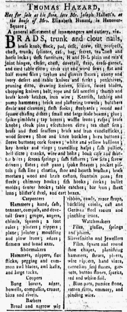
Both sorts of advertisements regularly appeared in the New-York Gazette and Weekly Mercury, but occasionally advertisers (perhaps in consultation with printers and compositors) added variations and innovations.  Such was the case with Thomas Hazard’s advertisement for ironmongery and cutlery in the August 13, 1770, edition.  Hazard began with a dense paragraph that included “H and H-L plain and rais’d joint hinges,” “brass and iron candlesticks,” and “sword blades.”  In addition, he divided a portion of his advertisement into two columns.  Within those columns, he resorted to short paragraphs of text rather than listing only one or two items per line, but those paragraphs were brief and likely easier for eighteenth-century consumers to navigate than the dense paragraph of text that constituted the bulk of the advertisement.  Furthermore, Hazard inserted headers for each of those shorter paragraphs:  “Carpenters,” “Shoemakers,” “Coopers,” “Barbers,” “Watchmakers,” and “Silversmiths and Jewellers.”  Each paragraph listed tools used in a particular trade.  In this manner, Hazard targeted specific consumers and aided artisans in finding the items of greatest interest to them.

Prior to the American Revolution, merchants and shopkeepers published undifferentiated lists of goods in their advertisements, but occasionally some attempted to impose more order and make their notices easier for prospective customers to navigate.  Thomas Hazard did so by grouping together tools used by various sorts of artisans, setting them apart in columns, and using headers to draw attention to them.  Carpenters or watchmakers who might have overlooked items when skimming dense paragraphs of text instead had a beacon that called their attention to the tolls of their trades.

April 26

What was advertised in a colonial American newspaper 250 years ago today?

Apr 26 - 4:26:1770 New-York Journal
New-York Journal (April 26, 1770).

“Horn combs, and ivory fine teeth’d ditto.”

Nicholas Bogart sold an assortment of goods at his shop “In the Broad-Way” in New York.  He listed many of them in an advertisement that ran in the April 26, 1770, edition of the New-York Journal.  His inventory included “Worsted and leather womens mits,” “Broad-cloths of various colours and prices,” “A variety of Dutch books for teaching children,” and “Knee garters, various colours.”  He stocked and sold such an array of merchandise that it demanded cataloging in detail in order for prospective customers to realize the full extent.

Yet Bogart did not merely list his wares.  He deployed rudimentary graphic design principles to make them easier for readers to peruse, dividing his advertisement into two columns and mentioning only one, two, or three items on each line.  When more than one item appeared on a line, they were all related to each other.  When a category of items overflowed onto the next line, the second line was usually indented.  In comparison, most merchants and shopkeepers who enumerated dozens of items did so in dense paragraphs.  Such was the case in James Beekman’s advertisement on the same page as Bogart’s notice.  Beekman included a similar number of items, but clustered them together in a manner that required more effort to read.  As a result, Beekman’s advertisement took up only about half the space of Bogart’s.  According to the colophon at the bottom of the page, advertisers paid by the amount of space that their notices occupied, not by the number of words.  That meant that Bogart paid twice as much as Beekman even though they listed a similar number of items.

Bogart was not alone in incorporating columns into his advertisement.  Immediately above Bogart’s notice, John Keating also used columns.  Elsewhere in the same issue, Abeel and Byvanck used columns to organize their “considerable Assortment of Ironmongery and Cutlery.”  Advertisers knew that this option was available to them on request, though the dense paragraph was the default format.  The more attractive option required a greater investment, but some advertisers apparently believed they would benefit from a greater return on that investment if they made it easier for prospective customers to engage with the extensive lists of merchandise they published in newspaper notices.

October 4

What was advertised in a colonial American newspaper 250 years ago today?

Oct 4 - 10:4:1769 Georgia Gazette
Georgia Gazette (October 4, 1769).

“A Compleat Assortment of MEDICINES.”

Lewis Johnson’s advertisements for medicines became a familiar sight in the Georgia Gazette in the late 1760s. Several qualities made them particularly notable, including their length, their unique format, and Johnson’s name in large gothic font as a headline. His advertisement in the October 4, 1769, edition included all of these attributes.

The compositor distributed gothic font throughout the issue, but sparingly. On the final page, four legal notices commenced by naming the colony. “Georgia” appeared in gothic font the same size as the rest of the copy in those advertisements. Another paid notice seeking overseers to manage a rice planation used “Wanted Immediately” in gothic font as a headline. The final advertisement on that page as well as another on the third page described enslaved people “Brought to the Workhouse.” That phrase in gothic type served as a standard headline for such advertisements in the Georgia Gazette, making them recognizable at a glance. One more notice, also on the third page with Johnson’s advertisement, described a house “To be Let” with that phrase in gothic font as the headline. In each instance of gothic font in the issue, it appeared in the same size as the copy for the rest of the advertisement, except for Johnson’s name. It ran in a much larger font, one larger than anything else in the newspaper except its title in the masthead. This created a striking headline that would have been difficult for readers to miss.

The length of Johnson’s advertisement also made it impossible to overlook. Listing dozens of medicines available at the apothecary’s shop, it extended two-thirds of a column. The entire issue consisted of only four pages of two columns each. Johnson’s advertisement was significantly longer than any other paid notice. It rivaled in length even the longest of news items, occupying a substantial amount of space in the issue. Considering that colonial printers charged by the amount of space rather than the number of words, Johnson’s advertisement represented a considerable investment.

Finally, the apothecary deployed unique typography that made it easier for prospective customers to read his advertisement than many others that listed their wares in dense blocks of text. Divided into three columns, his advertisement named only one item per line. Johnson did not always divide his advertisements into columns, but he
did so fairly regularly. Usually, however, he resorted to only two columns. This advertisement featured three, a graphic design decision that reduced the amount of space it occupied on the page while simultaneously introducing an innovative format that rarely appeared in advertisements in any colonial newspaper.

Johnson incorporated three visual elements that made his advertisement noteworthy and more likely to attract the attention of prospective customers. His name in large gothic font as a headline, the extraordinary length, and dividing it into three columns each on their own would have distinguished his advertisement from others in the Georgia Gazette. Combining them into a single advertisement made it even more unique. The various graphic design elements demanded that readers take notice.

September 27

What was advertised in a colonial American newspaper 250 years ago today?

Sep 27 - 9:27:1769 Georgia Gazette
Georgia Gazette (September 27, 1769).

“Pigtail tobacco,
Playing cards,
Box coffee mills.”

William Belcher and the partnership of Rae & Somerville both inserted advertisements in the September 27, 1769, edition of the Georgia Gazette. Each relied on consumer choice as the primary means of marketing their wares, though Belcher did make a nod toward low prices as well. Like many other merchants and shopkeepers that advertised in newspapers published throughout the colonies, Belcher and Rae & Somerville listed dozens of items available at their shops, cataloging their inventory to demonstrate an array of choices for consumers. Both concluded their advertisements with a promise of even more choices that prospective customers would encounter when visiting their shops. Belcher promoted “a variety if delph and tinware,” while Rae & Somerville resorted to “&c. &c. &c.” (the eighteenth-century version of “etc., etc., etc.”).

Despite this similarity, the advertisers adopted different formats for presenting their wares in the pages of the public prints. Rae & Somerville went with the most common method: a dense paragraph of text that lumped together all of their merchandise. Belcher, on the other hand, organized his goods into two columns with only one item per line. This created significantly more white space that likely made it easier for prospective customers to read and locate items of interest. Belcher and Rae & Somerville listed a similar number of items, yet Belcher’s advertisement occupied nearly twice as much space on the page as a result of the typography. Considering that most printers charged by the amount of space an advertisement required rather than the number of words in the advertisement, Belcher made a greater investment in his advertisement. Presumably he believed that this would attract more attention from prospective customers and garner better returns. In making this determination, Belcher relied on the skills of the compositor in the printing office to execute his wishes.

In general, advertisements in eighteenth-century newspapers appear crowded by twenty-first-century standards, especially since they relied almost entirely of text and featured few images compared to modern print advertising. Advertisers, printers, and compositors, however, devised ways of distinguishing the visual appearance of advertisements that consisted solely of text. They experimented with different formats in effort to vary the presentation of vast assortments of goods offered to the general public for their consumption.

December 26

What was advertised in a colonial American newspaper 250 years ago today?

Boston Evening-Post (December 26, 1768).

“Ravens Duck | Bohea Tea | Mason Glasses.”

Samuel Fletcher aimed to use typography to his advantage in an advertisement that ran in the December 26, 1768, edition of the Boston Evening-Post. In it, he listed a variety of imported goods among the inventory at his store “Near the Draw-Bridge,” including textiles, tea, and housewares. The contents of Fletcher’s advertisement did not much differ from what appeared in other notices for consumer goods placed in the Boston Evening-Post and other newspapers published in the busy port. The format, however, distinguished Fletcher’s advertisement from many others.

Fletcher enumerated approximately sixty items, organizing them into three columns that trisected the advertisement. Other advertisers that listed their wares tended to do so in dense paragraphs that did not feature any white space. Such was the case in Gilbert Deblois’s advertisement immediately below Fletcher’s notice and Joseph Barrell’s advertisement immediately to the right. Yet Fletcher was not alone among merchants and shopkeepers in electing to divide his goods into columns. Elsewhere on the same page, Samuel Allyne Otis divided his advertisement into two columns. Joshua Blanchard incorporated visual variety into his advertisement, publishing a short list of wines followed by a paragraph that promoted the quality of customer service his clients could anticipate. Although many advertisers opted for the standard dense paragraph, some experimented with other formats.

Fletcher’s decision to use columns came with one disadvantage. He could not list as many items in the same amount of space. Still, he managed to provide a general preview, enough to suggest an array of choices for consumers, before concluding with the phrase “With many Articles not mentioned” running across all three columns. This signaled to prospective customers that he did not necessarily stock fewer choices than his competitors, only that he organized them differently in his advertisement. In the spirit of “less is more,” listing fewer items but in a format with sufficient white space that allowed readers to navigate the contents of the advertisement more easily could have drawn attention to specific entries much more readily than had they appeared amidst a dense list of merchandise. For Fletcher’s advertisement, the typography very well could have been as effective as the copy.

September 13

What was advertised in a colonial American newspaper 250 years ago today?

Sep 13 - 9:13:1768 South-Carolina Gazette and Country Journal
South-Carolina Gazette and Country Journal (September 13, 1768).

“Black silk and cotton gauzes.”

Several merchants and shopkeepers placed list-style advertisements in the September 13, 1768, edition of the South-Carolina Gazette and Country Journal and its two-page supplement. Among them, George Ancrum and Company, Elizabeth Blaikie, Thomas Walter, Godfrey and Gadsden, and John McCall each enumerated dozens of items they offered for sale. Most of these advertisements took the form of dense paragraphs that did not incorporate visual signals intended to differentiate the various goods they listed. Godfrey and Gadsden, however, experimented with the format of one of their advertisements. Rather than a single paragraph, they opted for two columns with only one or two items listed on each line, making it easier for prospective customers to spot “coloured ribbons” and “parrot cages” amid the many other goods. This distinctive layout distinguished Godfrey and Gadsden’s advertisement from the many other notices on the same page, even though their inventory replicated the merchandise available from their competitors.

Yet this was not the only advertisement Godfrey and Gadsden placed in that issue. In another advertisement on the same page they deployed a lengthy paragraph that rivaled all others in its density. Although the advertisement with the dense paragraph of goods occupied a privileged position as the first item in the first column, the format of the advertisement divided into two columns (with significantly more white space) made the latter much more prominent, even though it appeared near the bottom of the final column. The disparity between the two demonstrates that Godfrey and Gadsden were not committed to one format over the other; it does suggest that they did intentionally experiment with the visual elements of their advertisements, perhaps of their own volition or perhaps at the urging of a compositor who made suggestions about possible alternatives. Compared to newspapers published in Boston, New York, and Philadelphia, the South-Carolina Gazette and Country Journal featured less variation when it came to the format of list-style advertisements in the late 1760s, yet advertisers and compositors did sometimes play with typography to create notices with unique graphic design elements.

August 5

What was advertised in a colonial American newspaper 250 years ago today?

Aug 5 - 8:5:1768 Connecticut Journal
Connecticut Journal (August 5, 1768).

“colours, Six quarter|London quality’s|common, Spike do”

Although many eighteenth-century newspaper advertisements for consumer goods took the form of long lists delivered in dense paragraphs, some advertisers and compositors experimented with other formats that made advertisements easier to read. Listing only one or two items per line better highlighted each item; the white space aided in directing readers to those goods that most interested them. This strategy, however, reduced the number of items that could be included in the same amount of space. Advertisers had to choose between listing fewer goods or paying for advertisements that occupied greater amounts of space in newspapers.

Getting creative with typography allowed for another choice: dividing an advertisement into columns and listing one item per line per column. When undertaken by a skilled compositor, this strategy still introduced sufficient white space to significantly improve readability while doubling or tripling, depending on the number of columns, the number of goods that appeared in a neatly organized list. List-style advertisements that featured columns usually had only two, but occasionally compositors demonstrated that it was possible to effectively incorporate three columns.

The success of this strategy depended on the skills of the compositor. An advertisement placed by Samuel Broome and Company in the August 5, 1768, edition of the Connecticut Journal demonstrates that experimenting with the graphic design elements of newspaper advertisements did not necessarily produce positive results. In an advertisement that filled an entire column, Broome and Company made an appeal to consumer choice by listing scores of items they sold at their store in New York. The compositor divided the advertisement into three columns, but apparently nobody affiliated with the production of the advertisement – neither Broome and Company when writing the copy nor the compositor when setting the type – insisted that it should list only one item per line per column. Instead, the advertisement featured the dense paragraph format common to so many newspaper advertisements, but divided into three narrow columns. Not only did this not make the contents any easier for prospective customers to read, the lack of space devoted to separating columns made the advertisement even more confusing and difficult to decipher.

While it is possible that the strange format may have attracted some attention, the challenges inherent in reading Broome and Company’s advertisement likely did not prompt potential customers to examine it closely, especially not casual readers who did not already have an interest in some of the goods that Broome and Company carried (if they could only find them in that disorienting list). Good typography helped to develop interest and perhaps incite demand for consumer goods listed in eighteenth-century newspaper advertisements, but clumsy typography that made it more difficult for readers to peruse some advertisements likely made those advertisements even less effective than if they had simply resorted to the traditional dense paragraph format.

March 13

What was advertised in a colonial American newspaper 250 years ago this week?

Mar 13 - 4:10:1768 Pennsylvania Journal
Supplement to the Pennsylvania Journal (March 10, 1768).

“Tea pots and sugar-pots … Slop-bowls.”

Cornelius Bradford, a pewterer, operated a shop “At the sign of the dish in Second Street” in Philadelphia. According to an advertisement that appeared in the Pennsylvania Journal, he made and sold “All Sorts of Pewter Ware,” including “Dishes and plates of all sizes,” “Half pint and gill tumblers,” “Porringers,” and “Saltcellars.” Like many other shopkeepers and artisans who placed advertisements in colonial newspapers, he provided a list of his wares. When it appeared in print, however, Bradford’s list had a fairly unique appearance, suggesting that either the advertiser or the compositor aimed to use typography to distinguish that notice from others in the same newspaper.

Advertisements that included a list of merchandise most commonly took the form of dense paragraphs that extended anywhere from five to dozens of lines. The shorter advertisements occupied the traditional square, often the unit that printers used when determining prices for paid notices, but others extended for half a column or more. Such dense advertisements demanded active reading on the part of prospective customers. In other instances, advertisements that listed goods also featured typography that made it easier for readers to peruse those items. Such advertisements sometimes divided the space to create narrower side-by-side columns within the column. Each line then listed only one or two items.

Two advertisements in the Supplement to the Pennsylvania Journal distributed on March 10, 1768, were designed with columns instead of dense paragraphs. Joseph Wood’s advertisement for textiles took the standard format: two columns of equal width. Cornelius Bradford’s advertisement, on the other hand, looked quite different from the side-by-side columns that usually appeared in the Pennsylvania Journal and other colonial newspaper. Rather than two columns of equal width, it had one wider column on the left and one narrower column on the right with the merchandise sorted accordingly.

This demonstrates that someone seriously contemplated the typography of the advertisement. Who? Ultimately the compositor set the type. Was it set exactly according to the copy submitted by Bradford? Or did the compositor revise the order of Bradford’s wares in order to create a more efficient and visually attractive use of space? What kinds of instructions did Bradford give when he submitted the copy? Did the advertiser and the compositor consult with each other at any point in the production of the advertisement? Bradford’s advertisement raises intriguing questions about the process for publishing newspaper advertisements in the eighteenth century. It also testifies to the careful consideration that went into the visual elements of some advertisements. Although composed entirely of text, Bradford’s advertisement had a unique graphic design that set it apart from others of a similar format.

September 13

What was advertised in a colonial newspaper 250 years ago today?

Sep 13 - 9:13:1766 Providence Gazette
Providence Gazette (September 13, 1766).

“AT BENJAMIN and EDWARD THURBER’s Shops, at the Signs of the Bunch of Grapes and Lyon.”

On August 9, 1766, Thompson and Arnold placed an exceptional advertisement in the Providence Gazette, an advertisement guaranteed to attract attention thanks to its innovative graphic design. Unlike the standard advertisement that appeared elsewhere in the Providence Gazette and other newspapers throughout the colonies, Thompson and Arnold’s advertisement extended across two columns, sequestered from other content on the page by a decorative border comprised of printer’s ornaments. Within the advertisement, the extensive list of merchandise was set in three columns, further disrupting the lines formed by the other columns on that page and the rest of the issue. Furthermore, Thompson and Arnold’s advertisement was so large that it dominated the page. At a glance, it seemed more like a trade card or handbill, meant to be distributed separately, yet superimposed on the newspaper page.

Thompson and Arnold’s striking advertisement appeared in the Providence Gazette in subsequent issues, moving to different corners of the page depending on the needs of the printer, but always the focal point no matter the quadrant where it appeared. Then something even more interesting happened just five weeks later. The Providence Gazette featured another advertisement, this one the shops operated by Benjamin and Edward Thurber, that imitated the graphic design of Thompson and Arnold’s advertisement. It was oversized. It spread across two columns. It included a decorative border made of printing ornaments. It further disrupted the lines on the page by dividing the merchandise into three columns. It could have been distributed separately as a handbill or trade card.

Benjamin and Edward Thurber’s advertisement appeared on the third page of the September 13, 1766, issue of the Providence Gazette. Thompson and Arnold’s advertisement continued to appear on the fourth page. What might Thompson and Arnold have thought of their competitors aping their unique graphic design? Advertisers seemed to be paying attention to the commercial notices placed by others and updating their own marketing in response to what they saw and what they anticipated would be effective.

August 9

What was advertised in a colonial newspaper 250 years ago today?

Aug 9 - 8:9:1766 Providence Gazette
Providence Gazette (August 9, 1766).

“JUST IMPORTED … BY THOMPSON AND ARNOLD, AT THEIR SHOP NEAR THE GREAT BRIDGE.”

The graphic design of Thompson and Arnold’s newspaper advertisement would have certainly caught readers’ attention in the 1760s. Featuring a decorative border and three columns listing “A large and general Assortment of English and India Goods,” it was unlike any other advertisements that appeared in newspapers of the period.

Whenever possible, I highlight innovations in format and graphic design that set particular eighteenth-century advertisements apart from their contemporaries. For the most part, these innovations were fairly conservative as advertisers and printers experimented with new methods yet continued to create advertisements that, to a greater or lesser degree, blended in with other commercial notices.

That was not the case with Thompson and Arnold’s eye-catching advertisement. The border was sufficient to mark this advertisement as different, but a small number of other advertisers (such as Jolley Allen) also used borders to set their advertisements apart from their competitors.

The number of columns in this advertisement also merited attention. Other advertisers frequently divided their lists of goods into two columns, but Thompson and Arnold managed to squeeze three columns into their advertisement. How did they do that? Their advertisement actually extended across two columns of the Providence Gazette, a mode of setting type not commonly used for either advertisements or new items. Typically only the masthead and the colophon extended across more than one column in any eighteenth-century newspaper.

Aug 9 - 8:9:1766 Fourth Page Providence Journal
Fourth Page of Providence Gazette (August 9, 1766).

The printer would have had to set Thompson and Arnold’s advertisement separately. Its design and inclusion required special effort and attention. Visually, it dominated the final page of the Providence Gazette. If a reader were holding open the newspaper to read the second and third pages, this advertisement would have also dominated any observer’s view of the first and fourth pages.

Other newspaper advertisements were certainly set in type specifically for inclusion in newspapers and possessed no other purpose. The size and design of this advertisements, however, suggests that it could have also been printed separately as a trade card or handbill, which would have benefited both the advertisers and the printer who generated revenue for the job.