What was advertised in a colonial American newspaper 250 years ago today?
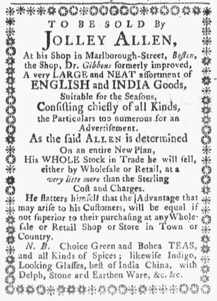
“ALLEN … will sell … at a very little more than the Sterling Cost.”
Jolley Allen made his advertisements in the Boston Evening-Post, the Boston Gazette, the Massachusetts Gazette and Boston Post-Boy, and the Massachusetts Gazette and Boston Weekly News-Letter easy to recognize in the spring of 1772. Each of them featured a border comprised of ornamental type that separated Allen’s notices from other content. Allen previously deployed this strategy in 1766 and then renewed it in the May 21, 1772, edition of the Massachusetts Gazette and Boston Weekly News-Letter. Four days later, advertisements with identical copy and distinctive borders ran in three other newspapers printed in town. Allen apparently gave instructions to the compositors at the Boston Evening-Post and the Massachusetts Gazette and Boston Post-Boy. Those advertisements had copy identical to the notice in the Massachusetts Gazette and Boston Weekly News-Letter, but the compositors made different decisions about the format (seen most readily in the border of Allen’s advertisement in the Massachusetts Gazette and Boston Post-Boy). Allen’s advertisement in the Boston-Gazette, however, had exactly the same copy and format as the one in the Massachusetts Gazette and Boston Weekly News-Letter. For some of their advertisements, newspapers in Boston apparently shared type already set in other printing offices.
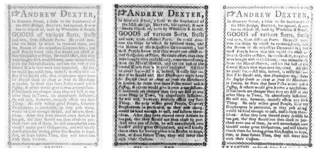
That seems to have been the case with Andrew Dexter’s advertisement. He also included a border around his notice in the May 21 edition of the Massachusetts Gazette and Boston Weekly News-Letter. The same advertisement ran in the Boston Evening-Post four days later. It looks like this was another instance of transferring type already set from one printing office to another. The compositor for the Boston Evening-Post may have very carefully replicated the format of Dexter’s advertisement that ran in the Massachusetts Gazette and Boston Weekly Mercury, but everything looks too similar for that to have been the case. In particular, an irregularity in closing the bottom right corner of the border suggests that the printing offices shared the type once a compositor set it. They might have also shared with the Boston-Gazette. Dexter’s advertisement also ran in that newspaper on May 25. It had the same line breaks and italics as Dexter’s notices in the other two newspapers. The border looks very similar, but does not have the telltale irregularity in the lower right corner. Did the compositor make minor adjustments?
It is important to note that these observations are based on examining digitized copies of the newspapers published in Boston in 1772. Consulting the originals might yield additional details that help to clarify whether two or more printing offices shared type when publishing these advertisements. At the very least, the variations in Allen’s advertisements make clear that he intentionally pursued a strategy of using borders to distinguish his advertisements in each newspaper that carried them. The extent that Dexter meant to do the same or simply benefited from the printing offices sharing type remains to be seen after further investigation.
**********

**********