What was advertised in a revolutionary American newspaper 250 years ago this week?
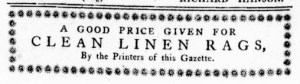
“A GOOD PRICE GIVEN FOR CLEAN LINEN RAGS, By the Printers of this Gazette.”
John Dixon and William Hunter continued to publish the Virginia Gazette on a smaller sheet than usual two weeks after running a notice that explained the circumstances. The “present Scarcity of Paper” forced them to resort to what they had on hand, the smaller sheets, but they assured readers that despite “the Size of this Gazette” it did contain “all the material Intelligence that came to Hand this Week.” The printers also declared that a “considerable Supply of Paper is daily expected from NEW YORK and PHILADELPHIA.” Once they received it, “our Customers shall be served as formerly.” Those deliveries took longer than anticipated. Dixon and Hunter expanded the June 8, 1776, edition to eight pages printed on the smaller sheet, allowing them to disseminate more news and advertisements. They did so again with the June 15 edition. The new format meant that that could not include the usual masthead at the top of the first page, but that may have been the least of Dixon and Hunter’s concerns.
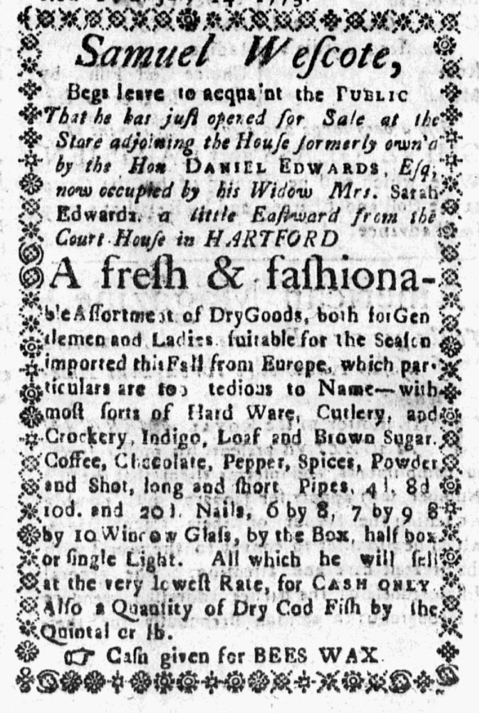
The printers aimed to do their part to increase the production of paper in the colonies amid the disruption in trade with England due to the war. That meant collecting linen rags that could be transformed into paper. They concluded the June 15 edition with a short advertisement, just three lines, that proclaimed, “A GOOD PRICE GIVEN FOR CLEAN LINEN RAGS, By the Printers of this Gazette.” A border comprised of printing ornaments enclosed that notice, distinguishing it from all the other advertisements in that issue. Dixon and Hunter used printing ornaments sparingly. Plain lines separated most news items and paid notices, though a delicate line of decorative type indicated where news ended and advertisements began on the fifth page of that issue. Even bolder lines of decorative type appeared above and below the poem in the upper left corner on the final page (a weekly feature in many colonial newspapers), setting the poet’s corner apart from the advertisements. Dixon and Hunter also enclosed an initial capital for the first news item on the first page within decorative type. Beyond these few examples, they did not use printing ornaments in that issue of the Virginia Gazette. That made the border enclosing their call for “CLEAN LINEN RAGS” even more remarkable. Even if readers quickly passed over other advertisements, the printers wanted to increase the chances that they took note of that final notice.