December 1

What was advertised in a colonial American newspaper 250 years ago today?

Dec 1 - 12:1:1768 South-Carolina Gazette
South-Carolina Gazette and Country Journal (December 1, 1768).

“EUROPEAN GOODS”

Two days after their advertisement for “A LARGE AND COMPLEAT ASSORTMENT OF EUROPEAN GOODS” dominated the front page of the South-Carolina Gazette and Country Journal, Webb and Doughty inserted the same advertisement in the December 1, 1768, edition of the South-Carolina Gazette. The advertisements featured identical copy but variations in typography. The most significant aspect of the advertisement’s format, however, carried over from one newspaper to the other. Webb and Doughty’s advertisement spanned two columns, distinguishing it from all others on the same page.

For most eighteenth-century newspaper notices the advertiser wrote the copy but the compositor determined the format. Some advertisers placed the same notice, at least as far as the copy was concerned, in multiple newspapers, but those notices varied in appearance as the result of decisions made by compositors. Advertisements that retained particular features across multiple publications, such as the decorative border that enclosed Jolley Allen’s advertisements, testify to explicit instructions given by advertisers. Most advertisers seemed content to entrust the graphic design to the printing office, but it was possible for advertisers to exert more control over the appearance of notices they paid to insert in colonial newspapers.

It appears that Webb and Doughty did offer instructions to the compositors at the South-Carolina Gazette and the South-Carolina Gazette and Country Journal. It seems unlikely that the two would have independently made the same decision to create advertisements that spanned two columns. (Unfortunately, Webb and Doughty did not place the same advertisement in the South-Carolina and American General Gazette. Perhaps they tried but the printer rejected any special instructions.) The compositors still exercised the discretion to make other decisions about the format of Webb and Doughty’s advertisement. The list of goods appeared as a paragraph in the South-Carolina Gazette and Country Journal, but as three narrow columns in the South-Carolina Gazette. The names of the merchants appeared in the largest font in the South-Carolina Gazette and Country Journal, but “EUROPEAN GOODS” appeared as the most prominent headline in the South-Carolina Gazette.

Although Webb and Doughty’s advertisement was the only one that spanned two columns on its page, two notices on the front page also spanned two columns. One for “SALES by the Provost-Marshal” was a somewhat regular feature. The headline enclosed in a decorative border occasionally graced advertisements of various lengths. The other, an advertisement for “A COMPLEAT ASSORTMENT OF GOODS” placed by Mansell, Corbett, and Roberts,” had the same format as Webb and Doughty’s advertisement. It spanned two columns. The list of goods was organized into three columns. What explains its appearance? Did Mansell, Corbett, and Roberts see Webb and Doughty’s advertisement in the South-Carolina Gazette and Country Journal and choose to adopt its format themselves? Or did the compositor at the South-Carolina Gazette decide to experiment with that format in other advertisements of sufficient length?

November 29

What was advertised in a colonial American newspaper 250 years ago today?

Nov 29 - 11:29:1768 South-Carolina Gazette and Country Journal
South-Carolina Gazette and Country Journal (November 29, 1768).

“WEBB & DOUGHTY, HAVE JUST IMPORTED A LARGE AND COMPLEAT ASSORTMENT OF EUROPEAN GOODS.”

As a result of its length and, especially, its graphic design, Webb and Doughty’s advertisement for a “LARGE AND COMPLEAT ASSORTMENT OF EUROPEAN GOODS” dominated the front page of the November 29, 1768, edition of the South-Carolina Gazette and Country Journal. No other item in that issue, neither news nor other paid notices, rivaled Webb and Doughty’s call to prospective customers to purchase the array of goods they had “JUST IMPORTED” from London and Liverpool.

Their advertisement occupied a privileged place, appearing immediately below the masthead. That alone would have drawn the eyes of readers, but the unique format increased the likelihood that subscribers and others would take note. Webb and Doughty’s advertisement extended across two of the three columns, unusual for any sort of content in the South-Carolina Gazette and Country Journal and other colonial newspapers. This advertisement would have otherwise filled an entire column, but that long-and-narrow format would have been much more familiar to readers. Due to that familiarity, it would not have been as visually striking as the lengthy list of goods that seemed to overflow the boundaries of its column. Overall, this advertisement accounted for one-quarter of the content on the first page.

Spanning two columns also allowed Webb and Doughty to mobilize a headline that would not have been possible in a single column. The additional space allowed them to increase the size of the font for both their names and “EUROPEAN GOODS.” Indeed, “WEBB & DOUGHTY” appeared in a larger font than “SOUTH-CAROLINA JOURNAL,” shifting attention away from the masthead in favor of the advertisement or, at the very least, setting the two in competition. The masthead proclaimed that the newspaper “Contain[ed] the freshest Advices, both Foreign and Domestic,” but readers had to turn to the second page to encounter any news. Webb and Doughty’s oversized advertisement made it clear that advertising was the order of business in this issue of the South-Carolina Gazette and Country Journal. In addition to Webb and Doughty’s advertisement, other paid notices filled three of four pages in the November 29 edition.

Webb and Doughty’s merchandise did not much differ from what competitors offered in their own advertisements, but the graphic design significantly deviated from the appearance of other advertisements for consumer goods and services in colonial newspapers. Webb and Doughty did not rely on copy alone to market their goods. Instead, they incorporated typographical innovation into their marketing strategy.

November 25

What was advertised in a colonial American newspaper 250 years ago today?

Nov 25 - 11:25:1767 Georgia Gazette
Georgia Gazette (November 25, 1767).

“LOAF SUGAR, BOHEA TEAD, MENS SADDLES.”

The typography of John Rae’s advertisement distinguished it from others that ran in the November 25, 1767, edition of the Georgia Gazette. Most of the items for sale in his list-style advertisement appeared in capital letters, a style deployed sparingly elsewhere among the paid notices. This indicates that the advertiser sometimes exercised some influence over the format of advertisements in the eighteenth century, even though standard practice dictated that the advertisers write copy but leave it to the discretion of printers and compositors to determine the layout and other typographical aspects of advertisements.

Rae’s advertisement suggests collaboration between advertiser and compositor. Compared to newspapers printed in other colonies, especially in the largest port cities, the Georgia Gazette featured relatively little innovative typography in its advertisements. The compositor generally adhered to a particular format in order to achieve speed and efficiency when setting type. Rae may not have specifically instructed that his goods appear in capital letters; instead, he may have merely requested some unique attribute to attract the attention of potential customers. The compositor, less imaginative than counterparts in printing offices in other colonies, may have considered the capital letters an adequate solution.

The headline – “The Subscriber has for Sale” – in an ornate font also may have been an attempt to create a distinctive visual style for Rae’s advertisement. Four other advertisements in the November 25 issue included headlines: “Wanted to Hire,” “Wanted on Hire,” “To be Hired by the Month or Year,” and “Brought to the Work-house.” Each of these introduced advertisements concerning servants or slaves, again hinting that the compositor devised particular methods for setting type for specific kinds of advertisements. Rae may have disrupted that system by requesting that his headline appear in that font. Alternately, when pressed to spruce up Rae’s advertisement, the compositor may have resorted to a familiar method that did not require excessive creativity. The compositor may have been capable of only limited innovation.

The visual aspects of Rae’s advertisement raise many questions about the process that went into creating it. It may be tempting to dismiss its format as arbitrary or haphazard, but comparing it to others on the same page reveals that someone – advertiser, compositor, or the two in collaboration – made deliberate choices in creating an advertisement that differed from all others in the same issue.

September 13

What was advertised in a colonial American newspaper 250 years ago this week?

Sep 13 - 9:10:1767 New-York Journal
New-York Journal (September 10, 1767).

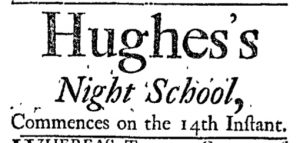
“Hughes’s Night School, Commences on the 14th Instant.”

In early September 1767, Hughes turned to the New-York Journal to advertise the opening of his night school in the middle of the month. His entire notice consisted of only eight words: “Hughes’s Night School, Commences on the 14th Instant.” Given the brevity of this advertisement, especially in comparison to those placed by other schoolmasters throughout the colonies, Hughes must have assumed that the general public was already aware of all the important details, everything from the curriculum to the hours of instruction to the location.

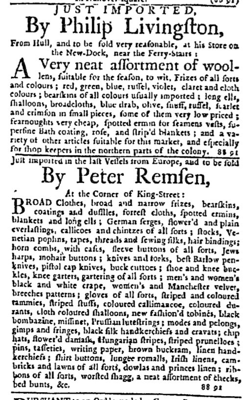
What Hughes’s advertisement lacked in relaying information it made up for in experimenting with layout designed to attract the attention of potential students. John Holt, the printer of the New-York Journal, and the compositor had developed a fairly standard visual appearance for advertisements inserted in that newspaper. They used a single font size for news items and most of the text included in advertisements, but headlines for advertisements (most often an advertiser’s name) appeared in a significantly larger font, regardless of the length of the advertisement. The first line of the body of the advertisement often featured a font only slightly larger than that used for the remainder. Advertisements by Philip Livingston and Peter Remsen that appeared in the same column as Hughes’s advertisement fit the general pattern when it came to the graphic design of paid notices in the New-York Journal.

Sep 13 - Extra Adverts from New-York Journal
New-York Journal (September 10, 1767).

Every word and every line of Hughes’s advertisement appeared in larger font sizes. The size of “Commences on the 14th instant,” the smallest in this advertisement, paralleled that of headlines in other advertisements throughout the standard issue and the supplement. The size of “Night School” rivaled the size of the newspaper’s title in the masthead. The size of the schoolmaster’s name far exceeded anything else printed in the issue or the supplement. Hughes’s message to potential students was short and straightforward, but the visual aspects had been designed to distinguish it from everything else on the page.

Newspapers published in colonial America’s largest cities in the 1760s often had a surplus of advertising, so much that they often had to print supplements to accommodate all of them. Space was limited, causing printers and compositors to standardize some of the visual aspects, including limiting the size of most text in advertisements. On occasion, however, they experimented with other formats that would have had a much different effect on readers accustomed to a particular style. Hughes’s relatively short advertisement for his “Night School” certainly stood out on the page.

April 7

GUEST CURATOR:  Maia Campbell

What was advertised in a colonial newspaper 250 years ago today?

Apr 7 - 4:7:1766 Boston-Gazette
Boston-Gazette (April 7, 1766).

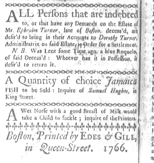
“A Quantity of choice Jamaica FISH to be Sold.”

Trade was, of course, a crucial part of colonial life. Since the colonists could not grow and produce everything they needed, the colonies traded the products they did make for items produced elsewhere, such and sugar, tea, and coffee. Most of their trade was with Britain and British colonies.

This is where Jamaica comes in. It is peculiar to me that Boston would import fish from Jamaica, when New England is known for its seafood as well. However, I think this import has much to do with trade with England. As Jamaica was an English colony, Britain regulated its imports and exports, as it did with the American colonies. Trade between the colonies was not uncommon. Also, even though New England was known for its seafood, the exotic appeal of “Jamaica FISH” could have been strong as well. It would have been a change to receive fish from elsewhere within the British Empire instead of having fish from New England all the time.

**********

ADDITIONAL COMMENTARY:  Carl Robert Keyes

Today’s advertisement is very brief compared to the one Maia selected for yesterday. In general, it is shorter than most of the other advertisements in the same issue of the Boston-Gazette. It also appeared as nearly the last item in that issue. Only a two-line advertisements for a “Wet Nurse with a good Breast of Milk” and the colophon (“Boston, Printed by EDES & GILL, in Queen-Street. 1766.”) followed Samuel Hughes’s notice that he sold “A Quantity of choice Jamaica FISH.”

In length and placement, this advertisement likely did not garner the same attention as yesterday’s advertisement for a political pamphlet that appeared at the top of the first page alongside political news. Still, the advertiser and the printer included some features intended to attract the attention of potential customers, making it more than just a bland commercial notice.

Samuel Hughes made an appeal to quality when he described the fish as “choice.” Throughout the eighteenth century, appeals to price and quality were among those most frequently deployed by advertisers. The printers varied the size and style of the font, putting “Jamaica” and “Samuel Hughes” in italics and capitalizing “FISH.” Ornamental type separated this advertisement from those that appeared above and below.

Apr 7 - Final Adverts
Final items that appeared in this issue of the Boston-Gazette (April 7, 1766).

By today’s standards, this advertisement may not appear especially engaging. It lacks the proverbial bells and whistles that we associate with marketing in the modern world. Yet it helps to demonstrate the evolution of advertising. Compare it to the advertisements that appeared in the Boston News-Letter fifty years earlier. Today’s advertisement may look rather stark to our eyes, but it showed evidence of innovation in the eighteenth century.

Apr 7 - Adverts 4:2:1716 Boston News-Letter
The entire advertising section of an issue of the Boston News-Letter (April 2, 1716).