
What was advertised in a colonial American newspaper 250 years ago this week?
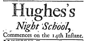
“Hughes’s Night School, Commences on the 14th Instant.”
In early September 1767, Hughes turned to the New-York Journal to advertise the opening of his night school in the middle of the month. His entire notice consisted of only eight words: “Hughes’s Night School, Commences on the 14th Instant.” Given the brevity of this advertisement, especially in comparison to those placed by other schoolmasters throughout the colonies, Hughes must have assumed that the general public was already aware of all the important details, everything from the curriculum to the hours of instruction to the location.
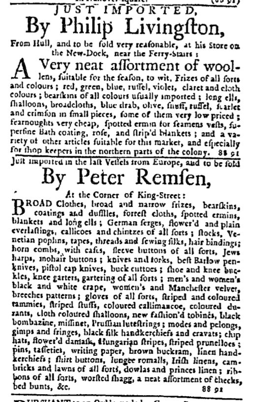
What Hughes’s advertisement lacked in relaying information it made up for in experimenting with layout designed to attract the attention of potential students. John Holt, the printer of the New-York Journal, and the compositor had developed a fairly standard visual appearance for advertisements inserted in that newspaper. They used a single font size for news items and most of the text included in advertisements, but headlines for advertisements (most often an advertiser’s name) appeared in a significantly larger font, regardless of the length of the advertisement. The first line of the body of the advertisement often featured a font only slightly larger than that used for the remainder. Advertisements by Philip Livingston and Peter Remsen that appeared in the same column as Hughes’s advertisement fit the general pattern when it came to the graphic design of paid notices in the New-York Journal.
Every word and every line of Hughes’s advertisement appeared in larger font sizes. The size of “Commences on the 14th instant,” the smallest in this advertisement, paralleled that of headlines in other advertisements throughout the standard issue and the supplement. The size of “Night School” rivaled the size of the newspaper’s title in the masthead. The size of the schoolmaster’s name far exceeded anything else printed in the issue or the supplement. Hughes’s message to potential students was short and straightforward, but the visual aspects had been designed to distinguish it from everything else on the page.
Newspapers published in colonial America’s largest cities in the 1760s often had a surplus of advertising, so much that they often had to print supplements to accommodate all of them. Space was limited, causing printers and compositors to standardize some of the visual aspects, including limiting the size of most text in advertisements. On occasion, however, they experimented with other formats that would have had a much different effect on readers accustomed to a particular style. Hughes’s relatively short advertisement for his “Night School” certainly stood out on the page.