January 30

What was advertised in a colonial American newspaper 250 years ago today?
Jan 30 - 1:30:1768 Providence Gazette
Providence Gazette (January 30, 1768).

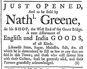
“JUST OPENED, and to be Sold by Nathl. Greene.”

To modern readers it may appear that Nathaniel Greene had just launched a new venture when he placed his advertisement in the January 30, 1768, edition of the Providence Gazette. After all, the first line announced in capital letters that he had “JUST OPENED” his shop at “the West End of the Great Bridge.” Residents of Providence in the late 1760s, however, would have understood this advertisement rather differently. Even if they had never visited, a great many would have been aware of his shop already. Readers of the Providence Gazette would have been exposed to Greene’s advertisements fairly regularly for more than a year. For instance, in August 1766 he had placed an advertisement that included the same location for “his Shop, on the West Side of the Great Bridge, Providence.”

So what did Greene mean when he proclaimed that he had “JUST OPENED” in late January 1768? This phrase described his merchandise rather than his location. His advertisement informed potential customers that he had updated his inventory and now offered a “neat Assortment of English and India GOODS, of all Kinds” that he had not previously made available. He attempted to entice consumers to examine his wares by presenting those goods as new rather than leftovers that had been lingering on the shelves.

That appeal may have lost some of its initial power to persuade by the end of January. Greene’s advertisement first ran in the January 2 issue, the promise of new merchandise coinciding with the new year. It then ran in five consecutive weekly issues, becoming as familiar to readers as the location of Greene’s shop, before being discontinued in the first issue published in February.

When it first appeared, however, the headline “JUST OPENED” distinguished Greene’s goods from those carried by his competitors – Joseph and William Russell, John Mathewson, Benoni Pearce, Thompson and Arnold, Jonathan Russell, and Darius Sessions – who had been advertising in late December and continued in January. Many of those competitors composed longer advertisements and purchased more space in the Providence Gazette. Only one, however, utilized a headline that promoted some aspect of their goods: Thompson and Arnold underscored they set “Very CHEAP” prices. In response, Greene chose an alternate appeal to emphasize in his headline. In the body of his notice he did pledge “to sell as low as any that are sold in this Town,” but only after demanding prospective customers’ attention with his “JUST OPENED” headline.

January 2

What was advertised in a colonial American newspaper 250 years ago today?

Jan 2 - 1:2:1768 Providence Gazette
Providence Gazette (January 2, 1767).

“Very CHEAP.”

The typography of Thompson and Arnold’s advertisement in the January 2, 1768, edition of the Providence Gazette deviated from the standard format for notices placed by merchants and shopkeepers throughout the rest of the issue. Each advertisement had a headline of sorts, but in most instances the headline announced the name of the advertiser. In fonts several sizes larger than the text for the rest of the advertisement, those headlines marked notices inserted by Samuel Carew, Nathl. Greene, J. Mathewson, Benoni Pearce, Jonathan Russell, J. & Wm. Russell, and Darius Sessions. Some of them abbreviated their names in order to fit on a single line.

Thompson and Arnold’s notice, on the other hand, included their names in larger font than most of the advertisement yet reserved the largest font for a marketing appeal that appeared first, preceding their names and all other information included in the advertisement. “Very CHEAP” proclaimed their headline, immediately signaling to prospective customers what kinds of prices they could expect to pay if they decided “to call at [Thompson and Arnold’s] Store, near the Great Bridge.” Each of the other advertisers included an appeal to price somewhere in their notices. Some deployed elaborate language to convince consumers that they sold their wares “cheaper than any Person or Persons in Providence” or “at the very cheapest rate.” Yet readers had to at least skim the notices places by J. Mathewson, Jonathan Russell, and their counterparts to encounter those appeals to price. Associating low prices with Thompson and Arnold required nothing more than a quick glance at their advertisement.

Perhaps the deployment of this typography was merely circumstantial in this case. After all, the name of their partnership contained more characters than the much shorter Samuel Carew or Darius Sessions and could not be abbreviated conveniently like Nathl. Greene or J. & Wm. Russell. Neither situation, however, prevented advertisers and the compositor devising other solutions that still gave primacy to the name of the advertiser in other advertisements elsewhere in the same issue. Nicholas Brown and Company, for instance, listed Brown’s name in large font on the first line, followed by “and COMPANY” in middling-sized font (but strategic capitals) on the next line. “THURBER AND CAHOON” used fonts as large as those in any other advertisement for their names, inserting one word on each of the first three lines of their advertisement.

Thompson and Arnold could have adopted a similar strategy. Doing so would have adhered to custom when it came to the standard format for advertisements in the Providence Gazette and other newspapers throughout the colonies in the 1760s. Finding themselves in the same position as their competitors – making an appeal to price – the partners innovatively wrote their copy in such a way that made their marketing strategy double as the headline for their advertisement. As a result, the typography of their advertisement promoted their business in a manner unique among the paid notices that appeared throughout the same issue.