June 5

What was advertised in a colonial American newspaper 250 years ago this week?

Norwich Packet (June 2, 1774).

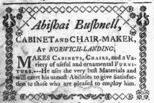
“CABINETS, CHAIRS, and a variety of useful and ornamental FURNITURE.”

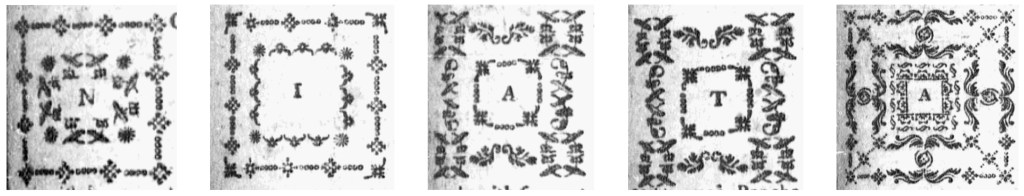
Alexander Robertson, James Robertson, and John Trumbull had been publishing the Norwich Packet for less than a year when Abishai Bushnell, “CABINET AND CHAIR-MAKER,” ran an advertisement with distinctive graphic design elements.  One of the printers or one of the compositors who worked in the printing office enclosed Bushnell’s copy within a border comprised of decorative ornaments.  That set it apart from other content, both news and advertising, in the Norwich Packet.  Bushnell may have also arranged to have his advertisement printed separated to use as labels for the “CABINETS, CHAIRS, and a variety of useful and ornamental FURNITURE” he made in his shop.

Except for the packet ship carrying letters from one port to another depicted in the masthead, the Norwich Packet did not usually feature visual images, neither to accompany news nor to adorn advertisements.  That included woodcuts of ships, houses, horses, indentured servants, and enslaved people, stock images that many printers made available to advertisers.  Yet the compositors did make liberal use of printing ornaments to indicate where one news item or editorial ended and another began and, especially, to separate advertisements from each other.  An intricate border also enclosed the first letter of the first word in the first article on the first page of each edition of the Norwich Packet, a design that changed every few weeks.  The masthead also made use of decorative type above and below the date of the newspaper, though that was a more recent innovation as the compositor experimented with the appearance of the front page.

Apparently, that was enough to convince Bushnell that Robertson, Robertson, and Trumbull could produce an advertisement that would attract attention with an ornate border that made it unlike anything else that appeared in the pages of the Norwich Packet.  The cabinetmaker almost certainly placed a special order or gave specific instructions about how he wished his advertisement to look.  After all, even though the compositor incorporated a lot of decorative type into each edition of the newspaper, no other advertisements received such treatment.  Bushnell did not opt for a woodcut of a chair or other piece of furniture representing his trade, but he did find a way to make his advertisement more visible and more memorable.

Decorative borders enclosing the first letter of the first word in the first item on the first page of the Norwich Packet (left to right: March 24, 1774; April 21, 1774; April 28, 1774; May 5, 1774; May 12, 1774).

May 7

What was advertised in a colonial American newspaper 250 years ago today?

Connecticut Journal (May 7, 1773).

ALL Persons indebted for this Paper, whose Accounts have been above 12 Months standing, are requested to make immediate Payment.”

It was the only decorative type in the May 7, 1773, edition of the Connecticut Journal and New-Haven Post-Boy.  It had been the only decorative type in the previous issue of that newspaper.  It would be the only decorative type in the following issue.  Thomas Green and Samuel Green, the printers, used decorative type sparingly.  What prompted them to deploy it in three consecutive issues in the spring of 1773?  They wished to call attention to their own notice that called on “ALL Persons indebted for this Paper, whose Accounts have been above 12 Months standing … to make immediate Payment.”  Such notices appeared frequently in newspapers throughout the colonies.  Printers often gave them privileged places to help direct readers to them.  Less often, they used decorative type to distinguish their notices from other advertisements.

Connecticut Journal (April 23, 1773).

The Greens enclosed their notice within an ornate border, enhancing its visibility no matter where it appeared on the page, whether near the bottom of the last column on the third page when it first ran on April 30 or as the last item on the last page in subsequent issues on May 7 and May 14.  No other advertisements in those issues featured decorative type, nor did the remainder of the contents.  In the previous issue published on April 23, a single line of printing ornaments that separated news items comprised the extent of decorative type.  After the Greens discontinued their notice, printing ornaments depicting skulls and bones appeared above a death notice for “Mrs. MARY LOTHROP, the agreable Consort of Mr. John Lothrop, of this Town,” in the May 21 edition.  No other decorative type appeared among the news or advertisements.

Connecticut Journal (May 21, 1773).

The Greens certainly had printing ornaments among their type.  They apparently believed that decorative type had practical value, that it could draw attention to an advertisement they considered important.  While they recognized the potential for adorning advertisements and other content, they did not embrace all the possible uses of printing ornaments in their newspaper in the eighteenth century.  That innovation came later.  Like other colonial printers, the Greens produced pages rather conservative in appearance compared to the vibrant use of printing ornaments in advertisements in many nineteenth-century newspapers.

October 8

What was advertised in a colonial American newspaper 250 years ago today?

South-Carolina Gazette (October 8, 1772).

“Dancing & Fencing.”

“THE Sign of the Golden Cup.”

Mr. Pike, a dancing master, and Thomas You, a silversmith, both used graphic design to draw attention to their advertisements in the October 8, 1772, edition of the South-Carolina Gazette, yet they adopted different strategies.  Their notices further enlivened the vibrant graphic design that distinguished notices in that newspaper from those that ran in other newspapers.  The compositor for the South-Carolina Gazette made liberal use of varying font sizes, gothic letters for headlines, italics, capitals, and centering compared to advertisements.

That being the case, the compositor may have played a role in how the dancing master used decorative type and gothic letters to enhance his advertisement.  The headline “Dancing & Fencing” in gothic letters appeared inside a border composed of printing ornaments above a secondary headline spread over three lines: “PIKE’s ACADEMY / for / DANCING and FENCING.”  Compare that to a similar advertisement that Pike ran in the South-Carolina Gazette and Country Journal.  It featured only one headline, “DANCING and FENCING,” that did not appear in a different font than the rest of the advertisement.  Rather than constituting a second headline, “PIKE’s ACADEMY, for FENCING and DANCING” was part of the first paragraph of the advertisement.  An enterprising compositor at the South-Carolina Gazette likely played a significant role in designing Pike’s advertisement, perhaps assuming full responsibility without consulting the advertiser.

On the other hand, You almost certainly submitted instructions to include a woodcut depicting a golden cup in his advertisement for the merchandise he sold at the “Sign of the Golden Cup.”  You commissioned that image for his exclusive use, previously inserting it in advertisements in the South-Carolina Gazette in December 1770 and March 1771.  Prior to that, he used a different woodcut in his advertisements in December 1766 and July 1767.  He seemed to appreciate that images helped draw attention to his notices.  How to incorporate an image, however, he may have left to the discretion of the compositor.  In 1772, his woodcut of a golden cup appeared in the center, flanked by his name and location.  In earlier advertisements, it was positioned to the left, replicating the placement of woodcuts depicting ships that adorned other notices.

The advertisements in the South-Carolina Gazette testify to both the role of the compositor in designing newspaper notices and occasional collaboration or consultation involving both the compositor and the advertiser.  Rather than dense text, variations abounded in the advertisements in that newspaper, making the South-Carolina Gazette one of the most visually interesting publications in the early 1770s.

July 17

What was advertised in a colonial American newspaper 250 years ago today?

New-London Gazette (July 17, 1772).

“Articles of JEWELLERY.”

John B. Brimmer stocked an array of goods at his store in Norwich Landing, Connecticut, in the summer of 1772.  In an advertisement in the New-London Gazette on July 17, he promoted a “great Variety of English and Hard Ware Goods,” but claimed to have “too great a Variety to be enumerated in an Advertisement.”  That differed from his marketing efforts the previous summer, but perhaps Brimmer determined that he did not wish to incur the expense of inserting lengthy lists of his goods in the newspaper.  He did list a couple of dozen items in a dense paragraph that included “best London Pewter,” “Brass Kettles,” “Iron Tea-Kettles,” concluding with “&c. &c. &c.”  In repeating the abbreviation for et ceterathree times, he suggested to prospective customers that they would discover much more when they visited his store.

Brimmer also informed the public that he carried many “Articles of JEWELLERY.”  Those items he did choose to enumerate, listing “Cypher Drops,” “Brilliants for Rings,” “Cyphers for Buttons,” “Brilliant Drops,” and “Sparks and Garnets.”  To draw attention to this merchandise, Brimmer arranged it in two columns with only item on each line.  Decorative type separated the two columns, giving the advertisement a unique visual component compared to any other notice in that issue of the New-London Gazette.  Only the “POETS CORNER,” a weekly feature at the top of the final page, featured anything similar, lines of decorative type appearing both above and below its headline.

Like most eighteenth-century advertisers, Brimmer relied on the copy to do most of the work in marketing his goods.  He made appeals to consumer choice, invoking the word “variety” more than once, and promised low prices.  However, he also introduced a bit of graphic design to engage readers of the New-London Gazette.  The decorative type enhanced the visibility of his advertisement, distinguishing it from others.