July 6

What was advertised in a colonial American newspaper 250 years ago today?

Essex Journal (July 6, 1774).

“Hour and Half-hour Glasses … of the neatest sort.”

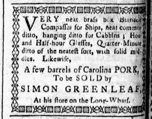
Simon Greenleaf advertised “VERY neat brass box Binnacle Compasses for Ships” and hourglasses “of the neatest sort” for sale at his store “on the Long-Wharf” in Newburyport in the summer of 1774.  He also hawked a “few barrels of Carolina PORK” in his advertisement in the Essex Journal.  Readers likely considered the decorative border that enclosed Greenleaf’s notice the most distinctive aspect of his marketing efforts.  It certainly distinguished his notice from the other advertisements in the July 6 edition and had done so since its first appearance on June 22.

Greenleaf apparently made a request when he submitted his copy to the printing office or met with the printer, Henry-Walter Tinges, to work out an arrangement for this enhancement to his advertisement.  Tinges and Isaiah Thomas commenced publication of the Essex Journal seven months earlier, with Tinges running the printing office in Newburyport while Thomas continued publishing the Massachusetts Spy in Boston.  Had Thomas overseen the Essex Journal, Greenleaf might not have managed to have the border included in his advertisement.  In the past, Thomas seemingly had not been amenable to such flourishes in the Massachusetts Spy, even when advertisers managed to have borders included with their notices published simultaneously in other newspapers.  Ultimately, graphic design depended not only on the imagination of advertisers and compositors but also the preferences of printers who published colonial newspapers.

For the Essex Journal, Greenleaf’s advertisement was a milestone.  It was the first that incorporated decorative type.  Tinges had experiments with using ornaments to as dividers between news items and in the headline for the “POETS-CORNER” on the final page of the newspaper.  Occasionally, he placed the first letter of the first word in an article or letter within a decorative border, but this was the first time that a border enclosed any content, whether news or advertising.  In addition, Tinges did not provide any of the common stock images, such as ships or houses, for the use of advertisers.  Throughout the publication of the Essex Gazette to that point, the only visual images appeared in the masthead, the coat of arms of the colony on the left of the title and a packet ship on the right.  That made Greenleaf’s advertisement even more noteworthy and memorable when readers encountered it since its appearance differed from anything else in that newspaper.

June 5

What was advertised in a colonial American newspaper 250 years ago this week?

Norwich Packet (June 2, 1774).

“CABINETS, CHAIRS, and a variety of useful and ornamental FURNITURE.”

Alexander Robertson, James Robertson, and John Trumbull had been publishing the Norwich Packet for less than a year when Abishai Bushnell, “CABINET AND CHAIR-MAKER,” ran an advertisement with distinctive graphic design elements.  One of the printers or one of the compositors who worked in the printing office enclosed Bushnell’s copy within a border comprised of decorative ornaments.  That set it apart from other content, both news and advertising, in the Norwich Packet.  Bushnell may have also arranged to have his advertisement printed separated to use as labels for the “CABINETS, CHAIRS, and a variety of useful and ornamental FURNITURE” he made in his shop.

Except for the packet ship carrying letters from one port to another depicted in the masthead, the Norwich Packet did not usually feature visual images, neither to accompany news nor to adorn advertisements.  That included woodcuts of ships, houses, horses, indentured servants, and enslaved people, stock images that many printers made available to advertisers.  Yet the compositors did make liberal use of printing ornaments to indicate where one news item or editorial ended and another began and, especially, to separate advertisements from each other.  An intricate border also enclosed the first letter of the first word in the first article on the first page of each edition of the Norwich Packet, a design that changed every few weeks.  The masthead also made use of decorative type above and below the date of the newspaper, though that was a more recent innovation as the compositor experimented with the appearance of the front page.

Apparently, that was enough to convince Bushnell that Robertson, Robertson, and Trumbull could produce an advertisement that would attract attention with an ornate border that made it unlike anything else that appeared in the pages of the Norwich Packet.  The cabinetmaker almost certainly placed a special order or gave specific instructions about how he wished his advertisement to look.  After all, even though the compositor incorporated a lot of decorative type into each edition of the newspaper, no other advertisements received such treatment.  Bushnell did not opt for a woodcut of a chair or other piece of furniture representing his trade, but he did find a way to make his advertisement more visible and more memorable.

Decorative borders enclosing the first letter of the first word in the first item on the first page of the Norwich Packet (left to right: March 24, 1774; April 21, 1774; April 28, 1774; May 5, 1774; May 12, 1774).

January 4

What was advertised in a colonial American newspaper 250 years ago today?

Connecticut Courant (January 4, 1774).

“Loaf and Brown Sugar, Coffee, Chocolate, Peeper, Spices.”

In the fall of 1773 and into the winter of 1774, Samuel Wescote ran advertisements in the Connecticut Courant to promote a “fresh & fashionable Assortment of Dry Goods, both for Gentlemen and Ladies.”  He gave directions to his store “a little Eastward from the Court-House in HARTFORD,” informed the public that he had recently imported his inventory from Europe, and insisted that he offered such a selection that the “particulars are too tedious to Name” in a newspaper notice.  Prospective customers needed to visit his store to see for themselves!  In addition to dry goods, he stocked “most sorts of Hard Ware, Cutlery, and Crockery” as well as sugar, coffee, and spices.  Wescote pledged to sell his wares “at the very lowest Rate,” but he did not extend credit.  “CASH ONLY,” he advised.

The contents of Wescote’s advertisement replicated what appeared in others that ran in the Connecticut Courant and newspapers throughout the colonies during the era of the American Revolution.  Its format, however, differed from most others.  A border comprised of a variety of printing ornaments surrounded the notice.  The compositor did not choose a single decoration but instead incorporated many in a seemingly random order.  Most other advertisements did not feature a border, though William Beadle of Wethersfield did opt for a border around his advertisement for a “good Assortment of GOODS suitable for the present Season” that ran in some of the same issues as Wescote’s advertisement.  Where did Beadle and Wescote get the idea to request borders for their advertisements?  Maybe they noticed the borders around Caleb Bull’s advertisements when they perused the Connecticut Courant … or perhaps all of those advertisers took inspiration from another newspaper that circulated in the colony, Rivington’s New-York Gazetteer, or the Connecticut, New-Jersey, Hudson’s-River, and Quebec Weekly Advertiser.  In the summer and fall of 1773, decorative borders became a signature feature of advertisements in that newspaper.  Rivington and others who labored in his printing office certainly did not invent that particular style, but they utilized to an extent previously unknown in colonial American newspapers.  As advertisements with borders increased in number and frequency in Rivington’s New-York Gazetteer they also became more common in many newspapers printed in the region served by that newspaper.  Printers, compositors, and advertisers in towns beyond New York seemed to take note of a format that became popular in Rivington’s New-York Gazetteer.

October 3

What was advertised in as colonial American newspaper 250 years ago this week?

Rivington’s New-York Gazetteer (September 30, 1773).

“A GENERAL ASSORTMENT OF CUTLERY.”

Richard Sause joined other entrepreneurs who experimented with decorative borders enclosing their advertisements when he promoted a “GENERAL ASSORTMENT OF CUTLERY” in Rivington’s New-York Gazetteer.  The cutler had previous experience incorporating visual images into his advertisements in both the New-York Gazette and Weekly Mercury and Rivington’s New-York Gazetteer.  By the fall of 1773, many advertisements in New York’s newest newspaper featured borders, a popular means of enhancing notices.  Similar borders sometimes adorned advertisements in other newspapers, but not in the numbers and frequency that they appeared in Rivington’s New-York Gazetteer.

The September 30, 1773, edition of that newspaper, for instance, included eight advertisements with ornate borders.  Most of those notices were relatively short, a single square of text.  Among them, Dennis McReady, a tobacconist, hawked his wares and Aspinwall and Smith announced that they sold “CHOICE OLD JAMAICA SPIRIT.”  Another of these shorter announcements advised that “the Delaware Lottery for the Sale of Lands, belonging to the Earl of Stirling, will commence on Monday the first Day of November next.”  James Rivington, the printer, also enclosed his advertisement for Keyser’s Pills within a decorative border.  George Webster, “At the THREE SUGAR LOAVES,” listed a couple of items “just received from LONDON” and promised “many other Articles which will be inserted next week.”  That advertisement, however, never materialized.  Given that advertisers paid by the amount of space their notices occupied rather than the number of words, borders made advertisements more expensive.  Rivington may have also charged additional fees for the borders, making them especially attractive to entrepreneurs running shorter advertisements.

Still, some advertisers enclosed longer notices within borders.  Thomas Hazard, one of Sause’s competitors, did so with an advertisement for “Ironmongery and Cutlery,” as did Francis Lewis and Sons in their advertisement that listed dozens of items for sale at their store on Queen Street.  Among these three longer advertisements, Sause’s notice was the shortest.  He apparently appreciated the visual appeal of the border and considered it worth the investment.  Four weeks later he placed a much more extensive advertisement that extended approximately three-quarters of a column.  A decorative border enclosed the lengthy list of merchandise that Sause “JUST IMPORTED.”  Along with several other advertisers, the cutler sought to generate interest in his newspaper notices by making them more visually appealing than text alone.  The printing office seems to have encouraged this innovation.

September 2

What was advertised in a colonial American newspaper 250 years ago today?

Rivington’s New-York Gazetteer (September 2, 1773).

“An assortment of goods suitable to the season.”

A little more than four months after James Rivington commenced publication of Rivington’s New-York Gazetteer, many of the advertisements in that newspaper had a notable feature intended to attract readers’ attention.  Borders composed of decorative type enclosed five of the advertisements in the September 2, 1773, edition.  That gave the section devoted to advertising a distinctive look compared to the New-York Gazette and Weekly Mercury and the New-York Journal.  During that week, the latter did not carry any advertisements with borders.  The former carried one with a border, a short notice about “KEYSER’s PILLS” placed by Hugh Gaine.

Rivington’s New-York Gazetteer (September 2, 1773).

Gaine happened to be the printer of the New-York Gazette and Weekly Mercury.  Although he adorned one of his own advertisements with a border, he also appeared to reserve that format for his exclusive use.  S. Sp. Skinner, a distiller, ran advertisements for “the best of RUM” with identical copy in both publications, with a border in Rivington’s newspaper and without a border in Gaine’s newspaper.  The distiller also advertised, without a border, in the New-York Journal.  Rivington or a compositor in his printing office experimented with a format that enhanced the visual appeal of advertisements.  They either offered borders to advertisers or some advertisers learned that Rivington’s New-York Gazetteer would accommodate such requests.

Rivington’s New-York Gazetteer (September 2, 1773).

Other advertisements with identical copy in multiple newspapers demonstrate that Rivington incorporated a visual element not available in other printing offices in New York.  Robert Murray and John Murray ran an announcement that they dissolved their partnership and requested that “Persons Indebted to them” settle their accounts or face legal action.  Their advertisement had a border in Rivington’s New-York Gazetteer, but not in the New-York Gazette or Weekly Mercury or the New-York Journal.  Similarly, T.B. Atwood placed an advertisement for his “Medicinal Store” in all three newspapers.  It featured side-by-side columns listing patent medicines and other merchandise in each of them, apparently a format specified by the advertiser, but only Rivington’s newspaper enclosed Atwood’s notice within a decorative border.  Not only did the advertisement have a border, that border consisted of decorative type different from any that surrounded other advertisements or separated news accounts in that issue.  Taking the service to a higher level, the compositor chose printing ornaments that made the borders for each advertisement unique.

Rivington’s New-York Gazetteer (September 2, 1773).

Vincent Pearse Ashfield’s advertisement for coffee, tea, wine, and spirits also appeared in two newspapers, the New-York Gazette and Weekly Mercury and Rivington’s New-York Gazetteer, but embellished with a border in only one.  All of the advertisers whose notices had borders in Rivington’s newspaper – Ashfield, Atwood, the Murrays, and Skinner – simultaneously placed the same advertisement in at least one other newspaper.  Despite the identical copy, only the notices in Rivington’s New-York Gazetteer incorporated borders, suggesting that Rivington’s printing office worked with advertisers to offer an option not available in other newspapers.  In addition to drawing attention to those advertisements, that made the pages of Rivington’s new newspaper easy to recognize and perhaps more interesting for readers.

November 30

What was advertised in a colonial American newspaper 250 years ago today?

Boston-Gazette (November 30, 1772).

“ANDREW DEXTER’S SHOP.”

Andrew Dexter’s advertisement in the November 30, 1772, edition of the Boston-Gazette consisted of only three lines, but its design likely gave it greater impact than other notices of similar length.  A border comprised of ornamental type enclosed the entire advertisement, making the manicule that called attention to the first line an unnecessary addition.  In its entirety, the advertisement stated, “ANDREW DEXTER’S SHOP, near the Mill-Bridge, is the Place for CHEAP GOODS, after all is done and said.”

Dexter had some experience using borders to set his advertisements apart from others in newspapers published in Boston.  A lengthier advertisement that ran in the Boston Evening-Post, the Boston-Gazette, and the Massachusetts Gazette and Boston Weekly News-Letter in May featured a border.  The border was not nearly as elaborate as the one in the advertisement published in November, but so few newspaper advertisements had borders that it still served its purpose.

Boston Evening-Post (November 30, 1772).

The number of advertisers who opted for borders increased in the wake of examples that Jolley Allen, who had a long history with borders, and Dexter published in multiple newspapers in May.  On the same day that Dexter’s brief notice with the prominent border ran in the Boston-Gazette, William Bant inserted advertisements with borders in both the Boston Evening-Post and the Boston-Gazette.  Jonathan Williams, Jr., once again ran his advertisement enclosed within a border in the Massachusetts Gazette and Boston Post-Boy.  Herman Brimmer and Andrew Brimmer had a border around just their names in an advertisement in the Supplement to the Boston Evening-Post.  Later in the week, Bant and Williams ran advertisements enclosed within borders in the December 4 edition of the Massachusetts Gazette and Boston Weekly News-Letter.  The Brimmers’ advertisement with a border around their names appeared in the supplement that accompanied that issue.

About half a dozen advertisers in Boston incorporated borders into their newspaper notices, publishing them so widely that they became a familiar to readers of several publications.  The majority of advertisers did not adopt this strategy for distinguishing their notices from others, but enough did so to suggest that advertisers carefully observed the tactics deployed by their competitors, including decisions about graphic design, and planned accordingly for their own advertisements.

June 7

What was advertised in a colonial American newspaper 250 years ago this week?

New-Hampshires Gazette (June 5, 1772).

“This EVENING … will be Exhibited several serious and comic Pieces of Oratory.”

Newspaper advertisements testify to the entertainment and popular culture enjoyed in the colonies in the eighteenth century.  A notice in the June 5, 1772, edition of the New-Hampshire Gazette informed the public that they could attend “several serious and comic Pieces of Oratory, intersper’d with Music and Singing” at the “new Assembly-Room” in Portsmouth that evening.  The sponsors created a network for distributing tickets.  Those interested in the performance could purchase tickets in advance “at the Printing-Office, at Mr. Appleton’s Book-Store, and at Mr. Stavers’s Tavern.” The sponsors also included a nota bene to address potential concerns about the content of the performance: “the Public may be assured, that nothing will be delivered in the above Exhibition, but what is conducive to, and consistent with Politeness and Morality.”  Neither the “comic Pieces” nor the songs would be ribald or bawdy.

The design of the advertisement increased the chances that readers would take note of it, especially important for an “Exhibition” of oratory and music scheduled for the same day the newspaper that carried the advertisement was published.  The first line operated as a headline, announcing “This EVENING” in a font larger than any in the rest of the notice.  In addition, a decorative border, comprised of printing ornaments, encircled the advertisement, setting it apart from other content.  It was the only item in that issue, whether or news or advertising, that featured a border.  Furthermore, the printers rarely used borders in the New-Hampshire Gazette, making this advertisement even more noteworthy to regular readers.  Its placement on the page also encouraged attention.  It ran in the upper left column, the first item on the third page.  With limited time to sell tickets and attract an audience for the performance, the sponsors depended on both copy and innovative graphic design in their marketing efforts.

June 4

What was advertised in a colonial American newspaper 250 years ago this week?

Jun 4 - 6:1:1769 South-Carolina Gazette
South-Carolina Gazette (June 1, 1769).

“BREW-HOUSE.”

John Calvert and Company placed a brief advertisement in the June 1, 1769, edition of the South-Carolina Gazette to advise readers that they sold “ALE, TABLE and SHIP BEER.” The partners also offered a convenient service for their customers: delivery to “any part of the town,” provided that the buyer purchased at least five gallons.

Decorative typography, however, rather than the copy accounted for the most notable part of Calvert and Company’s advertisement. Like some other advertisers, they included a headline to draw attention: “BREW-HOUSE.” Unlike other advertisers, they arranged for a decorative border to enclose the headline, distinguishing the advertisement from almost every other in the South-Carolina Gazette. One other notice did feature a similar layout, an advertisement for the “Sloop MONTAGU” to be sold at public auction. Its headline announced “SALE by the Provost-Marshal,” also enclosed in decorative type.

The South-Carolina Gazette frequently featured such advertisements for goods, property, or enslaved men, women, and children seized by the provost marshal and to be sold to settle debts or resolve other legal disputes. Such notices benefited from the unique format, the headline in the decorative border, but other advertisements for goods and services placed by merchants, shopkeepers, artisans, and others did not incorporate such distinctive typography. Although the compositor could have made the decision independently, this suggests that Calvert and Company negotiated for that particular element of their advertisement, realizing that the headline and border would make it more visible among the advertisements that filled the final pages of the South-Carolina Gazette. Alternately, the partners could have commissioned a woodcut to spruce up their advertisement, but that likely would have incurred greater expense compared to utilizing decorative type the printer already had in hand.

In general, advertisers generated copy for newspaper notices in eighteenth-century America, but printers and compositors made decisions about graphic design. Calvert and Company’s notice suggests that advertisers sometimes observed distinctive design elements that they wished to incorporate into their own advertisements. Some likely suspected that distinctive visual elements made advertisements more effective and yielded a greater return on their investment, prompting them to borrow styles that they regularly encountered when they perused the newspapers.

May 30

What was advertised in a colonial American newspaper 250 years ago today?

May 30 - 5:30:1768 New-York Gazette Weekly Mercury
New-York Gazette: Or, the Weekly Mercury (May 30, 1768).

At the Sign of the Looking Glass & Druggist Pot.”

To adorn many of the advertisements for his “UNIVERSAL STORE,” Gerardus Duyckinck commissioned perhaps the most impressive woodcut that accompanied any advertisements in newspapers published throughout the American colonies in the 1760s. In an advertisement that extended approximately two-thirds of a column, Duyckink promoted the “Medley of Goods” he sold “At the Sign of the Looking Glass & Druggist Pot” in New York, yet it was not the amount of space the notice occupied on the page that distinguished it from others. The intricately carved woodcut likely replicated his shop sign, depicting a looking glass in an ornate frame suspended below an urn. A larger rococo frame, equally ornate, enclosed most of the copy, including a nota bene that instructed potential customers how to read the list of merchandise contained in the notice: “The above advertisement, being only the Heads, which consists of a Variety of Articles, almost every particular in each Branch can be commanded at the above Store.” In other words, Duyckinck did not publish an exhaustive list of his wares. Instead, he used a series of headers to categorize the items among his inventory, truly a “Medley of Goods.”

Prospective customers first encountered Duyckinck’s elaborate woodcut in the October 29, 1767, edition of the New-York Journal. It ran for several weeks before Duyckinck discontinued it. In the spring of 1768 it reappeared, with evidence of wear and significantly revised copy in the cartouche, but this time in the New-York Gazette: Or, the Weekly Mercury. While the printers of both newspapers had some standard woodcuts – images of horses, houses, ships, and slaves – among their type, specialized images belonged to the advertisers. Some advertisers, like clockmaker Burrows Dowdney, invested in multiple woodcuts in order to insert them in more than one newspaper simultaneously. Duyckinck may not have considered this an option; given the amount of detail evident in his woodcut, the cost for commissioning others may have been prohibitive. Instead, he rotated the image from newspaper to newspaper, placing it before the eyes of as many readers and prospective customers as possible. Doing so likely yielded the best possible return on his investment in an innovative means of making his newspaper advertisements distinctive from anything else that appeared in the public prints.

October 29

What was advertised in a colonial American newspaper 250 years ago today?

Oct 29 - 10:29:1767 New-York Journal
New-York Journal (October 29, 1767).

“The Medley of Goods.”

Gerardus Duyckinck, a prolific advertiser in New York’s newspapers in the 1760s, introduced consumers to an innovative advertisement for his “UNIVERSAL STORE” in the October 29, 1767, edition of the New-York Journal. His new advertisement enclosed most of the copy within an ornate rococo cartouche, a design suggestive of the frames for the “Pictures [and] Looking-Glasses” he sold. Visually, his advertisement was unique. Nothing else of the sort appeared in that issue of the New-York Journal, nor in any newspaper published in the colonies.

Several other advertisements included images, but all of them were comparatively crude woodcuts of ships, houses, slaves, and horses. These widely used yet generic images belonged to the printer, a standard part of the type acquired by anyone who printed a newspaper. They could be used to spruce up any relevant advertisement. Occasionally some merchants and shopkeepers commissioned woodcuts for their exclusive use, images often tied to the shop sign that marked their location. In such instances, the image appeared at the top of the advertisement before any copy, not enclosing the text, as was the case for Duyckinck’s notice.

That visual element also distinguished this advertisement from others. In general, eighteenth-century newspaper advertisements did not have borders that set them apart from other items on the same page. Printers usually inserted a line between advertisements to help readers identify where one ended and another began. Sometimes they used decorative ornaments to add some visual appeal, but borders surrounding entire advertisements were exceptionally rare. Jolley Allen experimented with rudimentary borders for his advertisements in Boston’s newspapers the previous year, but they looked primitive compared to the genteel frame that enclosed Duyckinck’s advertisement.

It would have been impossible for readers not to notice Duyckinck’s advertisement. Noticing likely led to reading and examining the advertisement in greater detail, taking in the novelty of a form both new and sophisticated. In addition, the use of an elaborate cartouche introduced a common feature of eighteenth-century trade cards, each printed on its own sheet, into colonial newspapers. The form of one influenced the other, perhaps to the delight of readers. Such an extraordinary advertisement might have also enflamed potential customers’ curiosity about the “Medley of Goods” that Duyckinck sold at his “UNIVERSAL STORE.”