Skip to content

The Adverts 250 Project

An Exploration of Advertising During the Era of the American Revolution, 250 Years Ago This Week

  • Home
  • Advertising Adverts 250
  • Guest Contributors
  • About
HomePosts tagged 'Logo'

Logo

May 16

May 16, 2021May 14, 2021 Carl Robert Keyes Daily Advert Update Brand, Logo, Massachusetts Spy, Mathematical Instrument Maker, Visual Image, William Williams, Woodcut

What was advertised in a colonial American newspaper 250 years ago today?

Massachusetts Spy (May 16, 1771).

“Mathematical Instrument-Maker.”

William Williams, a “Mathematical Instrument-Maker,” kept a shop near the Long Wharf in Boston in the early 1770s.  That location likely made it relatively easy for mariners to find him and purchase a variety of navigational tools, including compasses, sextants, and manuals.  According to his advertisement in the May 16, 1771, edition of the Massachusetts Spy, he also stocked a variety of other item, such as “Gauging and Surveying Instruments,” “large and small Perspective Glasses in Ivory,” “hanging and standing Compasses in Brass and Wood,” and “Sand-Glasses, from two Hours to a Quarter of a Minute.”  In addition, he carried some general merchandise, such as ink powder, jackknives, and “plated Shoe and Knee Buckles,” to supplement his more specialized inventory.

The most striking aspect of Williams’s advertisement, however, was not the list of items he offered for sale but instead the image of a well-dressed man holding a sextant, an instrument that measures the angle between an astronomical object, such as the sun, and the horizon for the purposes of celestial navigation.  Few visual images appeared in the Massachusetts Spy at the time Williams placed his notice.  One other advertisement included an image of a ship at sea, a woodcut that could have adorned many advertisements.  Eighteenth-century printers tended to have many woodcuts depicting ships among the printing ornaments that advertisers could choose for their notices.  The image of a captain holding a sextant, on the other hand, corresponded specifically to Williams’s occupation as a mathematical instrument maker.  That woodcut did not belong to the printer.  Instead, Williams commissioned it and retained sole authority to use it.  Other advertisers did not have access to that particular woodcut, unlike the generic images of ships, houses, and horses that printers made available.

The depiction of a captain holding a sextant not only attracted attention on a page devoid of other visual images; it also immediately signaled what kind of enterprise Williams operated.  In that regard, it served as a rudimentary logo that enhanced his marketing efforts and branded his business.  Although some advertisers previously experimented with incorporating unique visual images into their newspaper notices, the practice gained popularity in the 1770s.

Leave a comment

November 23

November 23, 2019November 23, 2019 Carl Robert Keyes Daily Advert Update Advertisement in Multiple Newspapers, Bible-in-Heart, Logo, Multiple Woodcuts, Pennsylvania Chronicle, Pennsylvania Gazette, Pennsylvania Journal, Printer, William Evitt, Woodcuts

What was advertised in a colonial American newspaper 250 years ago today?

Nov 23 - 11:23:1769 Pennsylvania Gazette
Pennsylvania Gazette (November 23, 1769).

“PRINTING-OFFICE, AT the Bible-in-Heart.”

In the fall of 1769, William Evitt opened his own printing office, having “just purchased ALL that large and valuable assortment of Printing-Types” and other equipment from the estate of Andrew Steuart. He placed advertisements in the Pennsylvania Chronicle, the Pennsylvania Gazette, and the Pennsylvania Journal to inform residents of Philadelphia, the surrounding countryside, and “the neighbouring provinces” that he ran a shop “AT the Bible-in-Heart in Second-street, between Market and Arch-streets.” In addition to “all the necessary utensils fit for carrying on the printing business,” Evitt also acquired both a well-recognized symbol and a location that had been associated with Steuart and his business. Throughout most of the 1760s Steuart operated a printing shop at the Bible-in-Heart on Second Street. The American Antiquarian Society’s catalog includes fifty-nine items with imprints that included some variation of “Printed by Andrew Steuart, at the Bible-in-Heart, in Second-Street” dated between 1760 and 1768.

Nov 23 - 11:23:1769 Pennsylvania Journal
Pennsylvania Journal (November 23, 1769).

Evitt, who served an apprenticeship with Steuart, sought to take advantage of his former master’s reputation by associating his new business with one that had been well established in Philadelphia for quite some time. He underscored that the Bible-in-Heart continued to be located “in the house where said office has been kept these some years past.” (Sometime in 1770, however, he moved to Strawberry Alley, according to his imprint.) He also made certain that the Bible-in-Heart remained a visible symbol. In addition to displaying the sign at his shop, he also incorporated the image into the advertisements he inserted in all three newspapers published in Philadelphia. In most instances an advertiser who included a unique visual image in an advertisement incurred additional expense, but Evitt may have had woodcuts of the Bible-in-Heart at his disposal among the “assortment of Printing-Types” and other “necessary utensils” that he acquired from Steuart’s estate. Determining whether Steuart previously used any of the three woodcuts that appeared in Evitt’s advertisements in the Pennsylvania Chronicle, the Pennsylvania Gazette, and the Pennsylvania Journal requires additional research. Even if Evitt did not have to commission any of the woodcuts, he still had to pay for the additional space required to include them in his advertisements, apparently an expense that he considered a good investment.

Nov 23 - 11:6:1769 Pennsylvania Chronicle
Pennsylvania Chronicle (November 6, 1769).

Some advertisers experimented with creating logos in eighteenth-century America, finding it valuable to consistently associate their businesses with particular images. That William Evitt adopted an image previously associated with another printer when he acquired Steuart’s type and equipment suggests that he considered the reputation associated with that logo so powerful that it would work to his advantage to transfer it to his own business. It also suggests that he expected the symbol to resonate with other colonists and attract customers who were previously familiar with Steuart’s work. Evitt experimented with an eighteenth-century version of transferring a trademark from one business to another. He continued to incorporate the Bible-in-Heart into his imprint for at least three years after he opened his own shop.

In his brief biography of Evitt in his monumental History of Printing in America (1810), Isaiah Thomas did not comment on Evitt’s adoption of the Bible-in-Heart as the device to identify his own printing shop.  He dismissed Evitt as a journeyman printer, but did note that he “became a soldier in the American army, and died in the service of his country.”

1 Comment

June 26

June 26, 2019June 25, 2019 Carl Robert Keyes Daily Advert Update Charles Oliver Bruff, Goldsmith, Jeweler, Logo, New-York Gazette and Weekly Mercury, Shop Sign, Sign of the Tea-pot Tankard and Ear-ring

What was advertised in a colonial American newspaper 250 years ago today?

Jun 26 - 6:26:1769 New-York Gazette Weekly Mercury
New-York Gazette and Weekly Mercury (June 26, 1769).

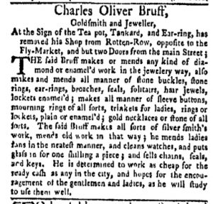
“Goldsmith and Jeweller, At the Sign of the Tea-pot, Tankard, and Ear-ring.”

When Charles Oliver Bruff, a goldsmith and jeweler, advertised in the New-York Gazette and Weekly Mercury, he described his location to prospective clients. They could find him “opposite to the Fly-Market, and but two Doors from the main Street.” Giving these directions was imperative since he had moved from his prior location on Rotten Row. Although his location had changed, another significant means of identifying his shop had not. Customers could continue to find the goldsmith and jeweler “At the Sign of the Tea-pot, Tankard, and Ear-ring.” Bruff had moved and the shop sign had moved with him.

It seemed that no matter where he set up shop in New York that Bruff continued to associate the same image with his business. In previous advertisements he listed his location as “the Corner of King-street, near the Fly-market,” though he also instructed clients to look for “the Sign of the Tea-pot, Tankard, and Ear-ring.” Taking into account his shops on King Street, Rotten Row, and, in the summer of 1769, “opposite to the Fly-Market, and but two Doors from the main Street,” Bruff displayed the same sign at three different locations. He “removed” his shop from one place to another, but the image he used to identify his business remained constant.

Bruff created a logo that made his merchandise and services more memorable by consistently using “the Sign of the Tea-pot, Tankard, and Ear-ring” to identify his business. Residents of New York spotted the image that marked his various locations, a familiar sight to those who regularly navigated the streets of the city in the late 1760s. This lent a sense of continuity to his enterprise even as Bruff moved from place to place. The image on the sign also helped to differentiate Bruff from competitors who did not make similar investments in marketing their merchandise and services.

Regularly advertising in the city’s newspapers would have increased Bruff’s visibility beyond relying on word of mouth to attract customers, but combining a recognizable image with newspaper advertisements enhanced that visibility. Over time, the “Sign of the Tea-Pot, Tankard, and Ear-ring” was not associated with a particular location but instead with the artisan who kept shop at several different locations in New York.

Leave a comment

December 29

December 29, 2018December 28, 2018 Carl Robert Keyes Daily Advert Update Brand, James Reynolds, John Elliott, Logo, Looking Glasses, Pennsylvania Gazette, Woodcut

What was advertised in a colonial American newspaper 250 years ago today?

Pennsylvania Gazette (December 29, 1768).

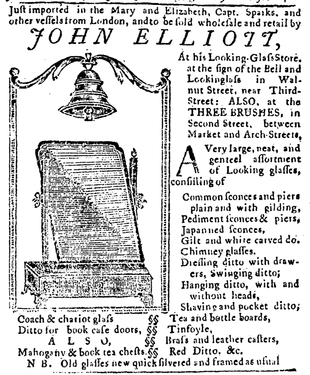
“A VERY large, neat and general assortment of looking-glasses.”

The copy they composed for their advertisements did not much differentiate the looking glass shops operated by John Elliott and James Reynolds in 1768. Both inserted an advertisement in the December 29 edition of the Pennsylvania Gazette. Elliott promoted “A VERY large, neat and general assortment of looking-glasses” at “his Looking-glass store, the sign of the Bell and Looking-glass, in Walnut Street.” Reynolds offered “A large and general assortment of looking-glasses” at his new location “nearly opposite the London Coffee-House, in Front-street.” Each advertisement even included a nota bene concerning services for maintaining looking glasses prospective customers already owned.

Given these similarities, it was visual imagery rather than copy that differentiated the two advertisements. Reynold relied on a landmark unrelated to his business when giving directions to his new location. Elliott, on the other hand, developed his own brand, instructing prospective customers to look for “the sign of the Bell and Looking-glass.” To enhance the association of that image with his business, Elliott included a woodcut depicting his shop sign in his advertisement, more than doubling the amount of space it occupied. Given how few woodcuts accompanied advertisements in the Pennsylvania Gazette, Elliott’s large image of a bell and a looking glass enclosed in a decorative frame would have certainly garnered attention. It appeared on the same page as Thomas Hale’s advertisement featuring a much smaller woodcut of a bell, an image that did not similarly increase the length of that advertisement. Elliott’s woodcut alone occupied more space than Reynolds’s entire advertisement.

Supplement to the Pennsylvania Gazette (December 29, 1768).

Throughout much of the year, Elliott demonstrated his commitment to developing an image that consumers would associate with his business. Advertisements featuring a woodcut of “the sign of the Bell and Looking-glass” appeared in multiple newspapers published in Philadelphia, including the Pennsylvania Chronicle, the Pennsylvania Gazette, and the Pennsylvania Journal. Elliott repeatedly deployed this image at his shop and in the press, saturating the local market with the logo he had chosen for his business. In the process, he made a significant investment in marketing. While it is difficult to determine if his strategy yielded better results compared to the advertisements placed by Reynolds, it is telling that Elliott considered it beneficial to devote time and expenses to a more sophisticated marketing campaign. While it might be tempting to dismiss many eighteenth-century advertisements as mere announcements, those placed by Elliott demonstrate that some entrepreneurs experimented with adopting logos and building their brand long before advertising professionals opened offices on Madison Avenue.

1 Comment

October 20

October 20, 2018October 19, 2018 Carl Robert Keyes Daily Advert Update Advertisement in Multiple Newspapers, Brand, John Elliott, Logo, Multiple Woodcuts, Pennsylvania Gazette, Pennsylvania Journal, Woodcuts

What was advertised in a colonial American newspaper 250 years ago today?

Oct 20 - 10:20:1768 Pennsylvania Gazette Postscript
Postscript to the Pennsylvania Gazette (October 20, 1768).

“The Sign of the Bell and Looking-glass.”

Logos are ubiquitous in twenty-first century marketing campaigns, but the modern advertising industry did not invent the concept of branding. Some advertisers experimented with developing readily recognized logos even before the American Revolution. Consider, for instance, John Elliott and the newspaper advertisements he placed in the fall of 1768.

Elliott ran a “Looking-glass store” at “the sign of the Bell and Looking-glass” on Walnut Street in Philadelphia. He also operated a second location “at the Three Brushes, in Second-street.” Both shop signs helped customers located Elliott’s shops, but it was the “Bell and Looking-glass” that he chose as the primary visual representation of his business. In addition to a shop sign that depicted these icons, Elliott also commissioned woodcuts of a looking glass and a bell enclosed within a frame to adorn his newspapers advertisements. These images appeared in both the Pennsylvania Journal and the Postscript to the Pennsylvania Gazette on October 20, 1768. To have an image run in two newspapers simultaneously amounted to a significant investment for Elliott, but it also demonstrated his commitment to consistency in portraying his business to prospective customers.

Other advertisers who experimented with visual images replicating their shop signs usually commissioned a single woodcut that they then ran in one newspaper for a period and eventually inserted in another, thus cementing the association by communicating it to multiple, yet sometimes overlapping, audiences. Gerardus Duyckinck, for instance, had an elaborate woodcut depicting “the Sign of the Looking Glass & Druggist Pot” that ran first in the New-York Journal for several weeks and then in the New-York Gazette: Or, the Weekly Mercury. The cost of replicating the rococo frame that enclosed his list of merchandise likely prohibited commissioning a second woodcut, so Duyckinck did his best to circulate the image by staggering its appearance in newspapers published in New York.

Oct 20 - 10:20:1768 Pennsylvania Journal
Pennsylvania Journal (October 20, 1768).

When it came to publishing woodcuts in more than one newspaper simultaneously, Elliott was not alone. Earlier in 1768 Burrows Dowdney, a clock- and watchmaker, included woodcuts depicting clocks in his advertisements in the Pennsylvania Gazette and the Pennsylvania Chronicle. Those images did not, however, mirror each other as closely as Elliott’s exceptionally similar (but not identical) woodcuts in the Pennsylvania Gazette and the Pennsylvania Journal, nor did Dowdney explicitly associate his woodcuts with his shop sign. They certainly represented the work Dowdney did, but he did not indicate that a sign marked his shop at all. In that regard Elliott was particularly innovative in his careful consistency when it came to linking a name and a corresponding image in his efforts to promote his business.

In the second half of the eighteenth century many advertisers experimented with establishing logos to represent their businesses. Although not as fully developed as modern marketing campaigns, these early efforts demonstrated a rudimentary understanding of the power of images to depict commercial endeavors and to augment recognition of particular businesses among prospective customers.

Leave a comment

August 5

August 5, 2016August 4, 2016 Carl Robert Keyes Daily Advert Update Boston Evening-Post, Brand, Heart and Crown, John Fleet, Justices Blank Certificates, Logo, Printed Blanks, Thomas Fleet

What was advertised in a colonial newspaper 250 years ago this week?

Aug 5 - 8:4:1766 Boston Evening-Post
Boston Evening-Post (August 4, 1766).

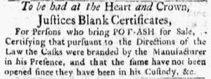
“To be had at the Heart and Crown, Justices Blank Certificates.”

For printers Thomas Fleet and John Fleet, their business was most widely recognized by the emblem of a Heart and Crown that appeared in a rococo-style cartouche in the masthead of their newspaper, the Boston Evening-Post. A sign featuring the Heart and Crown also hung outside their printing shop, announcing the location to residents and visitors alike. In effect, the Heart and Crown became the Fleets’ logo, a unique device associated specifically with them, their printing shop, and the goods and services they provided. The Heart and Crown was so widely recognized as an alternate means of identifying the Fleets’ printing shop that this advertisement did not include their names or the street on which they were located. They expected readers to recognize the Heart and Crown and associate it with their printing shop.

Aug 5 - Detail from Masthead of Boston Evening-Post
Heart and Crown:  detail from masthead of Boston Evening-Post (August 4, 1766).

Printed blanks, such as indentures and bills of lading (what we would call blank forms today), were among the goods produced and sold by the Fleets. This advertisement pertained to a certain kind of blank: “Justices Blank Certificates, For Persons who bring POT-ASH for Sale.” It appears that such blanks were used to regulate the production of potash, but they present a bit of a mystery. Eighteenth-century readers would have needed as little explanation for “Justices Blank Certificates” as they needed for “at the Heart and Crown,” but the meaning and familiarity have faded over time.

This advertisement demonstrates the ephemerality of many items printed in early America. “Justices Blank Certificates” were used so often that printers produced them in sufficient quantities to merit advertising them, yet unlike other types of printed blanks they do not seem to have survived to the twenty-first century. At least, I have not been able to turn up any examples. (Please let me know if you know of any!) Perhaps some are lurking in libraries and historical societies and have yet to be cataloged or digitized.

I have long suspected that most business forms that came off of printing presses in the eighteenth century have not survived. A precious few that were saved testify to their existence, as do the entries in printers’ ledgers that suggest that such items were frequently printed. This advertisement causes me to question how extensively commercial printed items – both printed blanks and advertisements (handbills, trade cards, billheads, broadsides) – were created and discarded in the eighteenth century. Even if they no longer exist in physical form, we know of some from advertisements and account books, but many, many others likely remain unknown. Those still extant are extraordinary remnants of a vibrant assortment of commercial printed items that circulated in early America.

Leave a comment

Recent Posts

  • February 8
  • Slavery Advertisements Published February 8, 1773
  • February 7
  • February 6
  • February 5
  • February 4
  • Slavery Advertisements Published February 4, 1773
  • February 3
  • Slavery Advertisements Published February 3, 1773
  • February 2

Recent Comments

July 28 | The Advert… on July 21
July 27 | The Advert… on March 4
July 24 | The Advert… on November 18
July 22 | The Advert… on July 15
July 13 | The Advert… on April 3

Archives

  • February 2023
  • January 2023
  • December 2022
  • November 2022
  • October 2022
  • September 2022
  • August 2022
  • July 2022
  • June 2022
  • May 2022
  • April 2022
  • March 2022
  • February 2022
  • January 2022
  • December 2021
  • November 2021
  • October 2021
  • September 2021
  • August 2021
  • July 2021
  • June 2021
  • May 2021
  • April 2021
  • March 2021
  • February 2021
  • January 2021
  • December 2020
  • November 2020
  • October 2020
  • September 2020
  • August 2020
  • July 2020
  • June 2020
  • May 2020
  • April 2020
  • March 2020
  • February 2020
  • January 2020
  • December 2019
  • November 2019
  • October 2019
  • September 2019
  • August 2019
  • July 2019
  • June 2019
  • May 2019
  • April 2019
  • March 2019
  • February 2019
  • January 2019
  • December 2018
  • November 2018
  • October 2018
  • September 2018
  • August 2018
  • July 2018
  • June 2018
  • May 2018
  • April 2018
  • March 2018
  • February 2018
  • January 2018
  • December 2017
  • November 2017
  • October 2017
  • September 2017
  • August 2017
  • July 2017
  • June 2017
  • May 2017
  • April 2017
  • March 2017
  • February 2017
  • January 2017
  • December 2016
  • November 2016
  • October 2016
  • September 2016
  • August 2016
  • July 2016
  • June 2016
  • May 2016
  • April 2016
  • March 2016
  • February 2016
  • January 2016

Categories

  • Announcement
  • Bonus Advertisements
  • Daily Advert Update
  • Guest Contribution
  • Slavery Adverts 250 Project
  • Special Features
  • Supplemental Commentary
  • Uncategorized

Meta

  • Log in
  • Entries feed
  • Comments feed
  • WordPress.org
Powered by WordPress.com.
 

Loading Comments...