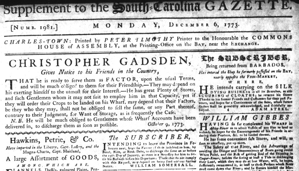
What was advertised in a colonial American newspaper 250 years ago today?

“He is determined to sell so low as to give every Purchaser full Satisfaction.”
Nathaniel Sparhawk emphasized all the choices available to consumers when he advertised a “general Assortment of English and India GOODS” in the December 14, 1773, edition of the Essex Gazette. To demonstrate some of those choices, he listed some of his merchandise. His inventory included a “Beautiful assortment [of] superfine, middling and low priced Broad-Cloaths of the most fashionable colours,” “Ribbons of all sorts,” “MEN’s black & cloth colour’d worsted Hose,” “Women’s black, white and cloth-colour’d silk Gloves and Mitts,” “black and white gauze Handkerchiefs,” and “Silk & worsted Knee Garters.” To further entice prospective customers, Sparhawk pledged to “sell so low as to give every reasonable Purchaser full Satisfaction.” The shopkeeper intended for the combination of low prices and wide selection to draw customers to his shop in Salem.
In addition to those appeals, Sparhawk used graphic design to attract the attention of readers of the Essex Gazette. His advertisement was the most visually striking of those that appeared in the December 14 edition. A border composed of florettes enclosed the entire advertisement, setting it apart from news articles and other advertisements. It was the only item that featured that sort of adornment on that page or anywhere in the issue. George Deblois once again published his advertisement promoting a “fine Assortment of ENGLISH and HARD-WARE GOODS.” It appeared in the column next to Sparhawk’s advertisement. Both entrepreneurs enumerated many of their goods, but Deblois listed his wares in two dense paragraphs. Sparhawk, in contrast, opted to divide his advertisement into two columns and list only one or two items on each line. That likely made it easier for readers to peruse his notice. In addition to the florettes that surrounded this advertisement, a line of other printing ornaments ran between the two columns, further enhancing its visual appeal. Sparhawk stocked much of the same merchandise as Deblois and other competitors, but he leveraged graphic design in his advertisement to distinguish his business from the others.