What was advertised in a colonial American newspaper 250 years ago today?
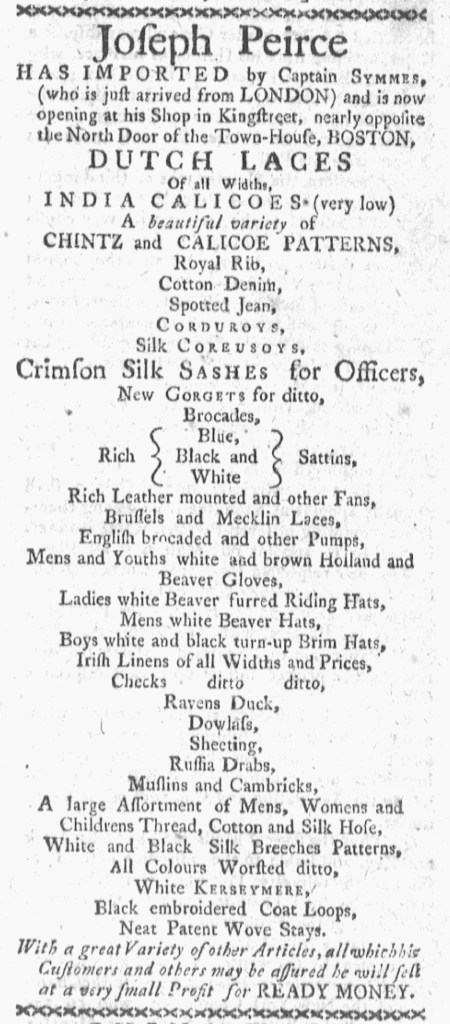
{ Blue }
Rich { Black and } Sattins
{ White }
Joseph Peirce’s advertisement on the front page of the May 2, 1774, edition of the Boston-Gazette stood out thanks to its unique graphic design. The shopkeeper provided a list of merchandise that he recently imported from London, but rather than arrange it in a dense paragraph, as in most advertisements, or create columns with one item per line, as in some advertisements, this one featured one item per line with each line centered. As a result, the text created an irregular shape with a lot of white space on either side. That certainly distinguished the advertisement from the news in the column to the right, justified on both sides.
Advertisers usually generated copy, while compositors made most decisions about format. When merchants and shopkeepers ran advertisements with identical copy in multiple newspapers, variations in fonts, capitalization, italics, font size, and other design elements testified to the creative work done by the compositors in each printing office. Advertisers likely submitted general instructions with the copy for advertisements that arranged goods in columns, but that may not have always been the case. M.B. Goldthwait’s advertisement for “DRUGS and MEDICINES” in the April 28, 1774, edition of the Massachusetts Spy, for instance, listed a variety of patent medicines in a paragraph, while his advertisement in the May 2 edition of the Massachusetts Gazette and Boston Post-Boy separated them into side-by-side columns.
Peirce seems to have submitted specific instructions with the copy for his advertisement. It had the same format in the May 2 editions of the Boston Evening-Post and the Massachusetts Gazette and Boston Post-Boy and the May 5 edition of the Massachusetts Gazette and Boston Weekly News-Letter. They even gave the same treatment to three lines for:
{ Blue }
Rich { Black and } Sattins
{ White }
That indicates that the compositors incorporated the format that Peirce sketched when he composed the copy. Curiously, the advertisements in the Boston-Gazette, the Boston Evening-Post and the Massachusetts Gazette and Boston Weekly News-Letter appear identical, as though the printing offices shared type set in one and transferred to the others. If that was indeed the case, it raises questions about day-to-day operating practices and collaboration among printers in Boston. Even if some printing office shared type, Pierce’s advertisements in the Boston-Gazette and the Massachusetts Gazette and Boston Post-Boy had minor variations while retaining the same format. That suggests that Peirce provided his vision for his advertisement to at least two printing offices, taking an active role in designing as well as writing his notice.