March 21

GUEST CURATOR: Zachary Dubreuil

What was advertised in a colonial American newspaper 250 years ago today?

Essex Gazette (March 21, 1769).

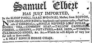
“CHOICE green Coffee.”

In this advertisement William Vans attempted to sell some items, including “CHOICE green Coffee.’ Green coffee had to do with the beans. Heather Baldus, the collections manager at George Washington’s Ferry Farm and Historic Kenmore, says, “In the 1700s, when you purchased coffee from your local merchant it most likely was in the form of bags of green beans.  The burden of turning those beans into the perfect cup of coffee was on the consumer.” When roasting the person doing it had to make sure that the beans were constantly turning so they would not burn. Then the person could use a coffee grinder, which was common and inexpensive in Europe, although most people in the colonies used a mortar and pestle to turn the beans into a powder. Finally, the person would put the amount they wanted with water, either boiling or infusing it. In addition to drinking coffee at home, some colonists went to coffeehouses. Coffeehouses began to pop up in colonial America in the eighteenth century. They were a mixture of a café, tavern, and inn. During the consumer revolution, coffee became a staple drink for early Americans.

**********

ADDITIONAL COMMENTARY: Carl Robert Keyes

At a glance, William Vans’s advertisement for “CHOICE green Coffee” and other goods appears to be the same advertisement from the Essex Gazette that guest curator Luke DiCicco examined last week, a second insertion that ran in a subsequent issue. For the most part, that was indeed the case, but the notice that ran in the March 21, 1769, edition did feature one notable difference compared to the first iteration. It did not include the place and date on the final line: “Salem, March 13, 1769.” What explains the alteration?

Most likely the compositor exercised discretion in dropping the final line of the advertisement, choosing to do so in order to make it fit in the final column on the last page of the March 21 issue. Six notices comprised that column. In addition to Vans’s advertisement, Benjamin Coats and Susanna Renken each ran advertisements for a “fresh Assortment of Garden Seeds,” Samuel Hall promoted a pamphlet for sale at the printing office, Benjamin Marston of Marblehead offered the Misery Islands for sale, and Peter Frye and Nathan Goodale published an estate notice following the death of Ebenezer Bowditch. All six advertisements ran in the March 14 issue. With the exception of Vans’s advertisement, all of them appeared in the March 21 edition exactly as they had the previous week.

Had the compositor not removed the final line from Vans’s notice, all six would not have fit in a single column. Most likely the compositor had looked for a convenient means of reducing the length of one of the advertisements. Two of them, Vans’s advertisement and the estate notice, included final lines listing place and date, lines easily removed without making it necessary to otherwise reset any type. The estate notice, however, needed the date because it specified that Frye and Goodale would continue to settle accounts at a local tavern “on the last Friday of this and of the five Months next ensuing.” Since such advertisements sometimes ran for weeks or months, the date at the end was imperative. Vans’s notice, on the other hand, did not require the date, facilitating the removal of that line. The compositor most likely made that decision without consulting the advertiser.

While these particulars may seem insignificant, they help to demonstrate the division of authority exercised by colonists involved in the production of newspaper advertisements in the eighteenth century. Advertisers usually generated copy, but compositors determined graphic design elements. In this case, the compositor made a slight alteration to the copy in the service of the format of the entire page on which the advertisement appeared.

March 12

GUEST CURATOR: Luke DiCicco

What was advertised in a colonial American newspaper 250 years ago this week?

Georgia Gazette (March 8, 1769).

“Samuel Elbert HAS JUST IMPORTED … NEW-ENGLAND RUM.”

This advertisement features a series of items that recently had been imported into Georgia by a trader named Samuel Elbert. Some of the items included soap, “CALIMANCO SHOES,” and New England rum.

Who was Samuel Elbert? Originally I was not expecting to uncover much about this advertiser, but I learned that he was an American merchant, politician, and officer during the Revolution. According to the Georgia Historical Society, Elbert started as a merchant and served in the colonial legislature as well as being a captain of a grenadier company. However, once fighting started, he decided that he wanted to serve in the war. He received a commission as an officer because of his wealth and social status. He rose up the ranks and was promoted to brigadier general in 1783 after years of service. He was later elected governor of Georgia. It is important to know about the many different people who participated in the American Revolution. Elbert may not be as famous as other officers, but he played a major role in the southern campaigns. Like other officers and soldiers from diverse backgrounds and occupations, he helped with defeating the British.

**********

ADDITIONAL COMMENTARY: Carl Robert Keyes

Luke has chosen an advertisement that may look familiar to regular readers of the Adverts 250 Project. Samuel Elbert’s notice was the featured advertisement on February 22. While the methodology for this project usually requires selecting an advertisement only once, I sometimes make exceptions when I wish to explore a particular aspect of an advertisement in more detail.

Elbert’s advertisement first appeared in the February 22, 1769, edition of the Georgia Gazette, notable because it was one of only two that incorporated a large gothic font for its headline. Such typography distinguished both advertisements from the others on the same page and throughout the issue. The other advertisement, an announcement that the former members of the “Ugly Club” would meet on the 25th was discontinued the following week, but Elbert’s advertisement ran once again on March 1. In that issue, Lewis Johnson, an apothecary, and William Sime, a goldsmith and jeweler, both inserted advertisements that displayed their names in the same large gothic font. Elbert, Johnson, and Sime all ran their advertisements once again in the March 8 edition, the one examined by Luke, though yet another notice deployed the same visual style, this time featuring the name of Michael Hamer, a shopkeeper.

Who was responsible for the sudden infusion of such bold typography? Was it all at the discretion of a compositor who wished to experiment with some of the types not often used in the pages of the Georgia Gazette? Or did Johnson, Sime, and Hamer notice how the unique type drew attention to Elbert’s advertisement and then request that their own notices receive the same treatment? The answers cannot be found in the pages of the Georgia Gazette. Instructions may have been submitted with the copy for those advertisements, though advertisers may have simply made verbal requests when visiting James Johnston’s printing office on Broughton Street in Savannah. In his examination of the typography of the Georgia Gazette, Ray Dilley remarks that the “large size (Great Primer, or 36 point), appears at least once as a fascinating announcement for a meeting of ‘The Ugly Club,’” but does not mention its use in Elbert’s advertisement or any that appeared in subsequent issues.[1] Nor does Lawrence speculate on why Johnston or a compositor happened to resort to that type. The advertisements themselves testify to a willingness to experiment with graphic design, but the identity of the innovator remains unknown.

**********

[1] Lawrence A. Alexander, James Johnston, Georgia’s First Printer: With Decorations and Remarks on Johnston’s Work by Ray Dilley (Savannah: Pigeonhole Press, 1956), 42.

February 22

What was advertised in a colonial American newspaper 250 years ago today?

Georgia Gazette (February 22, 1769).

“Samuel Elbert HAS JUST IMPORTED … NEW-ENGLAND RUM in hogsheads and quarter casks.”

James Johnston rarely experimented with typography in the pages of the Georgia Gazette. Both news items and advertisements generally adhered to a uniform format that did little to distinguish one news item from another or one advertisement from another. Like other colonial printers, Johnston printed some words in italics or all capitals, presumably for emphasis, but those examples usually represented the extent of his playfulness with the type that appeared in his newspaper in the late 1760s. One exception regularly distinguished an advertisement that listed captured runaway slaves who were being held until slaveholders claimed them. The headline “Brought to the Work-house” appeared in a gothic font of the same size as the rest of the advertisement. Although Johnston possessed that font, he rarely deployed it elsewhere in the pages of the Georgia Gazette.

The February 22, 1769, edition, however, included several advertisements that incorporated the gothic font for the headline. One presented an enslaved woman “To be hired out.” While rare, that advertisement was not unique. The phrase “To be hired out” did not appear nearly as often as ever constant “Brought to the Work-house,” but Johnston was just as likely to set it with gothic type when inserting such an advertisement. This advertisement introduced some variation onto the page, but not anything that caught the eye nearly so well as two other advertisements with headlines in gothic font. One informed prospective customers that Samuel Elbert had just imported a variety of goods from Boston. Like many other advertisements for consumer goods, the merchant’s name served as the headline. Unlike others in the Georgia Gazette, his name was in gothic font much larger than the remainder of the advertising copy. The same was true of “Ugly Club” in a notice that advised members of an upcoming gathering.

While either Elbert or the officers of the club may have negotiated with the printer for a distinctive headline, it seems unlikely that both did so simultaneously. More likely Johnston decided to experiment with the tools available to him. After all in the previous issue he upended the usual layout of the Georgia Gazette by distributing the advertisements throughout rather than grouping them all on the final pages after the news items. He did so again in the February 22 issue, with advertisements appearing on every page. In setting type for Elbert’s advertisement, Johnston demonstrated what was possible when it came to the paid notices in his newspaper, even if not what was probable. The spark of innovation apparent in that advertisement eventually became a much more common element of advertisements published in the nineteenth century.

January 7

What was advertised in a colonial American newspaper 250 years ago today?

Providence Gazette (January 7, 1769).

“A HORSE stolen!”

Among the new advertisements that ran in the January 7, 1769, edition of the Providence Gazette, one proclaimed “A HORSE stolen!” Following that headline, the advertisement included further details, such as a description of the horse (“14 Hands and a half high, well set, 9 Years old, a dark Sorrel, intermixed with some white Hairs, and has some Spots under the Saddle”) and the date and time it had been stolen (“Tuesday Evening, the 27th of December”). The thief had made off with the saddle, bridle, and saddlebags as well. Finally, the advertisement offered two rewards: five dollars for finding and returning the horse or ten dollars for capturing the thief along with locating the horse.

While most of contents of the advertisement were standard for the genre, the lively headline, including the exclamation point, was not. The headline did, however, echo the headline in another advertisement in the same issue, the Once more! that introduced an estate notice placed by executors Joseph Olney, Jr., and Jonathan Arnold. That advertisement also ran in the previous issue. Perhaps Samuel Danielson, Jr., had seen Olney and Arnold’s estate notice. Perhaps it had influenced him to devise a bold headline for his own advertisement. The signature at the end of Danielson’s advertisement indicated that he composed it on January 5 (even though the theft took place on December 27). He certainly could have seen the contents of the December 31 edition, including Olney and Arnold’s “Once more!” notice, before composing the copy for his own advertisement.

Danielson’s “A HORSE stolen!” headline suggests that eighteenth-century readers noted innovations in advertising and that some advertisers adopted those innovations when placing their own notices in the public prints. Yet they did so unevenly. Many other advertisers continued to place notices that deployed their names as the headlines or did not feature headlines at all. Notable for their innovation in the eighteenth century, headlines like “Once more!” and “A HORSE stolen!” were precursors of a common strategy later incorporated into newspaper advertisements in the nineteenth century.

December 31

What was advertised in a colonial American newspaper 250 years ago today?

Providence Gazette (December 31, 1768).

Once more!

In their capacity as the executors of the estate of Joseph Smith of North Providence, Joseph Olney, Jr., and Jonathan Arnold placed an advertisement in the Providence Gazette. In it, they called on creditors to attend a meeting to settle accounts and announced an auction of the deceased’s real estate. The contents of their advertisement did not differ from other estate notices, but the headline set it apart, drawing attention with a proclamation of “Once more!” Eighteenth-century advertisements did not always consist of dense text crowded on the page.

This innovative headline most likely emerged via collaboration between the advertisers and the compositor, perhaps even accidentally. Many eighteenth-century newspaper advertisements did not feature headlines at all. Some treated the advertiser’s name as the headline or otherwise used typography to make it the central focus. The names “Darius Sessions,” “Samuel Black,” and “J. Mathewson” all served as headlines for advertisements, each in italics and a font the same size as “Once more!” In another advertisement, “Gideon Young” appeared in the middle, but in a significantly larger font. Other advertisements used text other than names as headlines. John Carter’s advertisement for an almanac deployed “A NEW EDITION” at the top. A real estate advertisement used “TO BE SOLD” and an advertisement for a runaway slave used “FIVE DOLLARS Reward.” Both were standard formulations when it came to introducing information to newspaper readers.

On the other hand, “Once more!” was different than anything else that usually appeared in the headlines of eighteenth-century newspaper advertisements. Playful and quirky, it was a precursor to the advertisements that regularly appeared in American newspapers in the nineteenth century. Its departure from standard practices for headlines accompanying advertisements in the 1760s suggests that Olney and Arnold did not merely go through the motions of placing an announcement in the public prints. Instead, they devised copy intended to draw more attention than formulaic language would have garnered. The uniqueness of “Once more!” was calculated to arouse curiosity among readers. That it appeared in italics and larger font was most likely a fortunate accident, considering that the compositor gave other headlines the same treatment. (Recall Darius Sessions,” “Samuel Black,” and “J. Mathewson.”) Still, it signaled the possibilities of combining clever copy with unconventional typography, a strategy that subsequent generations of advertisers and compositors would explore much more extensively.

December 26

What was advertised in a colonial American newspaper 250 years ago today?

Boston Evening-Post (December 26, 1768).

“Ravens Duck | Bohea Tea | Mason Glasses.”

Samuel Fletcher aimed to use typography to his advantage in an advertisement that ran in the December 26, 1768, edition of the Boston Evening-Post. In it, he listed a variety of imported goods among the inventory at his store “Near the Draw-Bridge,” including textiles, tea, and housewares. The contents of Fletcher’s advertisement did not much differ from what appeared in other notices for consumer goods placed in the Boston Evening-Post and other newspapers published in the busy port. The format, however, distinguished Fletcher’s advertisement from many others.

Fletcher enumerated approximately sixty items, organizing them into three columns that trisected the advertisement. Other advertisers that listed their wares tended to do so in dense paragraphs that did not feature any white space. Such was the case in Gilbert Deblois’s advertisement immediately below Fletcher’s notice and Joseph Barrell’s advertisement immediately to the right. Yet Fletcher was not alone among merchants and shopkeepers in electing to divide his goods into columns. Elsewhere on the same page, Samuel Allyne Otis divided his advertisement into two columns. Joshua Blanchard incorporated visual variety into his advertisement, publishing a short list of wines followed by a paragraph that promoted the quality of customer service his clients could anticipate. Although many advertisers opted for the standard dense paragraph, some experimented with other formats.

Fletcher’s decision to use columns came with one disadvantage. He could not list as many items in the same amount of space. Still, he managed to provide a general preview, enough to suggest an array of choices for consumers, before concluding with the phrase “With many Articles not mentioned” running across all three columns. This signaled to prospective customers that he did not necessarily stock fewer choices than his competitors, only that he organized them differently in his advertisement. In the spirit of “less is more,” listing fewer items but in a format with sufficient white space that allowed readers to navigate the contents of the advertisement more easily could have drawn attention to specific entries much more readily than had they appeared amidst a dense list of merchandise. For Fletcher’s advertisement, the typography very well could have been as effective as the copy.

December 1

What was advertised in a colonial American newspaper 250 years ago today?

Dec 1 - 12:1:1768 South-Carolina Gazette
South-Carolina Gazette and Country Journal (December 1, 1768).

“EUROPEAN GOODS”

Two days after their advertisement for “A LARGE AND COMPLEAT ASSORTMENT OF EUROPEAN GOODS” dominated the front page of the South-Carolina Gazette and Country Journal, Webb and Doughty inserted the same advertisement in the December 1, 1768, edition of the South-Carolina Gazette. The advertisements featured identical copy but variations in typography. The most significant aspect of the advertisement’s format, however, carried over from one newspaper to the other. Webb and Doughty’s advertisement spanned two columns, distinguishing it from all others on the same page.

For most eighteenth-century newspaper notices the advertiser wrote the copy but the compositor determined the format. Some advertisers placed the same notice, at least as far as the copy was concerned, in multiple newspapers, but those notices varied in appearance as the result of decisions made by compositors. Advertisements that retained particular features across multiple publications, such as the decorative border that enclosed Jolley Allen’s advertisements, testify to explicit instructions given by advertisers. Most advertisers seemed content to entrust the graphic design to the printing office, but it was possible for advertisers to exert more control over the appearance of notices they paid to insert in colonial newspapers.

It appears that Webb and Doughty did offer instructions to the compositors at the South-Carolina Gazette and the South-Carolina Gazette and Country Journal. It seems unlikely that the two would have independently made the same decision to create advertisements that spanned two columns. (Unfortunately, Webb and Doughty did not place the same advertisement in the South-Carolina and American General Gazette. Perhaps they tried but the printer rejected any special instructions.) The compositors still exercised the discretion to make other decisions about the format of Webb and Doughty’s advertisement. The list of goods appeared as a paragraph in the South-Carolina Gazette and Country Journal, but as three narrow columns in the South-Carolina Gazette. The names of the merchants appeared in the largest font in the South-Carolina Gazette and Country Journal, but “EUROPEAN GOODS” appeared as the most prominent headline in the South-Carolina Gazette.

Although Webb and Doughty’s advertisement was the only one that spanned two columns on its page, two notices on the front page also spanned two columns. One for “SALES by the Provost-Marshal” was a somewhat regular feature. The headline enclosed in a decorative border occasionally graced advertisements of various lengths. The other, an advertisement for “A COMPLEAT ASSORTMENT OF GOODS” placed by Mansell, Corbett, and Roberts,” had the same format as Webb and Doughty’s advertisement. It spanned two columns. The list of goods was organized into three columns. What explains its appearance? Did Mansell, Corbett, and Roberts see Webb and Doughty’s advertisement in the South-Carolina Gazette and Country Journal and choose to adopt its format themselves? Or did the compositor at the South-Carolina Gazette decide to experiment with that format in other advertisements of sufficient length?

November 29

What was advertised in a colonial American newspaper 250 years ago today?

Nov 29 - 11:29:1768 South-Carolina Gazette and Country Journal
South-Carolina Gazette and Country Journal (November 29, 1768).

“WEBB & DOUGHTY, HAVE JUST IMPORTED A LARGE AND COMPLEAT ASSORTMENT OF EUROPEAN GOODS.”

As a result of its length and, especially, its graphic design, Webb and Doughty’s advertisement for a “LARGE AND COMPLEAT ASSORTMENT OF EUROPEAN GOODS” dominated the front page of the November 29, 1768, edition of the South-Carolina Gazette and Country Journal. No other item in that issue, neither news nor other paid notices, rivaled Webb and Doughty’s call to prospective customers to purchase the array of goods they had “JUST IMPORTED” from London and Liverpool.

Their advertisement occupied a privileged place, appearing immediately below the masthead. That alone would have drawn the eyes of readers, but the unique format increased the likelihood that subscribers and others would take note. Webb and Doughty’s advertisement extended across two of the three columns, unusual for any sort of content in the South-Carolina Gazette and Country Journal and other colonial newspapers. This advertisement would have otherwise filled an entire column, but that long-and-narrow format would have been much more familiar to readers. Due to that familiarity, it would not have been as visually striking as the lengthy list of goods that seemed to overflow the boundaries of its column. Overall, this advertisement accounted for one-quarter of the content on the first page.

Spanning two columns also allowed Webb and Doughty to mobilize a headline that would not have been possible in a single column. The additional space allowed them to increase the size of the font for both their names and “EUROPEAN GOODS.” Indeed, “WEBB & DOUGHTY” appeared in a larger font than “SOUTH-CAROLINA JOURNAL,” shifting attention away from the masthead in favor of the advertisement or, at the very least, setting the two in competition. The masthead proclaimed that the newspaper “Contain[ed] the freshest Advices, both Foreign and Domestic,” but readers had to turn to the second page to encounter any news. Webb and Doughty’s oversized advertisement made it clear that advertising was the order of business in this issue of the South-Carolina Gazette and Country Journal. In addition to Webb and Doughty’s advertisement, other paid notices filled three of four pages in the November 29 edition.

Webb and Doughty’s merchandise did not much differ from what competitors offered in their own advertisements, but the graphic design significantly deviated from the appearance of other advertisements for consumer goods and services in colonial newspapers. Webb and Doughty did not rely on copy alone to market their goods. Instead, they incorporated typographical innovation into their marketing strategy.

November 25

What was advertised in a colonial American newspaper 250 years ago today?

Nov 25 - 11:25:1768 Connecticut Journal
Connecticut Journal (November 25, 1768).

“Broad cloths in|Best belladine sew-|Bellows’s Gimblets”

The format of Samuel Broome and Company’s advertisement in the Connecticut Journal suggested the work of an unskilled compositor, someone who had not sufficiently mastered the typographical arts to create an advertisement that was either visually appealing or easy to read. Yet Bernard Lintot’s advertisement that appeared immediately to the left in the November 25, 1768, edition hinted that the compositor of Broome and Company’s notice might not have been entirely at fault for its dense and cluttered appearance.

Both advertisements featured two vertical lines trisecting three columns of goods. Lintot’s advertisement listed only one item per line in each column, taking advantage of white space to make each legible for readers. Broome and Company’s advertisement, on the other hand, included multiple items per line and crushed the columns together without any space to separate them. Why adopt that approach when it was clear that those employed at the printing office were capable of doing better?

It may have been an issue of finances rather than a lack of aesthetics. The cramped advertisement already filled an entire column. If Broome and Company had insisted on a style that replicated Lintot’s advertisement, their notice would have extended into a second column. That may not have been a viable alternative considering that the partners ran their advertisement in the Connecticut Journal in alternating issues for five months, incurring significant advertising costs. Broome and Company may have intentionally avoided the additional expense associated with overflowing into a second column; given their frequent publication schedule, the printers also may have confined Broome and Company to a single column. Each time their notice appeared it accounted for one-eighth of the total content in a four-page newspaper with only two columns per page.

What kind of consultation took place among advertisers, printers, and compositors in the eighteenth century? On its own, Broome and Company’s advertisement suggests that the compositor did not execute his charge particularly well, but that might not have been the case. The variation in visual appeal among the advertisements in the Connecticut Journal indicates that other factors may have also been at play in determining the format of Broome and Company’s lengthy notice.

October 3

What was advertised in a colonial American newspaper 250 years ago today?

Oct 3 - 10:3:1768 New-York Gazette Weekly Mercury
New-York Gazette and Weekly Mercury (October 3, 1768).

“JUST imported by ADAM GILCHRIST.”

Hugh Gaine, the printer of the New-York Gazette and Weekly Mercury, took in so many advertisements that he could not fit all of them in the standard four-page issue for October 3, 1768. In addition to two pages of advertising in the regular issue, Gaine distributed a two-page supplement comprised solely of advertisements. That still did not provide sufficient space for all of the paid notices submitted to the printing shop at the Sign of the Bible and Crown in Hanover Square. Either Gaine or the compositor who set the type for the October 3 edition made space for inserting four additional advertisements on the second and third pages by printing them in the margins.

The first and fourth pages appeared as usual: three columns on each page as well as the masthead and prices current running across the top of the first page. The second and third pages, however, each had a slender fourth column created by rotating the text of short advertisements and setting them perpendicular to the rest of the content. These advertisements appeared in the left margin of the second page and the right margin of the third page, positioned away from the fold that separated the two pages.

This strategy required selecting short advertisements to divide into columns. For instance, the second page featured two short advertisements: nine lines from Adam Gilchrist promoting textiles he had recently imported and five lines announcing an employment opportunity for “A Person qualified to teach three or four Children, in a Gentleman’s Family.” These notices had the same width as other advertisements and news content throughout the rest of the New-York Gazette and Weekly Mercury yet they were broken into several columns to fit them in the margins. If necessary, the several columns of each could be combined into one and printed elsewhere in subsequent issues without having to set the type from scratch.

The unconventional placement of these advertisements may have given them more visibility than if they had appeared in the long columns amidst other paid notices. Their position on the page may have incited curiosity among readers, yielding a benefit for the advertisers even as Gaine and the compositor sought to solve the problem of having too much content for the current issue of the New-York Gazette and Weekly Mercury. Many printers throughout the colonies resorted to this trick on occasion, yet not so frequently that the unusual placement of these advertisements would have passed without notice.