July 12

What was advertised in a colonial American newspaper 250 years ago this week?

Jul 12 - 7:9:1767 Massachusetts Gazette
Massachusetts Gazette (July 9, 1767).

“Ready for Sale, BY Jolley Allen.”

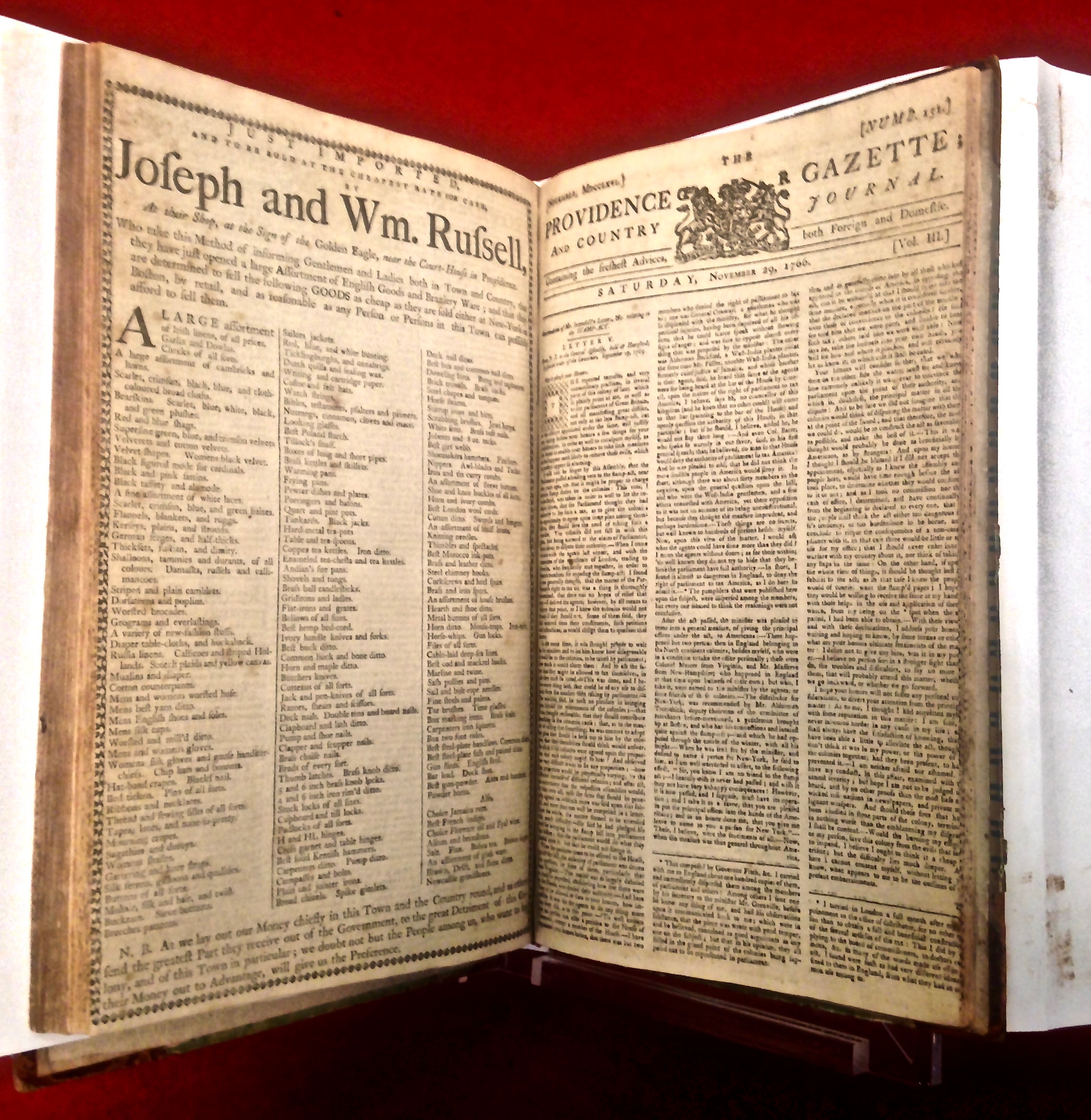
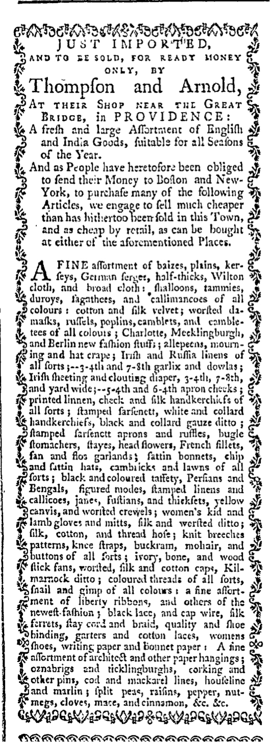
Regular readers of the Massachusetts Gazette may have been surprised when they glimpsed this notice for Jolley Allen’s “Shop about Midway between the Governor’s and the Town-House, and almost Opposite the Heart and Crown in Cornhill, BOSTON.” Allen regularly advertised in the Massachusetts Gazette. He also regularly advertised in the city’s other three newspapers, so the advertisements itself would not have caused surprise. No, that would have resulted from the design of the advertisement. It did not feature a border comprised of printing ornaments, a distinctive aspect of Allen’s advertising that had practically become his trademark in all of his notices, regardless of which newspaper published them. Allen had developed a consistent visual appearance for his advertisements, making them instantly recognizable. This advertisement, however, looked like so many others on the page. It lacked the most significant element that previously set Allen’s notices apart from others.

Perhaps the printer made an error. Perhaps a new compositor now worked in the shop and set the type without realizing that Jolley’s advertisement was supposed to have a decorative border. After all, the shopkeeper seems to have consistently negotiated with the printers of all four of Boston’s newspapers to include that adornment. Perhaps he forgot to underscore this request when he submitted the copy for this advertisement.

Yet later in the week, the Boston Evening-Post, the Boston-Gazette, and the Boston Post-Boy all carried Allen’s newest advertisement. None of them enclosed his list of “English and India Goods” within any sort of border. While it was possible that one printing office overlooked this particular request, it seems unlikely that all four made the same mistake. Apparently Allen had not renewed his instructions concerning the graphic design of his advertisement. Why did he abandon a practice that made his advertisements so easily identifiable to readers and potential customers? Why did he eliminate the most innovative aspect of his advertising?   Even as eighteenth-century advertisers experimented with early forms of branding, they did not consistently adopt new methods, not realizing the value of cementing unique images of their business endeavors in the minds of consumers.

June 1

What was advertised in a colonial American newspaper 250 years ago today?

Jun 1 - 6:1:1767 New-York Gazette
New-York Gazette (June 1, 1767).

“JOHN MORTON, Has just received … a very neat Assortment of goods.”

The layout of John Morton’s advertisement on the front page of the June 1, 1767, edition of the New-York Gazette would have attracted attention because it so significantly deviated from most other eighteenth-century advertisements. In his list-style advertisement, the text extended across two columns. In most cases, if a newspaper advertisement occupied space in two columns at all it was because of length, overflowing from one column into the next. That was not, however, necessary when it came to Morton’s advertisement. William Weyman, the printer of the New-York Gazette, or a compositor working in his printing shop made design decisions that not only yielded a unique advertisement for Morton but also produced a distinctive first page for the newspaper compared to the other three printed in New York and nearly two dozen more throughout the colonies.

Jun 1 - 6:1:1767 First Page of New-York Gazette
New-York Gazette (June 1, 1767).

Why assert that the printer and compositor were responsible for the typographical elements of Morton’s advertisement rather than merely responding to requests made by a paying customer who generated the copy? The New-York Gazette was not the only newspaper that carried Morton’s notice during the first week of June. It also appeared in the New-York Mercury on the same day and again in the New-York Journal three days later. Although the content of the advertisement was consistent across the three publications, the layout differed significantly. In the Mercury, Morton’s notice took the standard form of most list-style advertisements, a dense paragraph. In the Journal, the compositor introduced more white space that made it easier to distinguish among the assortment of merchandise by creating two columns and listing a small number of items on each line. These differences were the most substantial, but the three advertisements also had variations in font size and the inclusion of printing ornaments. The Gazette, for example, included a decorative border on three sides, but was the only one that did not use a manicule to draw attention to Morton’s final plea for former customers “to make speedy payment.”

Although advertisers wrote their commercial notices themselves, printers and compositors exercised primary responsibility for layout and other typographical elements of most eighteenth-century advertisements. There were occasional exceptions. Jolley Allen and William Palfrey, for instance, both negotiated for specific design aspects of their advertisements, but generally innovative visual effects originated in the imaginations of members of the printing trade who then experimented with their execution.

Jun 1 - 6:1:1767 New-York Mercury
New-York Mercury (June 1, 1767)
Jun 1 - 6:4:1767 New-York Journal
New-York Journal (June 1, 1767).

May 27

What was advertised in a colonial American newspaper 250 years ago today?

May 27 - 5:27:1767 Georgia Gazette
Georgia Gazette (May 27, 1767).

DAVID GIONOVOLY, Taylor.”

David Gionovoly’s advertisement may have been short, but it was visually stimulating, especially compared to the other commercial notices that appeared on the same page of the Georgia Gazette. Amid a series of advertisements that consisted of dense blocks of text, the format of Gionovoly’s advertisement likely drew the attention of prospective clients. The visual aspects of the advertisement eclipsed the contents.

May 27 - Entire Page 5:27:1767 Georgia Gazette
Georgia Gazette (May 27, 1767).

Most of the evidence suggests that advertisers submitted copy to printers who then determined the format, though negotiations took place and special requests were sometimes honored (perhaps for an additional fee). Gionovoly may have worked closely with James Johnston, the printer of the Georgia Gazette, to create an advertisement with distinctive visual appeal. Alternately, he may have made a general request but offered no specifics. On the other hand, the format of the tailor’s advertisement may have been entirely due to the printer’s own initiative.

Regardless of who was responsible for each visual element of the advertisement, it effectively deployed varied fonts and sizes. It also included just enough white space to accentuate those variations. The headline of the advertisement – “DAVID GIONOVOLY, Taylor” – was set in the largest font used on that page (or anywhere else in the issue, with the exception of the masthead). Both capitals and italics further emphasized the tailor’s name, giving him an appropriate sense of style that anyone in the garment trades would have wanted to communicate to potential customers. The ornate font for the next line – “Gives this Publick Notice” – also appeared in other advertisements, but not so many that it did not seem novel in Gionovoly’s notice. The remainder of the advertisement had a standard format and incorporated the usual sorts of appeals – “work done after the best manner, and with the greatest dispatch” – but the lack of innovation in the copy may not have mattered as much as making sure that readers noticed the advertisement at all.

December 7

What was advertised in a colonial American newspaper 250 years ago this week?

dec-7-1261766-providence-gazette
Providence Gazette (December 6, 1766).

“For New-York, the Brig General Conway; will sail in ten days, and for the sake of getting ballast, will carry freight for half price.”

More than any other printers who published newspapers in 1766, Mary Goddard and Company experimented with layout and graphic design for advertising. In collaboration with several shopkeepers, Goddard and Company mixed genres, placing advertisements that otherwise could have been separately printed and distributed as trade cards within several issues of the Providence Gazette during the summer and fall of 1766. Next, the printers continued producing hybrid publications with issues that featured full-page advertisements, effectively giving over the final page to what otherwise could have been an advertising broadside had it been produced separately.

For those efforts, Goddard and Company emphasized the size of the advertisements that appeared in the pages of the Providence Gazette. Today’s advertisement, however, was relatively short and took up little space on the page. What distinguished it from others was its position within the December 6, 1766, issue. It appeared on the third of four pages, running alongside, but perpendicular to, the column on the far right. It ran in the blank space usually reserved for the margin, making it the last text item readers would have seen when scanning the open pages of the newspaper from left to right.

dec-7-1261766-page-3-providence-gazette
Third Page of Providence Gazette (December 6, 1766).

This advertisement occupied space where text usually did not intrude, which would have encouraged curiosity among readers. Three columns appeared on each page of the Providence Gazette, all of them separated by sufficient white space to make them easily distinguishable from those on either side. This advertisement printed perpendicularly in the margin, however, did not have white space on its left. Instead, it was closely nestled next to the conclusion of a news article and an advertisement for the New-England Almanack. This format served both to hide and highlight the advertisement since it would have become distinguishable to readers as a distinct text only after doing a double take and realizing that the layout deviated from expectations of how the page should appear.

Mary Goddard and Company were not the first printers to deploy the single-line advertisement that ran in the margin, but they added a new twist to the relatively few examples from other printers and other newspapers. Such single-line advertisements, when they did appear, spanned multiple columns across the top or bottom of the page. Just as they had previously played with other graphic design elements for the layout and format of advertising in the second half of 1766, Goddard and Company added their own innovation to the single-line advertisement printed in the margin.

The First Full-Page Advertisement in an American Newspaper

I usually refrain from selecting an additional advertisement to examine on days that my students are serving as guest curators, but I am making an exception in this case because Joseph and William Russell’s advertisement on the final page of the November 22, 1766, issue of the Providence Gazette was just too significant to allow it to pass without acknowledgment. I believe that this is the first full-page advertisement that appeared in an American newspaper!

nov-22-11221766-full-page-providence-gazette
Providence Gazette (November 22, 1766, left; November 29, 1766, right). Courtesy American Antiquarian Society.

For months I have been tracking the innovative layouts designed by Mary Goddard and Company when they began publishing the revived Providence Gazette in the summer of 1766. Between August and November, a trio of advertisers – Thompson and Arnold, Benjamin and Edward Thurber, and Samuel Nightingale, Jr. – placed advertisements that featured decorative borders to set them apart from everything else on the page. Each spanned two columns, dominating the pages on which they appeared. They deviated so significantly from standard eighteenth-century advertisements that they certainly would have attracted the attention of readers. No matter the goods they listed or the appeals the shopkeepers made, these advertisements already caused a visual sensation even before colonists read any of the copy.

Each of these advertisements looked like it could have been printed separately as a trade card that the shopkeepers would have distributed on their own, perhaps recording purchases on the reverse. For the issues of the Providence Gazette in which they appeared, it looked like the oversized advertisements had been positioned in one corner of a page and then the remaining columns built around them.

Given that Mary Goddard and Company were experimenting with size, format, and other graphic design elements on the advertising pages of the Providence Gazette, it probably should not have come as any surprise to find a full-page advertisement occupying the final page of the November 22, 1766, issue. Still, I could not believe my eyes when I saw the digitized image in Readex’s America’s Historical Newspapers database. I needed confirmation, so I visited the American Antiquarian Society and examined the original issue.

nov-22-11221766-full-page-providence-gazette
Providence Gazette (November 22, 1766).

If trade cards had inspired the design of the earlier advertisements, then broadsides must have inspired Joseph and William Russell’s full-page advertisement. Mary Goddard and Company had already played around with mixing genres by placing a trade card within the pages of a newspaper. Making a broadside the entire final page of the newspaper was the logical next step, one that was even more likely to attract notice. Imagine a reader holding up this issue of the Providence Gazette while perusing the pages in the middle. Instead of columns of smaller advertisements typical of other newspapers, observers would have been confronted by a single advertisement larger than any they had preciously encountered in an American newspaper.

I frequently argue that many of the advertising innovations of the twentieth century had precursors in the eighteenth century. Here we see yet another example of eighteenth-century printers and advertisers creating sophisticated marketing materials that have been largely forgotten or overlooked.

November 15

GUEST CURATOR: Mary Williams

What was advertised in a colonial American newspaper 250 years ago today?

nov-15-11151766-providence-gazette
Providence Gazette (November 15, 1766).

“TO BE SOLD, FOR CASH, BY Samuel Nightingale … Sealing wax and wafers.”

In this advertisement published in the Providence Gazette, Samuel Nightingale offered a wide assortment of goods in his “new shop.” Out of the many goods to choose to research, I decided to take a look at sealing wax and wafers.

Letters in colonial America were not placed into separate envelopes before being sent. Instead, the letters themselves were folded into hand-made envelopes and sealed closed with either sealing wax or wafers.[1] Using sealing wax involved melting a stick of wax over the folded letter with a candle. Before the wax dried, the writer pressed a stamp into the wax to form a seal. The process was messy and time consuming compared to the alternative method to seal letters: wafers. Wafers were pre-made seals that would stick to paper when they were wet.

Reading about the ways letters were sealed reveals a few issues of security and privacy involving mail in the colonies. In “The Meaning and Value of Privacy,” Daniel J. Solove writes, “In colonial America, mail was often insecure. Letters sealed only with wax, left many people concerned that they were far from secure.”[2] Solove goes on to say that Benjamin Franklin, who was a colonial postmaster general, required his post workers to take an oath that they would not open up other people’s mail. [3] We can infer from sealing wax and wafers that there was a certain lack of privacy that existed in the postal system in colonial America.

**********

ADDITIONAL COMMENTARY: Carl Robert Keyes

More than any other newspaper printers in the 1760s, Sarah Goddard and Company, the printers of the Providence Gazette, seem to have allowed advertisers to experiment with innovative graphic design. Goddard may have even suggested and encouraged innovative approaches to layout that distinguished individual advertisements from each other and her newspaper from others circulating in New England and beyond.

The Providence Gazette, established by William Goddard in 1762, ceased publication in May 1765. When it was resurrected by his mother in August 1766, issues almost immediately included oversized advertisements that spanned two columns and featured decorative borders. The Adverts 250 Project has already examined several of those advertisements, including notices by Thompson and Arnold and Benjamin and Edward Thurber and Samuel Nightingale, Jr. Although copies of Goddard’s Providence Gazette most certainly made their way to Boston and New York and beyond, neither advertisers nor printers in other cities were quick to adopt the unique layout that resembled a trade card superimposed on a page of the newspaper. Given that printers ultimately controlled the content and layout of their newspapers, it is possible that shopkeepers requested similar treatment for their advertisements only to meet resistance from printers who did not wish to disrupt the format of their publications.

Considering that the Providence Gazette was only recently revived and may not yet have had an extensive cohort of advertisers providing financial support for the endeavor, Goddard may have been more eager and willing to experiment with the graphic design elements of advertising as a means of filling space and possibly raising more interest among potential new advertisers. Whatever the reasons, advertisements of the type that Mary has selected for today appeared exclusively in the Providence Gazette during the summer and fall of 1766. Keep an eye open for next week’s entry featuring an advertisement from the Providence Gazette to see how Mary Goddard and Company and their advertisers continued to create attention-grabbing advertisements using innovative graphic design.

**********

[1] E. Jennifer Monaghan, Learning to Read and Write in Colonial America, (Amherst: University of Massachusetts Press, 2005), 284.

[2] Daniel H. Solove, “The Meaning and Value of Privacy,” in Social Dimensions of Privacy: Interdisciplinary Perspectives, ed. Beate Roessler and Dorota Mokrosinka (New York: Cambridge University Press, 2015), 75.

[3] Solove, “Meaning and Value of Privacy,” 76.

November 9

GUEST CURATOR: Carolyn Crawford

What was advertised in a colonial American newspaper 250 years ago this week?

nov-9-1161766-massachusetts-gazette
Massachusetts Gazette (November 6, 1766).

“A great Variety of GOODS … cotton gowns … womens mitts and pompadore gloves.”

When I first glanced at this advertisement, I was overwhelmed by the number of products and clothing accessories that Caleb Blanchard listed and sold to the public in Boston. After I examined this advertisement, I concluded that there was some differentiation between the social classes, especially for the women.

For instance, affluent women could afford to purchase the necessary materials for seamstresses to make clothes. In particular, gowns, designed in cotton or rich satin and silk, were a favorite for elite women. A gown “consisted of the bodice and skirt joined together, with the skirt opened in the front to reveal the separate petticoat, which was an essential part of the dress and not an undergarment.” Elite women presented themselves in clothes that were displayed in various colors and fabrics. Additionally, affluent women presented themselves in the latest fashionable necklaces, earrings, gloves, and satin bonnets and hats.

On the other hand, some colonial women purchased materials that they needed from shopkeepers like Caleb Blanchard in order to make their own clothing themselves. Many of them had to consciously ration out their money. Since the goods were sold “at the very lowest Rates,” colonial women strategically made purchases.

Throughout the colonial era, fashion was represented status. With that being said, individuals were given the opportunity to purchase any products of their choosing. However, finances played an essential role. Some could afford to purchase anything they wanted, while others had to be more selective.

**********

ADDITIONAL COMMENTARY: Carl Robert Keyes

This advertisement attracted Carolyn’s attention thanks to the number of imported goods it listed, divided into two columns within the advertisement. It would have been hard to miss because it comprised the entire third and final column of the second page of the Massachusetts Gazette. Its impressive length, however, lent itself to the graphic design element that drew my eye: the printing ornaments deployed to divide the advertisement into two columns of goods. They were all the more visible because they extended down the entire page.

Dividing a lost of goods within in advertisement into two columns was fairly common in the 1760s. Two other advertisements that appeared in the same issue used this method, one full-column advertisement by Frederick William Geyer on the third page and one shorter advertisement by John Head on the fourth page. Both of the other two advertisements, however, featured a narrow line dividing the two columns of merchandise. Caleb Blanchard’s advertisement was unique in its use of printing ornaments to separate the columns.

I have argued on other occasions that advertisers assumed responsibility for writing copy while printers oversaw layout and other design elements of most newspaper advertisements. On occasion, it appears that advertisers made requests or gave specific directives concerning the appearance of their advertisements. This seems to have been just such a case. While it’s possible that Richard Draper may have played with the design elements within the Massachusetts Gazette, it seems highly unlikely that Edes and Gill would have independently made the same decision when they printed Blanchard’s advertisement in the November 10, 1766, issue of the Boston-Gazette – or that T. and J. Fleet would also use the same printing ornaments to create columns in Blanchard’s advertisement in the November 10, 1766, Supplement to the Boston Evening-Post. (The November 6, 1766, issue of the Massachusetts Gazette also included Jolley Allen’s advertisement with its distinctive border created with printing ornaments.)

Blanchard was a savvy marketer who aimed for maximum exposure by advertising in multiple newspapers, but that was not where his entrepreneurial spirit ended. He adroitly used distinctive graphic design to make sure that readers of those newspapers noticed his advertisements, increasing the chances the chances that they would become customers.

October 7

GUEST CURATOR: Elizabeth Curley

What was advertised in a colonial American newspaper 250 years ago today?

oct-7-1071766-south-carolina-gazette-and-country-journal
South-Carolina Gazette and Country Journal (October 7, 1766).

“MAHOGANY Furniture … GLASSWARE … HOSIERY and HABERDASHERY.”

This advertisement has different kinds of letters throughout, and that is originally what made me pay attention to it. I am sure that the middle of the page placement and the large “M” of Mahogany would have caught consumers’ eyes as well. Reeves and Cochran start their advertisement by politely addressing consumers and noting the exact location of their shop. This seems to have been a common practice in the colonial American marketplace. Another common practice in advertisements from the 1760s was to let customers know where goods came from. In this case Reeves and Cochran’s goods came from London on board the Queen Charlotte.

“Furniture of the best workmanship” could be hard to come by in colonial America. Artisans did build fine furniture in the major cities, but mahogany furniture was commonly built in Ireland and imported.[1] Many of the other goods that had just finished unloading from the Queen Charlotte came from different English colonies throughout the world as well as other faraway places. Reeves and Cochran sold “India and Barcelona silk handkerchiefs,” “French trimmings,” and “Manchester velvet.” By naming the origins of the goods that they sold, they made everyday items seem exotic and exciting.

This is not much different than what companies do today to market to twenty-first-century consumers. From the placement of the advertisement to the different kinds of letters to the wording, it is fair to say that colonial merchants and shopkeepers planned their marketing strategies.

Earlier in the week I talked about John Taylor and how he had multi-newspaper marketing technique.   This strategy is not much different than what multiple companies do today, such as placing radio, newspaper, and online advertisements.   As for Reeves and Cochran, their advertisement was designed to catch and keep the eye of consumers. Colonial merchants may have lived and worked 250 years ago, but they used and possibly developed marketing strategies that are still used today.

**********

ADDITIONAL COMMENTARY: Carl Robert Keyes

Elizabeth expresses interest in the layout and graphic design of Reeves and Cochran’s advertisement. While it may seem strange to suggest that this dense advertisement consisting exclusively of text with no woodcuts or ornamental type does indeed have graphic design elements, recall that it must be compared to the hundreds of other advertisements for consumer goods and services that appeared in colonial newspapers during the same week in 1766.

Many of those advertisements were disambiguated lists of goods, often grouped in a single paragraph. Sometimes similar types of goods were listed together, such as mentioning all the textiles before moving on to all the hardware, but in other instances the lists seemed to have no organization at all.

This advertisement listed a great variety of goods, but Reeves and Cochran constructed an advertisement easy for potential customers to navigate, not a hodgepodge favored by some of their competitors. Note that the advertisement was divided into several short paragraphs, each devoted to a different sort of merchandise stocked at Reeves and Cochran’s “STORE on the BAY.” (The final paragraph did revert to the dense list form. Why didn’t Reeves and Cochran divide it into two shorter paragraphs based on the different sorts of goods listed in the first and second halves?) Each paragraph included a key word or phrase in all capitals: “GLASS WARE” or “PEWTER and TIN WARE” or “HOSIERY and HABERDASHERY.” This would have made it easy for potential customers to find the sorts of goods that interested them, but it may have also attracted attention to items readers previously had not realized they might like to purchase.

I have suggested before that most of the evidence indicates advertisers generated the copy but printers had primary responsibility for layout as they set the type. In the manner it deviates from most others of the period, this advertisement seems to be an exception. Quite likely Reeves and Cochran included instructions when they submitted both copy and design specifications to the printer of the South-Carolina Gazette and Country Journal.

**********

[1] James Peill and John Rogers, Irish Furniture: Woodwork and Carving in Ireland from the Earliest Times to the Act of Union (New Haven, CT: Yale University Press for the Paul Mellon Centre for Studies in British Art, 2007).

September 27

GUEST CURATOR: Nicholas Commesso

What was advertised in a colonial American newspaper 250 years ago today?

sep-27-9271766-providence-gazette
Providence Gazette (September 27, 1766).

“A fresh and large Assortment of English and India Goods.”

This advertisement in the Providence Gazette features a lengthy list of newly imported goods at the shops of Thompson and Arnold. “TO BE SOLD, FOR READY MONEY ONLY,” these goods had been imported from both from England and India. Included in this “FINE assortment” were different textiles, clothing, and related items, such as “Irish and Russia linens of all sorts,” satin bonnets, shalloons, tammies, “colored threads of all sorts,” and countless other products. Why was importation so important? Business for the British was truly booming in colonial America. As T.H. Breen notes, newspapers “carried more and more advertisements for consumer goods,” and all Americans were a part of this “consumer revolution.”[1]

This shop clearly emphasized fashion, as they offered many different options in terms of colors and materials, which especially interested women. For women, shopping was an exhibition of liberty, and “with choice came a measure of economic power.” They had choices of products and choices of shops to visit. A variety of options allowed customers to gain leverage as they asked questions and made demands. Additionally, Breen argues, choice “reinforced the Americans’ already strong conviction of their own personal independence.”[2]

**********

ADDITIONAL COMMENTARY: Carl Robert Keyes

I originally intended to feature this advertisement a week ago today, but when Nick submitted the same advertisement (printed a week later) for approval I decided to hold off for a week. I figured that the chances were quite probable that he and I would approach the advertisement from very different perspectives, that discussion of this advertisement would be enhanced from both of us examining it.

That turned out to be the case. I initially selected this advertisement because I wanted to discuss its format. In some regards it looks quite similar to an advertisement previously published by Thompson and Arnold (which appeared for the first time in the August 9, 1766, issue of the Providence Gazette and then many more times in subsequent issues.) The original iteration of this advertisement deployed graphic design in several unique ways. It surely caught the attention of readers and potential customers.

This version of the advertisement reverted to some of the more standard aspects of eighteenth-century newspaper advertisements. In particular, it inhabited a single column within the issue, whereas the earlier version spanned two columns. The previous version also used three columns to delineate Thompson and Arnold’s merchandise, but in today’s advertisement their inventory collapsed into a dense list instead. This did not have the same visual resonance, nor did it make it as easy for potential customers to locate specific products of interest.

Still, the updated version of Thompson and Arnold’s advertisement featured design elements intended to continue drawing the eyes of readers. Like the previous version, it retained a decorative border made of printing ornaments. Very few newspaper advertisements in the 1760s had such borders (though we have previously seen that Jolley Allen made sure that his advertisements in Boston’s newspapers were easily identified by their borders). In addition, Thompson and Arnold’s advertisement was much longer than most that appeared in the Providence Gazette. Its size alone merited notice. Finally, today’s advertisement appeared in the first column of the first page of the Providence Gazette, right below the masthead. In design, layout, and location, there was no way for readers to overlook Thompson and Arnold’s updated advertisement.

**********

[1] T.H. Breen, “An Empire of Goods: The Anglicization of Colonial America, 1690-1776,” Journal of British Studies 25, no. 4 (October 1986): 486-487.

[2] Breen, “Empire of Goods,” 489.

September 13

What was advertised in a colonial American newspaper 250 years ago today?

Sep 13 - 9:13:1766 Providence Gazette
Providence Gazette (September 13, 1766).

“AT BENJAMIN and EDWARD THURBER’s Shops, at the Signs of the Bunch of Grapes and Lyon.”

On August 9, 1766, Thompson and Arnold placed an exceptional advertisement in the Providence Gazette, an advertisement guaranteed to attract attention thanks to its innovative graphic design. Unlike the standard advertisement that appeared elsewhere in the Providence Gazette and other newspapers throughout the colonies, Thompson and Arnold’s advertisement extended across two columns, sequestered from other content on the page by a decorative border comprised of printer’s ornaments. Within the advertisement, the extensive list of merchandise was set in three columns, further disrupting the lines formed by the other columns on that page and the rest of the issue. Furthermore, Thompson and Arnold’s advertisement was so large that it dominated the page. At a glance, it seemed more like a trade card or handbill, meant to be distributed separately, yet superimposed on the newspaper page.

Thompson and Arnold’s striking advertisement appeared in the Providence Gazette in subsequent issues, moving to different corners of the page depending on the needs of the printer, but always the focal point no matter the quadrant where it appeared. Then something even more interesting happened just five weeks later. The Providence Gazette featured another advertisement, this one the shops operated by Benjamin and Edward Thurber, that imitated the graphic design of Thompson and Arnold’s advertisement. It was oversized. It spread across two columns. It included a decorative border made of printing ornaments. It further disrupted the lines on the page by dividing the merchandise into three columns. It could have been distributed separately as a handbill or trade card.

Benjamin and Edward Thurber’s advertisement appeared on the third page of the September 13, 1766, issue of the Providence Gazette. Thompson and Arnold’s advertisement continued to appear on the fourth page. What might Thompson and Arnold have thought of their competitors aping their unique graphic design? Advertisers seemed to be paying attention to the commercial notices placed by others and updating their own marketing in response to what they saw and what they anticipated would be effective.