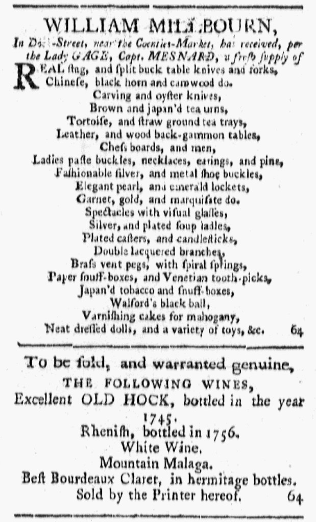
What was advertised in a colonial American newspaper 250 years ago today?
“HATS … of as good a Quality and at as low a Price as they are sold in New-York and Boston.”
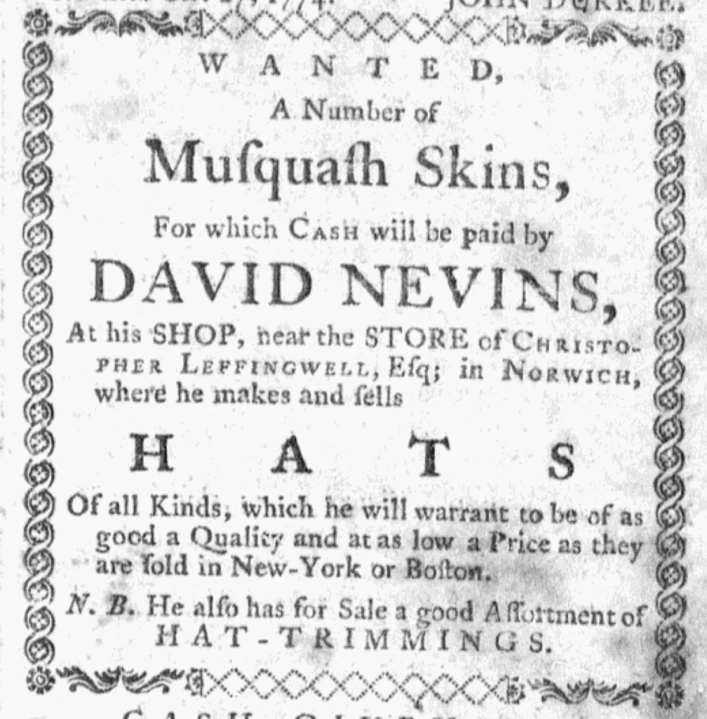
The use of decorative type as a border certainly distinguished David Nevins’s advertisement from other content in the October 27, 1774, edition of the Norwich Packet. It appeared in the final column on the third page along with several other advertisements. News items filled the facing page as well as the first two columns of that page, each of them in relatively small type compared to some of the fonts in the advertisements. The compositor used printing ornaments to separate those news items, but nothing as extensive as the border that surrounded Nevins’s advertisement.
Some of the advertisements featured larger fonts to draw attention to consumer goods and services and their purveyors and providers, including “THOMAS COIT” and “Drugs and Medicines” in one, “FLAX SEED, SMALL FURRS, BEES-WAX” in another, and “PUBLIC VENDUE” in a third. The same was true in Nevins’s advertisement, with his name, “Musquash Skins,” and “HATS” each centered and in larger fonts. Yet Nevins did not deploy those fonts alone in his effort to draw the attention of readers. He must have submitted a request for the decorative border along with the copy for his advertisement when he contacted the printing office.
Even with that visual advantage, Nevins also devised copy intended to sell the hats that he produced at his shop. In addition to hats made of musquash or muskrat pelts, he promoted others “Of all Kinds” that customers could depend on being “of as good a Quality and at as low a Price as they are sold in New-York and Boston.” Norwich was a small town compared to those major urban ports, yet that did not mean that consumers had to settle for second best or inflated prices. Nevins consistently mad that point in his advertisements. In February, he “warranted” his hats “to be of the best Quality, and as cheap and fashionable as can be purchased in Boston and New-York” in an advertisement in the Connecticut Gazette.
Other advertisers who placed notices in the Norwich Packet may or may not have made requests about the design elements. In writing the copy, they may have assumed that the compositor would select certain words to capitalize, center, and print in larger font without providing instructions to do so. After all, that was a common feature of advertisements in that newspaper. Nevins, on the other hand, almost certainly stated that he wished to enhance his advertisement with a decorative border to aid in highlighting the appeals he made in his copy.